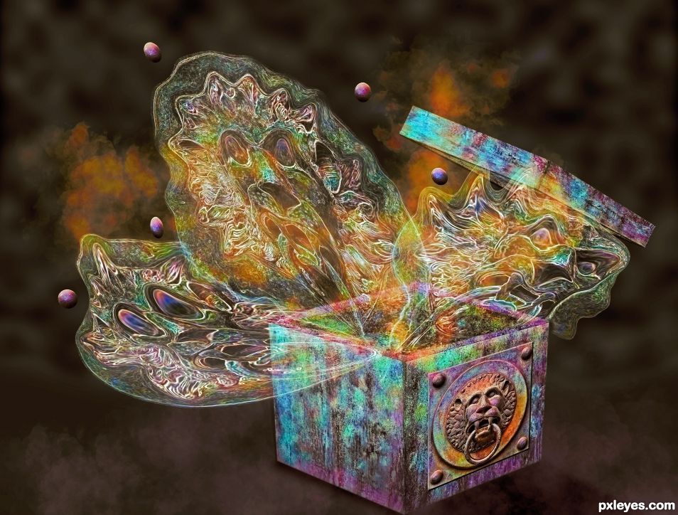
It's filled with roaring spirits and rage.
Made only with source image plus brushes. (5 years and 616 days ago)
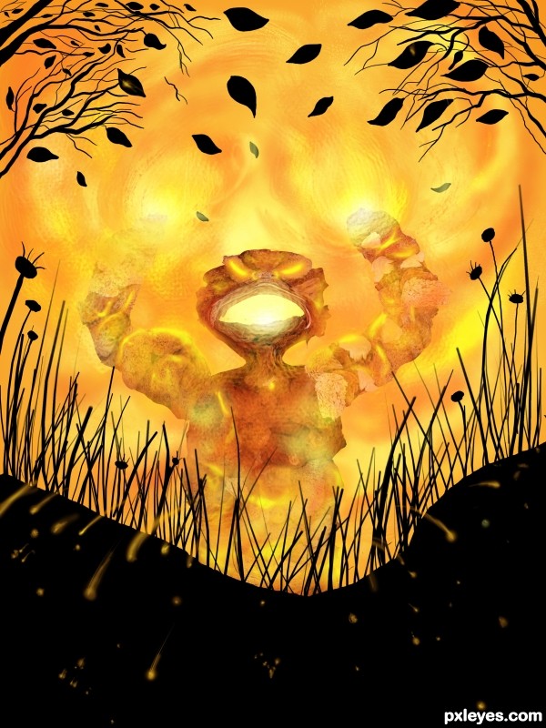
Only source image used. I wanted a comic / cartoonish appearance so I painted the foreground. (5 years and 3423 days ago)
NIIIIIIIIICE!!!!! 
Howdie stranger!
If you want to rate this picture or participate in this contest, just:
LOGIN HERE or REGISTER FOR FREE
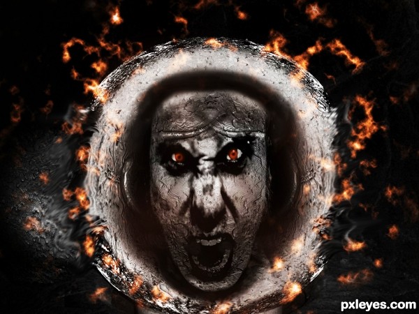
For the 'flames' i used difference clouds. Hope you like it and as always your comments are very welcome as i'm just starting out!! :-)
(5 years and 3434 days ago)
It's a bit too dark.
Thanks MossyB. I took your advice and lightened it a bit, also gave it some contrast to level it out..Cheers
Nice improvement. Now you can see the expression much better!
I like how you did the flames, although it looks a lot like lava, but it is still a nice effect. I feel the anger!
Howdie stranger!
If you want to rate this picture or participate in this contest, just:
LOGIN HERE or REGISTER FOR FREE
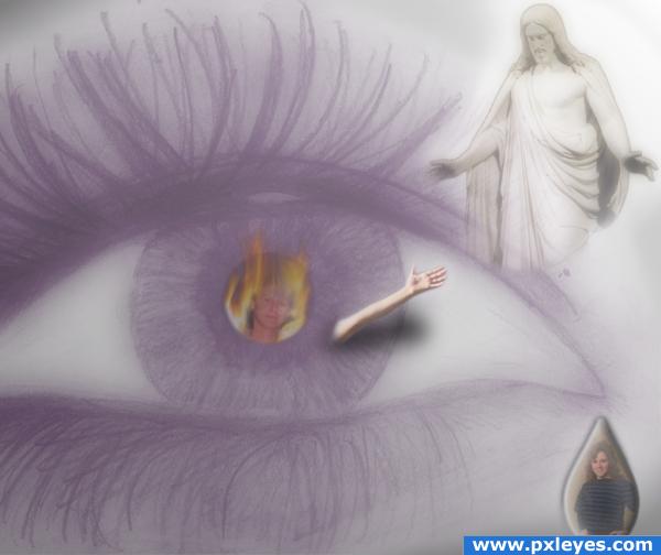
Rage, Grief, Hope...all in the window of the soul.
This took me a whole day to make (well in between chores and making dinner). I couldn't seem to get it to the way I had in mind though so I made many many changes.
Other than sources listed, the other images are my own.
EDIT: I changed this a bit. Kidox got me thinking about the perspective some. (5 years and 3882 days ago)
The colors are all messed up an the perspective ain't that good...
Good luck!
What do you mean by "the colors are all messed up"? Some people see different emotions as different colors, that is why there are mismatched colors here. Perspective-- do you mean the fire over the eye?
If you have to include Jesus, he should be behind the eye, not in front of it...
why? the eye is looking at and reaching out to Jesus
Howdie stranger!
If you want to rate this picture or participate in this contest, just:
LOGIN HERE or REGISTER FOR FREE
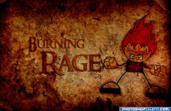
Hope you like it ;) (5 years and 3938 days ago)
nice work, reduce the darkness
bravo.....excellent paper work....GL
nice! okay..I like it ^^ 
very nice.. good luck.. I'm wondering if jag edging the character to match the text border.. only if you want to.. not necessary at all.. Just in my mind if this was drawn on paper.. the figure would have the same border effect as the text.. GOOD LUCK and very nice color scheme
I think the type detracts from this...you already have this as a title. Perhaps have the character holding something or put something next to him to replace the text. Great job otherwise! 
Looks like a movie poster of some sort. The text has a shadow the angry little guy doesn't and if you look at it in high res it looks like the hair is floating over the surface. Try using the displace filter to make it look more painted on there. Well done.
very nice 
Good Luck 
Cool effects  good luck
good
Howdie stranger!
If you want to rate this picture or participate in this contest, just:
LOGIN HERE or REGISTER FOR FREE
congrats!
Thanks Loyd.
Congrats on 2nd. It was a hard source.
Thanks BWR
Congratulations my friend...
Thanks George.
Howdie stranger!
If you want to rate this picture or participate in this contest, just:
LOGIN HERE or REGISTER FOR FREE