Tools: Motion blur, fibers, brightness/contrast, hue/saturation, warp. (5 years and 3997 days ago)
3 Sources:
(5 years and 3999 days ago)
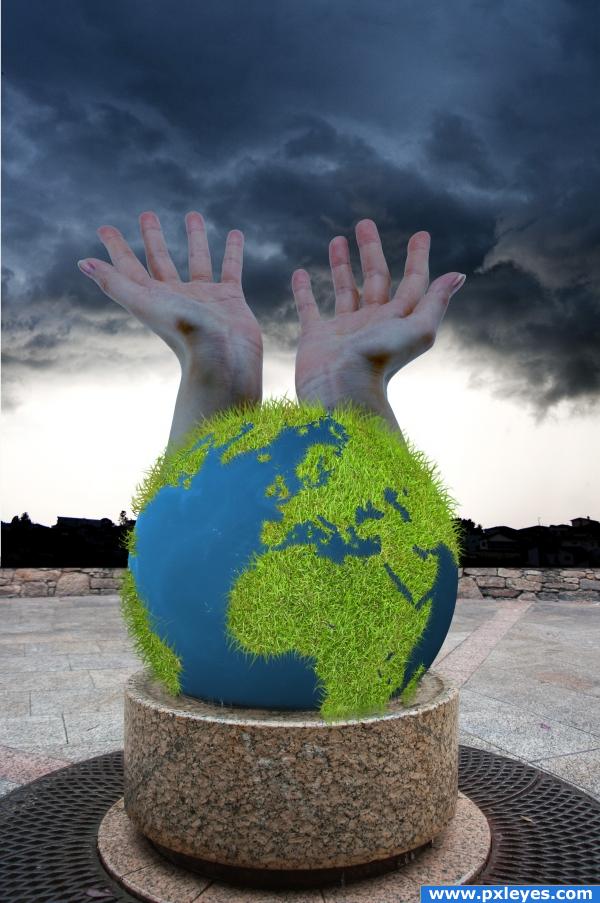
A very interesting use of the source image, i'll give you that, but i think you could blend the hands a little better, maybe starting from lower down on the globe to make it nice and smooth. I also question or use of the grass for the world, the image would be a lot more effective with a flat - brown and green land. That's just my opinion though, after all, it's your image! Good luck!!
i like it but think it would look better without the hands.
i like the image we all need rain it makes the worl happy right? and we all need to be nice to the worlsd ! its our only one right! nice blending on the hands! i love the earth you know because without it, we wouldnt evenbe here wed just be...well... nothing so i congratulate you on your wonderful image and idea and im giving you high marks! oh and by the IMO
Very creative.......love the grass
the earth looks great, but I think that the hands should be lightened a lil bit more. Also, the mood og the image should be in harmony with the other graphic ellements.
very interesting
the foreground of the image is very bright considering the background you have chosen.. Also the hands are a nice touch but maybe lower them a bit so they look like they are coming out of the earth... right now they look like they go straight up and it throws the whole perspective off to me  goodluck.
idea is good but this gress in earth is ugly, sorry, good luck
I LIKE THE GRASS... REALLY SMART IDEA.... GREAT WORK
nice
i like the grass a lot... good job...
Howdie stranger!
If you want to rate this picture or participate in this contest, just:
LOGIN HERE or REGISTER FOR FREE
no outside sources used (5 years and 4020 days ago)
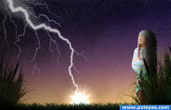
Ummm...where's the dance? Where's the rain?
lmao @ CMYK but have to agree author....
good point cmyk46...... now that the rain is falling... the dance is over
source link for lightning???
edit: if those sources say to notify them if you use their brushes, you need to link back to them... thats an awful lot of brushes your using. also, if you didnt use any outside sources, and your project has this much detail, you need to post a SBS in here to show us how you did it.
NO outside sources were used...lightening,grasses,rain,sky,clouds ALL created with brushes
Nice job! I like the color and the power of this willed indian!! Why not save a high resolution version? NEXT!
hhhahaha coool
Howdie stranger!
If you want to rate this picture or participate in this contest, just:
LOGIN HERE or REGISTER FOR FREE
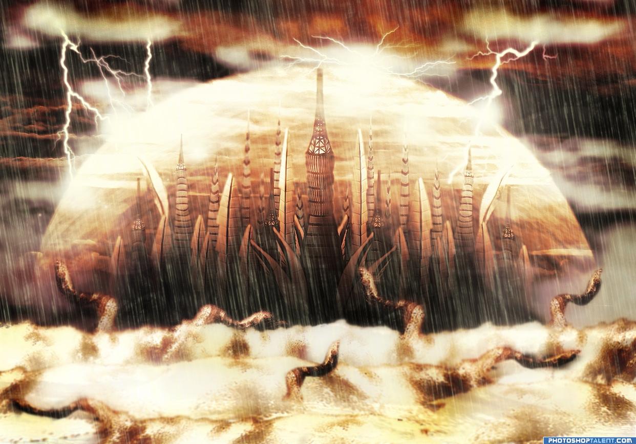
My source of inspiration was the city from Stargate series (I'm not a big fan, I just liked the city). My main goal wasn't to replicate this city, but to create one of my own, therefore I have added some personal fantasy elements.
I have build the city entirely out of parts from the source image, created the protective aura, added some waves and got the demons silhouettes from the same waves.
A lot of work was done to find the perfect color match and to integrate lots of brushes the best way I could.
Hope you like it!
(5 years and 4044 days ago)
good job! gl
Author.. SBS please.. we really can't SEE the use of source.. and the SBS will Clarify, will hold vote til then.. BAYOOTIFUL entry by the way.. Just need to know how you did it before I vote...
SBS IS AWWWWEEEEESSSSOOOOMMMEEEE


AUTHOR.. you rock
great!!
SBS on the way....thanks for the quick comments...lol...happy you've liked it!
good one it looks like the final fantasy city
Wonderfull job... Just... Beautiful! Good Luck!!! 
awesome!
Very cool, reminds me of stargate atlantis if you have seen it
Good-looking image very nice work!
Ace place
nice work
I don't mind the rain, but the foreground, middle ground & background are the same colors, and it kills the illusion of depth...
great entry, however, I'm a bit confused as to where the city sets.
Good-looking scene...Very final fantasy
cool image...love the idea, I think it some depth would really improve this, like with the rain and dome. Good luck!
Sweet manipulation, really like it The protection circle looks really cool 
O-o-o-o-o, so many scary worms want to eat this beautiful city. It needs to be protected
Congratulations for 2nd
Congras!
congrats
congrats
Howdie stranger!
If you want to rate this picture or participate in this contest, just:
LOGIN HERE or REGISTER FOR FREE
Photography and photoshop contests
We are a community of people with
a passion for photography, graphics and art in general.
Every day new photoshop
and photography contests are posted to compete in. We also have one weekly drawing contest
and one weekly 3D contest!
Participation is 100% free!
Just
register and get
started!
Good luck!
© 2015 Pxleyes.com. All rights reserved.


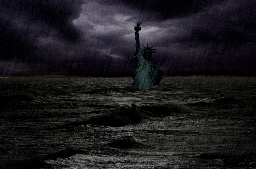
your statue is rather bright considering her surroundings...if you give the water a bit more highlight then just darken the left side of her body a bit more you might get away with it goodluck anyway
What i suggest, instead of darkening the statue, brighten up the background, because now it's way too dark. Another suggestion would be to add a few splashes around the statue to make it look like a real storm. Good luck!
i totally disagree with ponti (sorry ponti) but im sure what the author was aiming for was a dark and stormy look right author! i think you should let the image fly like it is because its fantastic! and theres nothing wrong with it! oh BTW im adding this image to my favorites list!
Howdie stranger!
If you want to rate this picture or participate in this contest, just:
LOGIN HERE or REGISTER FOR FREE