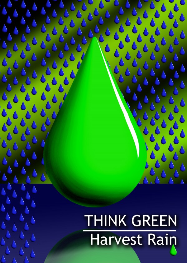
Wanted something simple and easy to read.
Especially in a poster..
built in PS (5 years and 3842 days ago)
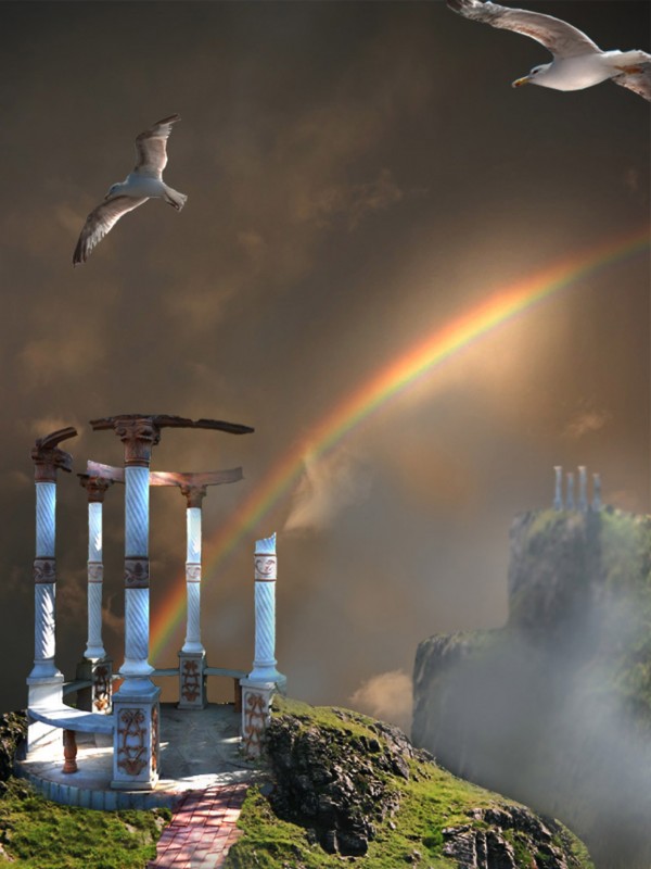
Thanks to:
Lelaina..for the pic of the hills.
mqtrf for the pics of seagulls and sky.
The rest is PS. (5 years and 3872 days ago)
Good mood, but no high res version? Please fix link #1.
very nice work on the lighting
Thank you for your comments....I've tried loading the High Resolution several times, but for any reason, does not do it.... sorry. Link # 1 fixed. 
the white thing looks fake, because it stands out too much
Kayaklovegirl: I think it should be a kind of highlights over the pavilion, (if it is the "thing" you talk about). Thank you for comment.
Your high res version is probably too high. Make sure it's less than 2500 pixels wide. Anything much bigger than that might give you issues.
Try to fade the background mountains and make the foreground less faded(fog not in the right place), thats a standard rule to give an illustration depth.
Thank you jawshowwhah, HIgh Resolution works now. Sander, thank you for the tip, I will do that.
Good blend of different sources.. good luck!!
nice choices of stock images. seagulls/Albatros are an interesting touch.
Beautiful! 
Great mood.
Thank all of you, for your comments....
Howdie stranger!
If you want to rate this picture or participate in this contest, just:
LOGIN HERE or REGISTER FOR FREE
Thanks for view and comments. (5 years and 3877 days ago)
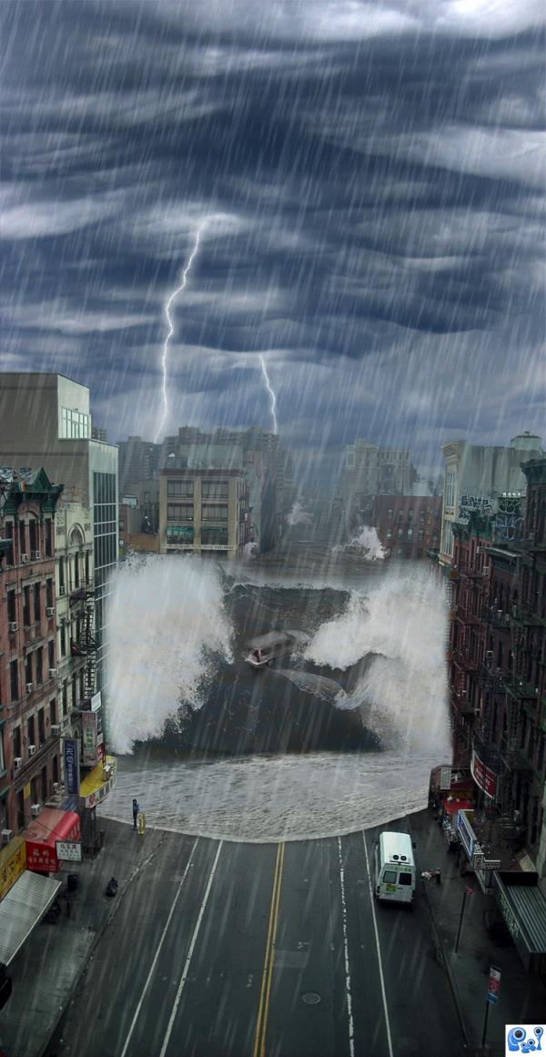
Good work cleaning up the source pic and blending the waves...the car in the wave is a great touch...excellent image! 

Nice blending...eerie final image. Perhaps make the wave less transparent on the left side where the whitewater hits the building...Great job, author! 
since i was a kid i have dreamt of myself standing on this one building in the center of our city and a tidal wave comes crashing down right in front of me... i have a sever fear of the ocean lol.......... you've done a good job with this, i shaln't sleep for a week lmao
I do NOT wanna be the person standing outside the building in the right side,, anyways .. great Job ;D
Nice work author 
Thanks for comments!! 
Why are the people just standing there. I know there's only two or three but it's like they are oblivious, especially the guy with the red bag on the right. .
You are very observant, is obviously an oversight. Anyway thanks for the notice. 
PD. I´ll try to get time to clone the people.
Ok, no people. 
this image is truely on theme. great choice and use of stock photos ..
nice
Removing the people was probably your best choice. It's definitely one of the best now. . GL! 
wow nice job author, i dont want to be the man standing there lol
nice image.. good luck
Congrats...well done! 
Enhorabuena amigo  buen trabajo
Congrats, terrific work 
Congrats
Congrats!
Told ya it was one of the best  Congrats.
Congrats!!
A lot of thanks folks!!
A lot of thanks folks!!
Howdie stranger!
If you want to rate this picture or participate in this contest, just:
LOGIN HERE or REGISTER FOR FREE
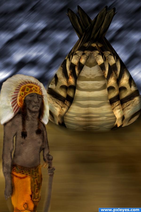
Only used source image given.
SBS on the way (5 years and 3906 days ago)
ART is a free form of expression. I think you deserve a comment, for the time you spent at the computer, looking at the screen, trying to make your idea work. Good job, and good luck.
very nice 
Hey, xwd: do not be disappointed, it is ok, participating is the main thing. Congratulations any way!!!! You'll do better next time.
Howdie stranger!
If you want to rate this picture or participate in this contest, just:
LOGIN HERE or REGISTER FOR FREE
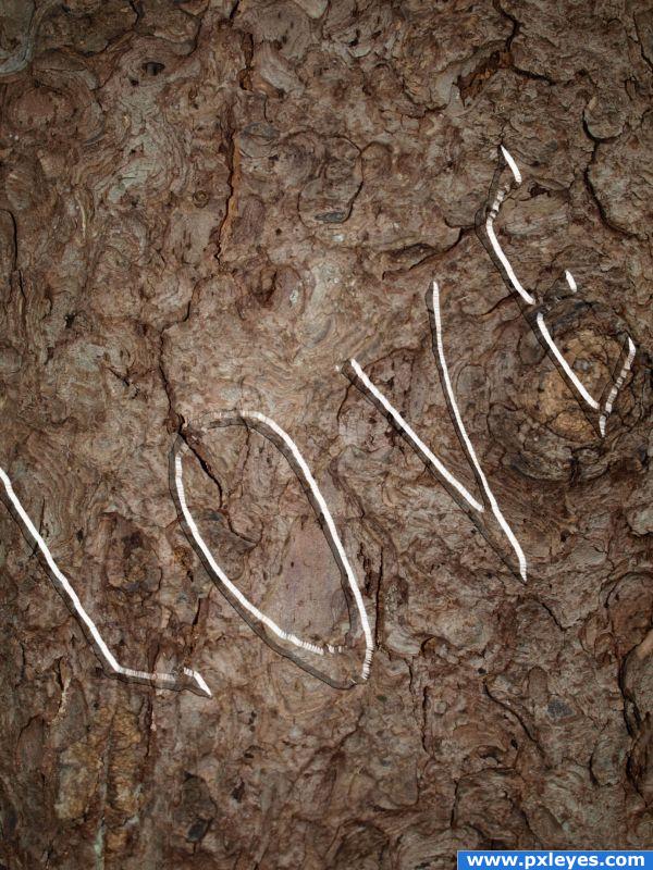
the rain make a word "LOVE" in the ground... (5 years and 3912 days ago)
in the ground? isn't this a tree? 
WHATEVER!!
Howdie stranger!
If you want to rate this picture or participate in this contest, just:
LOGIN HERE or REGISTER FOR FREE
Lol, it took a minute before I had understand it.. But that probably is because I'm not English! Succes though !!!
Drops are going behind & in front of the blue plane?
agrees with CMYK. Make it one way or the other, not both, I suggest behind.
Just thinking out side the box.. I did the walking over surface on purpose... I prefer it that way..(represents the rain that is being harvested while the rest of the rain escapes) but thanks for the comment
(Goal was to balance the text on the other side like a real poster)
(I also don't read anything CMYK types on my entries... his comments on my work are always suspect)
Author, your entries are subject to criticism just like any others.
very nice
Howdie stranger!
If you want to rate this picture or participate in this contest, just:
LOGIN HERE or REGISTER FOR FREE