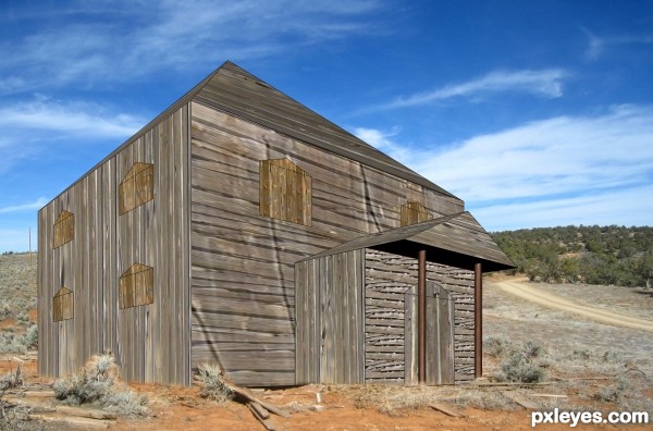
source only (5 years and 3446 days ago)

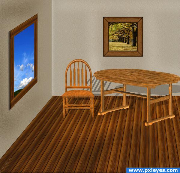
only source for room, except the sky. worked 2 days, sbs is in progress. i m waiting for your suggestions and votes :). (5 years and 3846 days ago)
It would really top this image off if you were to add some shadows under the table and chairs. Also, perhaps think about making one of the walls slightly darker than the other. It'll give the room some depth and variation. If you put a tighter shadow around the left part of wood window sill it will also help. Good job! 
thanx for suggestions, pixelkid. i will change it tomorow.
very sweet image.. reminds me of a McKnight (Thomas)
great work
efforts you put is seen... good work... please chk the shadow of the table.. it makes the table float... the shadow always starts from the point where obj touches the ground... good luck..
this is a sweet image.. a lot of work with the source author.. well done
i`ve changed the table shadows, thx all for comm. 
Howdie stranger!
If you want to rate this picture or participate in this contest, just:
LOGIN HERE or REGISTER FOR FREE
looks weird... image modeler? 3ds max?
Great idea, and perspective drawing, but the shed looks like an illustration still. See the shadows under the boards? Try to make similar ones with the door and window parts - separate them from the main image and then add them.
good try...nice image.... good luck
Good work on the re-making of the shed.....gl
Howdie stranger!
If you want to rate this picture or participate in this contest, just:
LOGIN HERE or REGISTER FOR FREE