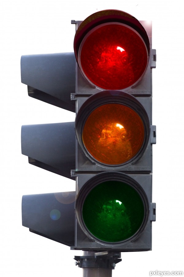
I just changed the colors a little bit. (5 years and 3643 days ago)
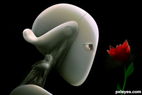
The source image was used to make the neck of the robot. And it for some reason inspired me to make this image. I don't know why? No outside sources used. (5 years and 3643 days ago)
its great...good luck
I like the rose over there and the white edges! 
very nice work author...good luck
I love the peace and rest in the image! well done!
bravo.. the eye is wonderful
Beautiful work, author! 
I like the mix of passion/sadness of robot look... 
nice work author 
Very Good work and very nice lighting.
love the outcome you have here...good luck
this is really nice! gl
nice!
Great work!
Congrats for your second place!
Congrats for 2nd
congrats fabulous entry
Thanks 
Congrats!
congrats on 2nd place 
congrats........
This is an awesome creation, would be perfect for a since fiction book = )
Howdie stranger!
If you want to rate this picture or participate in this contest, just:
LOGIN HERE or REGISTER FOR FREE
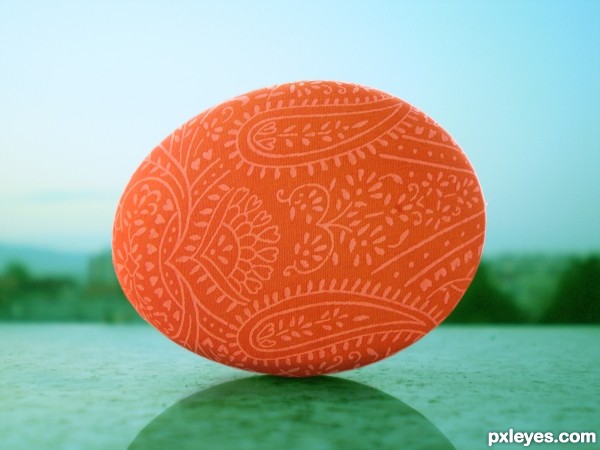
I took the egg picture. No external sources used.
Could I get some comments, so I could fix some things? (5 years and 3653 days ago)
Well, let's go... In hi res it's possible to notice a fine white line around the egg; so it means you need to mask/chop it better... And the way it is now, the egg seems a bit flat; how about using warp tool around it and some burn tool on lower side, to give it roundness? 
i agree with Erica...work a bit more on this author,this is really nice work and great idea...best of luck
Nice job! 
I think I fixed it a little bit...
this is simple and yet so beautiful , very well done author, i love this 
Howdie stranger!
If you want to rate this picture or participate in this contest, just:
LOGIN HERE or REGISTER FOR FREE
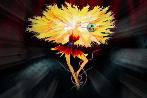
"Dancer In The Dark" is a concept that came to my mind as soon as I saw this image.
Only used the source image, took me about 3 hours to complete.
Ingredients:
Photoshop CS4, Pen Tablet and 4 cups of coffe...
;)
(5 years and 3672 days ago)
Wow! Great work!
hehehe.. mountain dew works better LOLOLOL.. hehehe.. great job
But don't drink coffee after 7 o'clock pm, it may cause insomnia... Beautiful work! 
beautiful ... imo bowling ball retracts from the subtle beauty of the image ...high marks from me though
Great job...well done author
Thank you guys.. Unfortunately I DO drink coffe after 7 pm... A LOT actually... :P but I'm glad you liked my work.
You aren't the only one 
Congrats for your third place, MrLuna! Good to see you entering again 
Congrats! for 3rd
Congratulations for 3rd
Congrats!
Thanx ! I didn't know I was being missed around here !!  I'll try to login more often now...


Howdie stranger!
If you want to rate this picture or participate in this contest, just:
LOGIN HERE or REGISTER FOR FREE
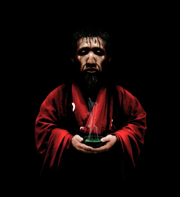
"Would you like some tea?"
A complex photoshopping result...I divided the man's face and mirrored it to make him turn forward. (5 years and 3688 days ago)
Good job, look quite convincing. Maybe you should change the shadow below his head a bit, because it's not round like that. GL
Thank you langstrum, I agree. I'll try to fix it within the next couple of hours.
Maybe just liquify the tip of his nose downward a tiny bit. Good concept to turn him around! 
Good idea too, pearlie.  Thanks! Will work on it.
Fixed! How is it now?
Hmm, quite better but not desired to me. The shadow should be more or less like that around his neck --> \/. About his nose, it's still not realistic, you can use the bloat tool in liquify to make the center of his nose tip (whatever, I don't know how to call) to be rounder. Just find an photo and observed the real nose than you can figure it out 
Great feedback--much appreciated. I think I have an idea what to do now. Thanks again.
Pretty good, nobody thought of turning forward the man! 
Okay here goes...attempt number 3. Altered the shadow again and fixed the nose (hopefully). How is it now? The bloat tool didn't work as desired so I blended it with another asian man's nose.
Good idea, but do something to alter the symmetry on the face, so it doesn't look like you just flopped it...otherwise it's a good image.
Thanks, CMYK. What would you suggest? Adding some assymetrical details to the features? I already did a bit of work on the hair so that it doesn't look too mirrored but I'm not sure what else to do. :/ This is my first try at attempting something like this.
Author, just play around...remove some shadows, etc...it shouldn't be hard to alter the symmetry.
Okay I get what your saying now. I fixed it up a bit. Any better now? Again, thanks alot for the feedback. 
Yes, that's much better...good luck! 

Thanks! 
Cool
nice work --- has been interesting to watch this this one evolve
perfect ! --- completely different and nice work !  Good luck author !!
Very nice...good luck author

Congrats!
congrats !!
Thank you everyone! 
congrats for 2nd 
Howdie stranger!
If you want to rate this picture or participate in this contest, just:
LOGIN HERE or REGISTER FOR FREE
Nice colors , i like it
its realistic.. nicely done
Good
Good.
GL
good luck
good luck
Howdie stranger!
If you want to rate this picture or participate in this contest, just:
LOGIN HERE or REGISTER FOR FREE