(5 years and 3838 days ago)
- 1: thanks jarrodvk
- 2: Dave Hamster
- 3: source3
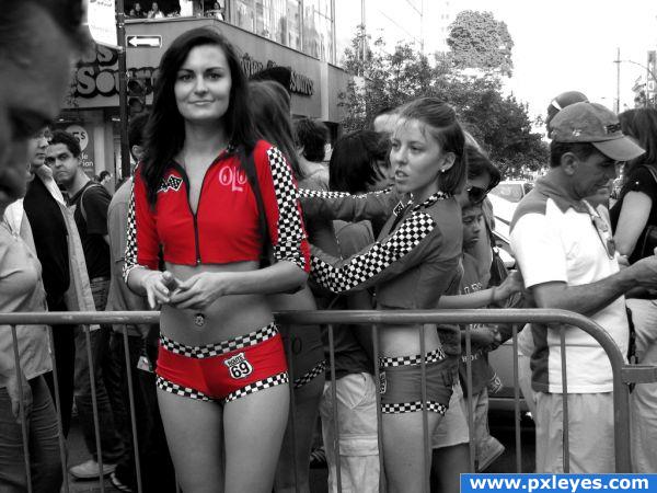
sexy red girl
F1 weekend in Montreal - Club Locoloco (5 years and 3846 days ago)
Good job. The red really pops out. Good luck 
Howdie stranger!
If you want to rate this picture or participate in this contest, just:
LOGIN HERE or REGISTER FOR FREE
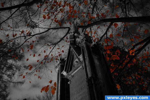
first i desaturated the image and then colored back the leaves only (5 years and 3847 days ago)
Nice autumn feel to this. Nice color choice!
i agree great colour choice.
nice s/c choice
Howdie stranger!
If you want to rate this picture or participate in this contest, just:
LOGIN HERE or REGISTER FOR FREE
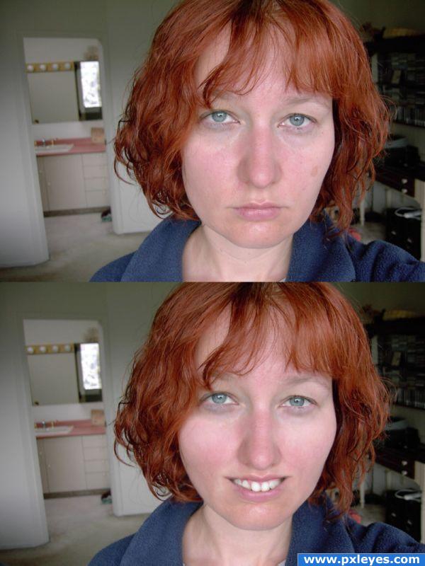
I think that the more difficult part has been drawing the teeth.. But it's just a patience work. (5 years and 3848 days ago)
excellent!!!
EDIT: I noticed  very good job author
The whole face changes when someone smiles...you changed the mouth but there are no smile lines on the face, and the eyes should smile more too...a smile is half in the eyes.
to be honest I changed mouth, eyebrows, eyes and cheeks, but just a little because I wanted a simple smile... Anyway you're right ^^
I really like, how good you drew her teeth! Very good job on that! Good luck 
Great job on her face, you can see the smile in her eyes!
Howdie stranger!
If you want to rate this picture or participate in this contest, just:
LOGIN HERE or REGISTER FOR FREE
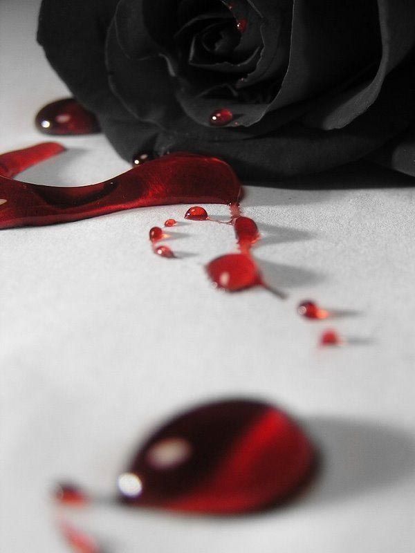
Thanks to UrDisaster for the beautiful pic. (5 years and 3851 days ago)
nice idea.gl
nice image and a well done masking job
Beautiful...
This is a great image! For pete's sake remove that artifact under the rose to the right. I remember that from PST days. Great shot...just remove that thingy! 
EDIT: Ahhhhhhhhhhhhhh 
@pixelkid , dunno whether i got ir right or not, but just made a bit of correction. not sure if u meant that... thanks anyways for remembering this entry and the thing  ..
..
Good to see it back!  And I suppose, that I don't have to mention, how great it is. I think it says everything that people are able to remember it, even though that contest at PST had 250 entries. So you did a really really good job! Good luck again!

Congrats for your second place, Vinshine!
Congratulations for 2nd
Congrats Vinshine! You nabbed a great source and did quite well with it. Great job!
congrats
Thanks everyone..
Congrats 
Congrats!!
Congrats 
Howdie stranger!
If you want to rate this picture or participate in this contest, just:
LOGIN HERE or REGISTER FOR FREE
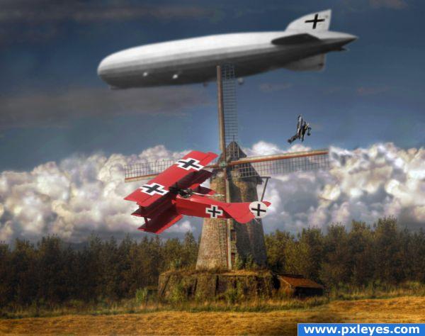
there's too much going on.. you also have proportion issues.
well, then i guess i must have misinterpreted the image.. the plane and the zeppelin seem one next to each other which is obviously impossible due to their sizes.. i think seperating the red plane from the zeppelin a bit more might help. in this image the zeppelin is farthest away, right? i dunno, that little plane looks like it's very far, but it's too big i think the sharpnes and blur play a role here.. the zeppelin is sharper than the red plane and i think there's the conflict. that black plane is too sharp too imo.

also, you could contract the zepp and the red plane by a pixel or so to get rid of the white outline.
i hope i have been helpful, author
fixed
MUCH better! good thing i don't vote up until next sunday
nice
Howdie stranger!
If you want to rate this picture or participate in this contest, just:
LOGIN HERE or REGISTER FOR FREE