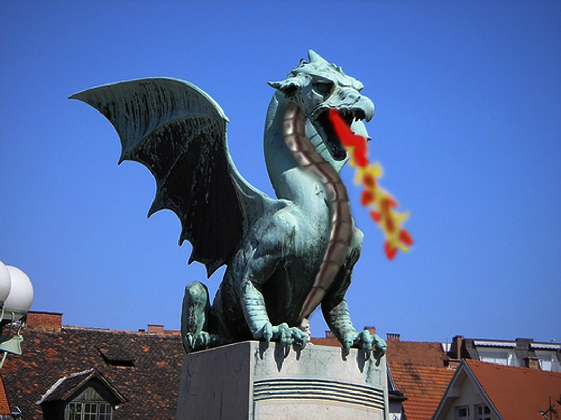
used the warp tool for the neck armour plates and the smudge tool for the water / inferno, hear rest in sbs, sbs coming soon (5 years and 3922 days ago)
1 Source:
source and My pics (5 years and 3923 days ago)
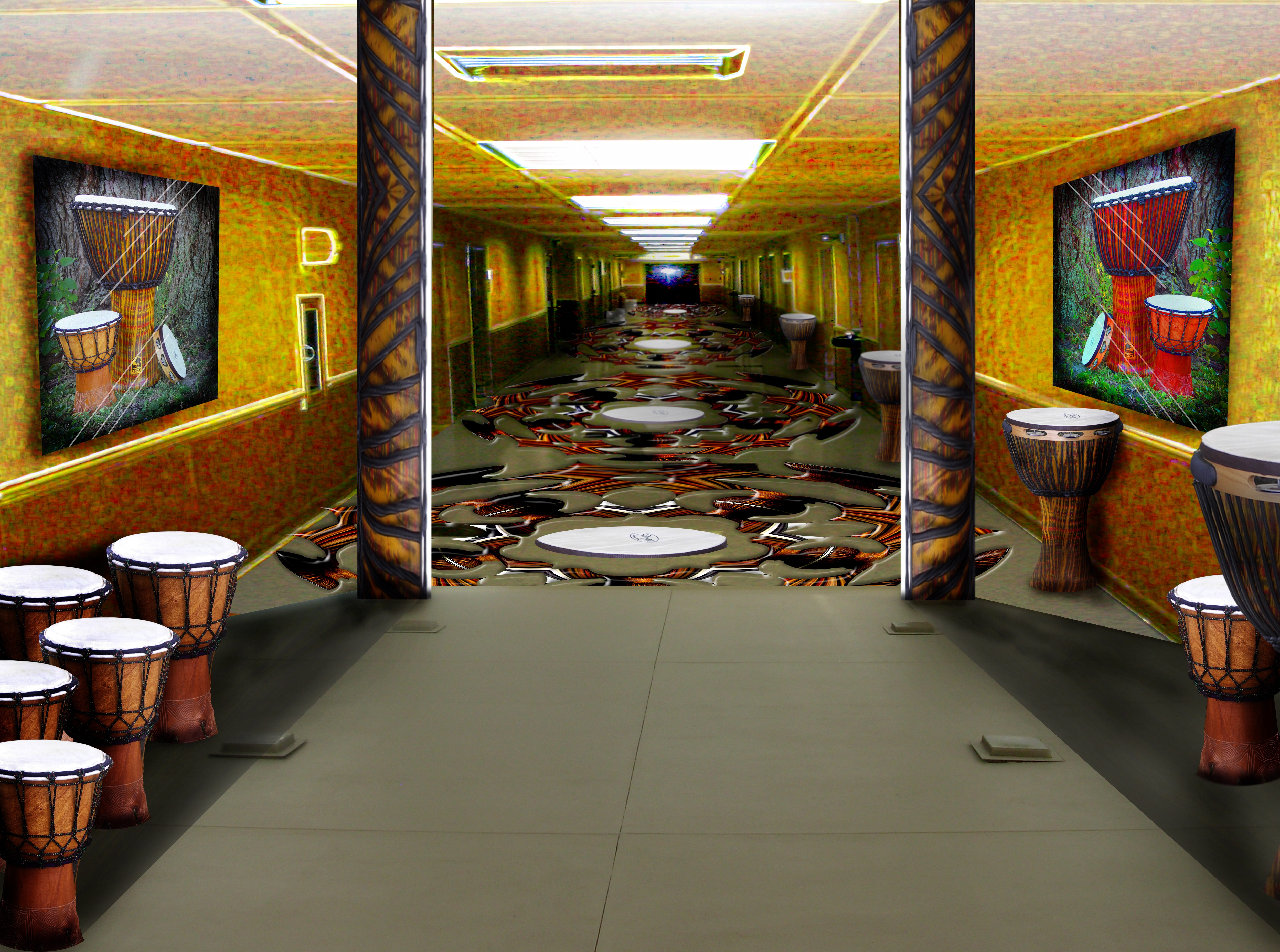
Cleverly done!! Good job! Perspective is tip top! Really detailed work, but on the high res i can see that as you get further and further away, the hallway gets pixelated but the floor doesn't, you may want to try and match that up. Good luck and high marks from me 
very nice
DERNT PONTI.. give me your eyes.. LOL.. thanks a lot Buddy.. I'll go in after it now..boy.. must be great to have such awesome eyes ..all fixed PONTI..
I only did a light blur, I'll get overzealous and ruin it.. THANKS FOR THE HELP
The left wall should be parallel to the columns, not leaning out...
looks great
Nice perspective work.
Very nice work!!
good work
good job!
very nice 
Looks a bit like a room from the Prince of Persia video game! g/l
very nice
Very nice. Some shadow issues, the shadow behind the columns and the objects it is falling onto.
very nice job
interesting, how long this hall is? 
Howdie stranger!
If you want to rate this picture or participate in this contest, just:
LOGIN HERE or REGISTER FOR FREE
Only source image used.
Please see in High Resolution. (5 years and 3924 days ago)
Awesome job! The design is so intricate!! Really well done. High marks from me!!
very pretty and wonderful design good luck author
A lot went into this. Really like the colors too.
beautiful
very nice!!
interesting design
nice use of source......high resolution luks pretty cool.....GL
very good work!
Just lovely!
hoo... it will be nice to see this flower in life!
Howdie stranger!
If you want to rate this picture or participate in this contest, just:
LOGIN HERE or REGISTER FOR FREE
(5 years and 3935 days ago)
very nice
good work
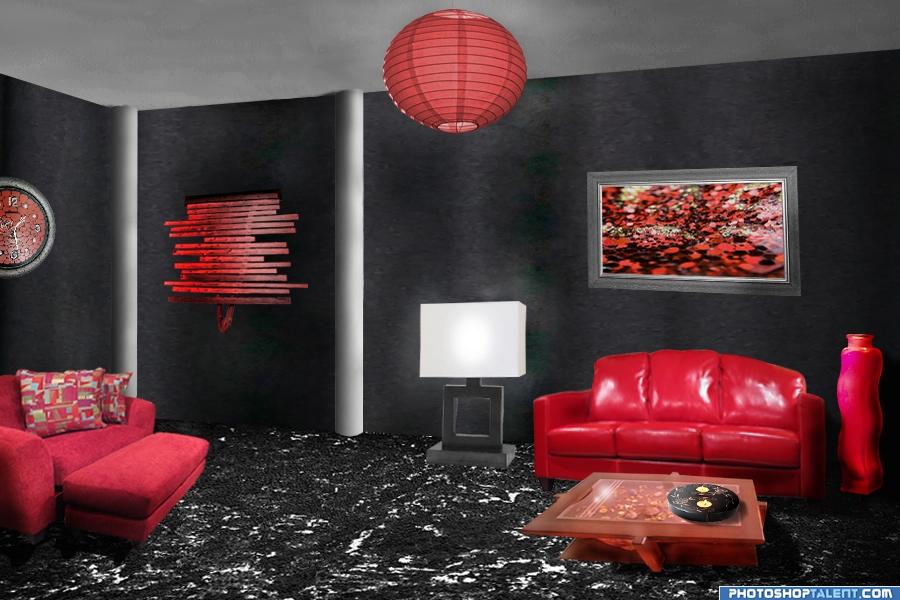
Now that's a room to induce a lot of drinking (old bar trick, to get people to drink more you put out red napkins, it works)..a little over boad on the red, a little greenery would be in order.. a few green plants here in there.. and the lamp is not really a floor lamp(needs an end table) it's more horizontal then vertical.. but still very much on theme author good luck (sorry 15 years of decorating condos on the beach good luck
you should adjust the left side of the floor, now its at a wrong angle wich makes it look like going uphill. The source its original angle for the left couch would have been a lot better then the way it looks now. Also why is the right couch its edges so blurry while the painting above/behind it its edges are sharp ? Do love the overal mood of the room.
nice work gl
nice modernistic look
The floor looks like a sea full of waves to me  rest is good!
wow futuristic like it
Love the vibe
nice!!
a lot better in this one, but perspective needs improving, love it, good job and good luck
congrats!!!
Howdie stranger!
If you want to rate this picture or participate in this contest, just:
LOGIN HERE or REGISTER FOR FREE
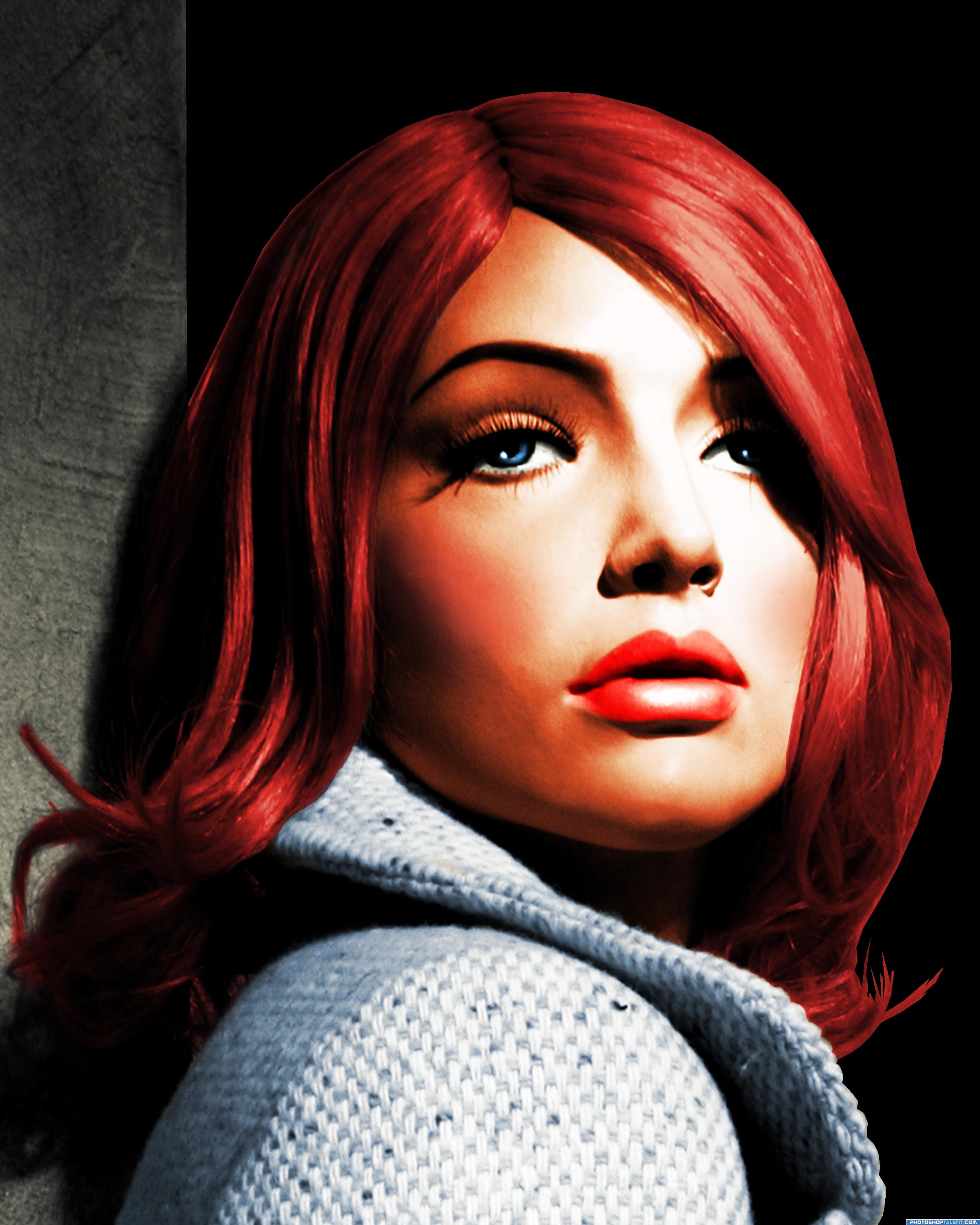
Anyone see that movie where the mannequin comes to life??
Thanks to ElRincon @ SXC for the great image. (5 years and 3938 days ago)
It would be nice to show in the Ste3p By Step what you did with the face to make her even more beautiful. For now I mostly see she has color
You did a great job on this...it would have been nice to have seen the before  Good Luck
I guess she was pretty in B&W, but in colour......
yah, it's nice but you need to do more than color it. Also, please put up the before image as well (split image) cause it's mandatory for this contest. *points to contest description*
It says you can post the source in SBS, which I thought I did, but have now.
the required change is not just color
very good choice of source image; looks artistic and much improved after adding color
Good Luck
verry pretty, nice "sin city" look
very good
Howdie stranger!
If you want to rate this picture or participate in this contest, just:
LOGIN HERE or REGISTER FOR FREE
Photography and photoshop contests
We are a community of people with
a passion for photography, graphics and art in general.
Every day new photoshop
and photography contests are posted to compete in. We also have one weekly drawing contest
and one weekly 3D contest!
Participation is 100% free!
Just
register and get
started!
Good luck!
© 2015 Pxleyes.com. All rights reserved.


I like the idea of added scales to the dragon statue. You were very creative in your implementation of the faucet when you set out to do this. I would, however, recolor and shade your scales a bit more so that they blend better with the statue (right now they appear to be floating above the picture as opposed to being a part of it). Also, I would give consideration to losing the fire. It seems a bit too cartoony, and to be honest it doesn't heighten the image in my opinion. Still, nice work! Keep it up and you'll have something amazing in no time!
It's a very good idea, i'm not denying that, but it looks like too much of a copy and paste job if you know what i mean. Good luck with this anyway, but tehre isn;t much more to say Magicsteve pretty much covered it all. Good luck!!
yikes author.. I think magicsteve and ponti have put you through the ringer .. I'll just skiddaddle out of here before they come after me LOL
Nice start on your image here taking into account that this site is for all lvls of P/S skills, I am gonna say nice job and keep up up the good work. I would try and do a wee bit more with the image. But good luck all the same .
.
usage of source image is very little, and the fire looks unreal or unfinished.
Just keep practising, and learn from others.
blurry
it's alive!
Howdie stranger!
If you want to rate this picture or participate in this contest, just:
LOGIN HERE or REGISTER FOR FREE