(5 years and 3263 days ago)
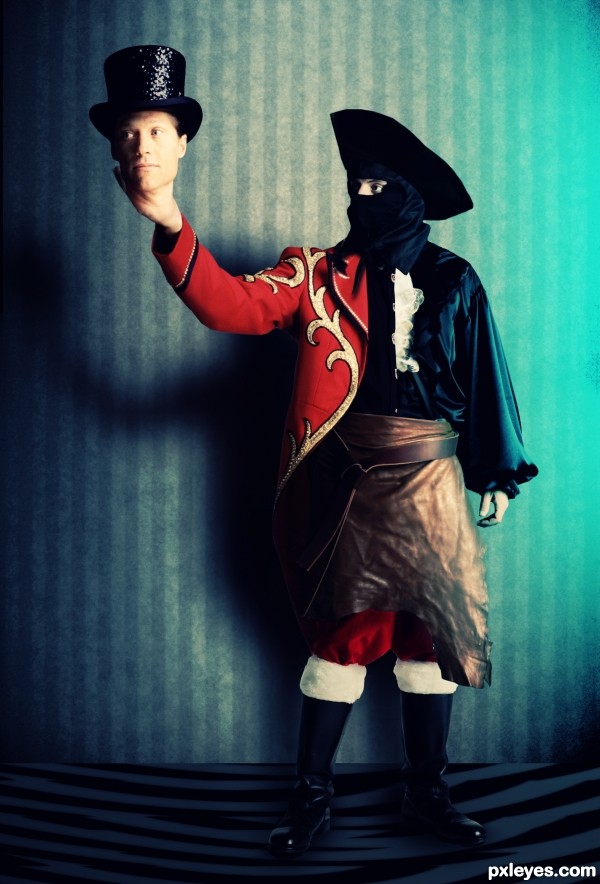
I have no cue how i came up wit this, hope you all like it :D
Thanks to mjranum-stock, CrazyDreamer1-Stock, AbsurdWordPreferred, Enchantedgal-Stock (5 years and 3477 days ago)
hahahahaha....cool image with nice touch of humor...good luck author
thnx mate
Howdie stranger!
If you want to rate this picture or participate in this contest, just:
LOGIN HERE or REGISTER FOR FREE
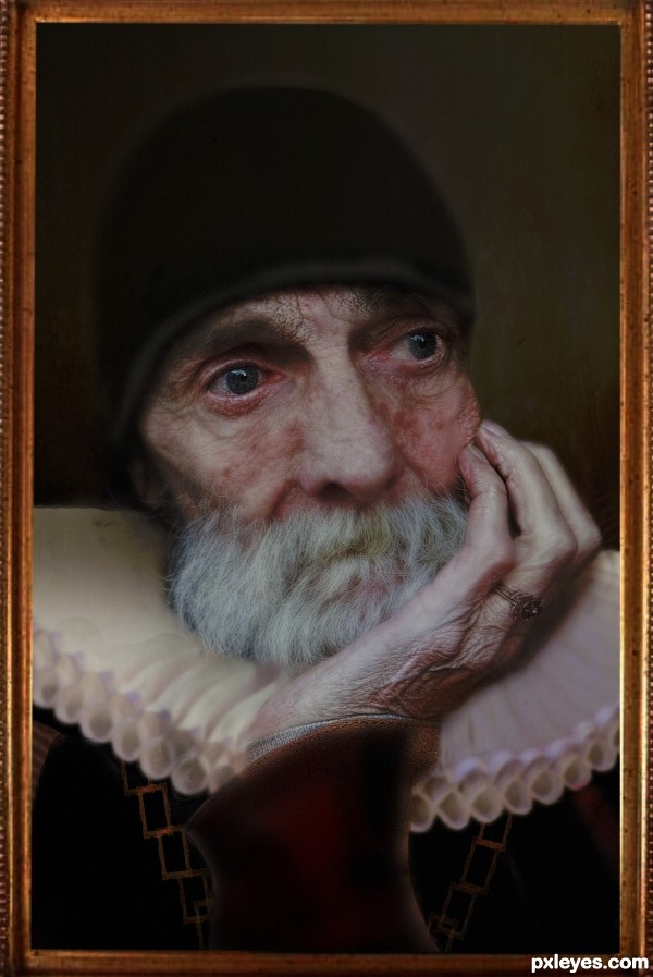
This is an unknown Rembrandt's painitng from Musee Du Louvre :-)
I want to say thanks to : for
Frame source and Background to Temari 09, for Ring source to Catherinette Rings Steampunk, for frame (chain created from this frame - I have used this frame to create the chain) to rubyblossom and for ruffle collar source to Heesterbeek Ineke. (5 years and 3599 days ago)
Very nicely done!  The filter should only be applied to the canvas, not the frame, and IMO should be toned down just a bit, but still excellent work.
Very nice and realistic, but I also agree with both about filter.
To CMYK46, Nator, erikuri: Thank you guys! I've updated image with new fraimed one.!  Is that looks better? Thanks again.
Canvas is still too filter heavy. (Rembrandt would never have made such heavy texture.).
I have changed filter as suggested, thank you!  I have also corrected an eye and hat a little bit.
nice idea
Looks great in high res now...good luck, author! 
Thank you CMYK46 ,much appreciated!
Thank you Chuck! 
Nice work....as an oil painting, it needs a little bit more texture.
Excellent! 
Thank you All, for your nice comments, votes and FAV - I am really appreciate it! 
Howdie stranger!
If you want to rate this picture or participate in this contest, just:
LOGIN HERE or REGISTER FOR FREE
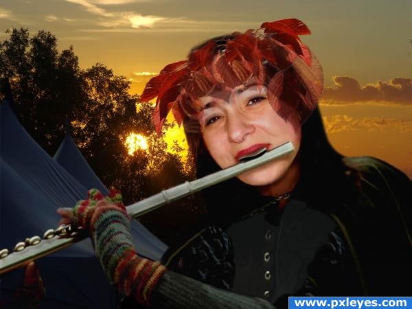
The challenge of this entry was to transfer the flute and clothes from the real flute player to my own photo. A lot of changes had to be made through the editing tools to do this. (Please see SBS) Girl's photo is my own. Thanks to gotmeamuse at pxleyes for the sunrise photo; for the flute and costume, thanks to Earl53 at morguefile. (5 years and 3898 days ago)
ummm.. why are the leaves clear? it looks really bad like that
I agree, the leaves should not be so transparent.
nice 
Howdie stranger!
If you want to rate this picture or participate in this contest, just:
LOGIN HERE or REGISTER FOR FREE
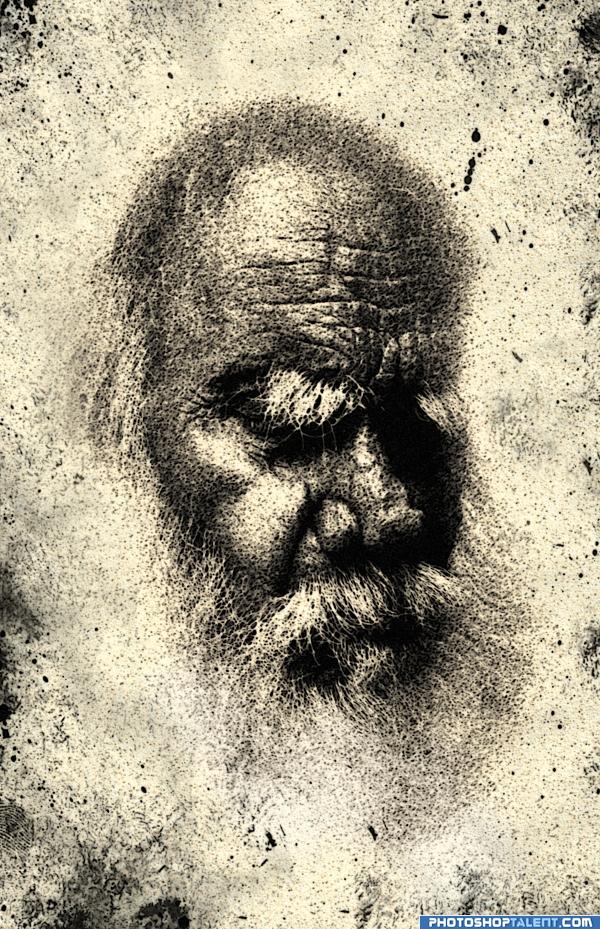
the first that went through my mind when i saw the pic was that i looks like davinci. so i made it. filters, image adjusting and that's it. very simple. hope u like it. a bit dark though, i think i'll change that. anyway, give me your suggestions plz. (5 years and 4040 days ago)
Very nice effect!! I'd crop the image to focus better to the subjet 
I'm afraid to give you any suggestions that would send you into a new direction that you may never recover from.. the piece is at stability now.. if it where to be framed you would have what giallo suggested.. mainly ARE YOU HAPPY with it.. it's all that matters in the end
nnnice effects but if it is coloured it will a marvelous piece but if ur happy with it then really simple and good work of mind
Very DaVincian. Perhaps a little sepia would enhance the effect a bit. Good Job and GL
welldone.
Good job Author.........Good Luck.
cool very nice
great
Interesting application of brushes. 
Fab
great
simple but nice filter work
you did very well
this is a powerful image...beautiful!
Howdie stranger!
If you want to rate this picture or participate in this contest, just:
LOGIN HERE or REGISTER FOR FREE
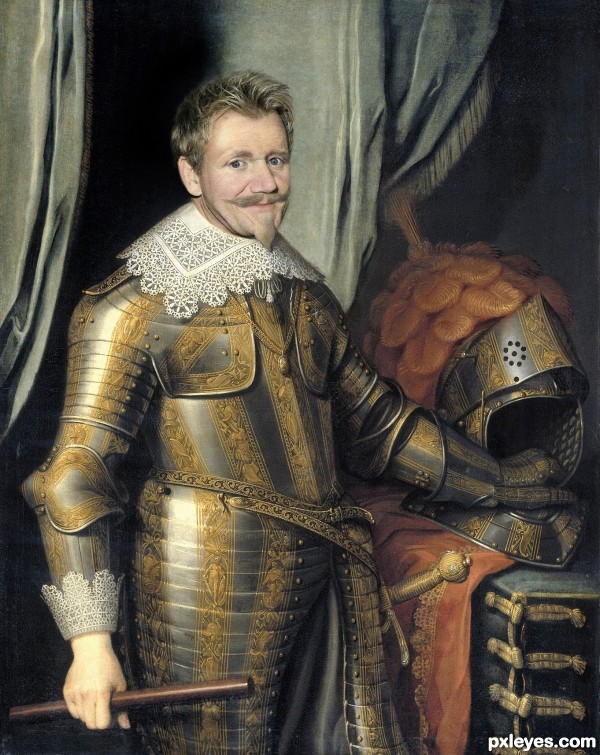
You should maybe put a knife sharpener, or a kitchen blade in his hand instead of the staff, and possibly substitute a "Chef's Hat Pouf" for the feathers on the helmet, but this is a great chop!
Dislike the man find him very rude -- but like this very much very nice matching of the images
I think he would have some choice words for you if he saw that outfit
I love Gordon Ramsay, always wanted to try out for his show just so he could yell at me lol
He should be holding a Sharpening stick or a Kitchen knife instead of a staff...Also, making the feathers on his helmet into a Chef's Hat pouf would be cool...
Excellent execution. But beyond pure skill, I would like a second level of meaning, i.e., why is Gordon Ramsay as a dubious knight compelling commentary? Or is that in fact the point some how?
nice blending author!
I like this image very much...He fits perfectly but IMHO u should add some noise at his face for better blending...play a bit with this author and u will have fantastic image...best of luck
Howdie stranger!
If you want to rate this picture or participate in this contest, just:
LOGIN HERE or REGISTER FOR FREE