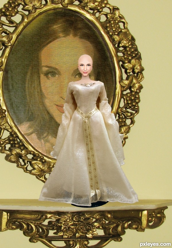
"Try to be creative as possible" This was what came to mind after mulling it over for a few days. All work used was found by artists from DA.
Doll body by VelvetStock
Bald Image by Voivodess
Girl Image by Glodis2stockphotos
Mirror and Shelf by Lillyfly06-stock
(5 years and 3004 days ago)


I am a little disappointed that an entry like yours with a little more creativity then just a change to bald image, didn't ended up higher in the winners list. But that is not your fault you made a very nice entry, one of my favorites in this contest.
Thanks Eladine I thought the same thing and was surprised it placed lower than some of the others. I had wanted to create something that would be challenging and as always tell a story of sorts. I feel I achieved that and am appreciative of the you kind words towards this entry. Maybe the bald doll image freaked people out.
Well the other more creative entries ended up third, don't get me wrong, the other chops are very good as well I just think yours and the other should have gotten extra points for creativity. Ah well for what its worth, my vote on yours was the highest.
I appreciate that. I've been trying to be more creative with my entries and am glad it was noticed. I agree, I thought the third place entry was also very creative and well executed. It also told a story.
Howdie stranger!
If you want to rate this picture or participate in this contest, just:
LOGIN HERE or REGISTER FOR FREE