(5 years and 2430 days ago)
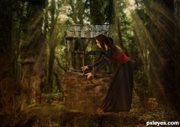
I used two outside sources from artists off of deviant art. With the exception of the source images all other pictures were my stock. (5 years and 2966 days ago)
I really like the composition, author...just wish the woman fit into environment better. Perhaps the lighting on her doesn't match the lighting in the forest. If you adjust this, it might place her there better. 
Howdie stranger!
If you want to rate this picture or participate in this contest, just:
LOGIN HERE or REGISTER FOR FREE
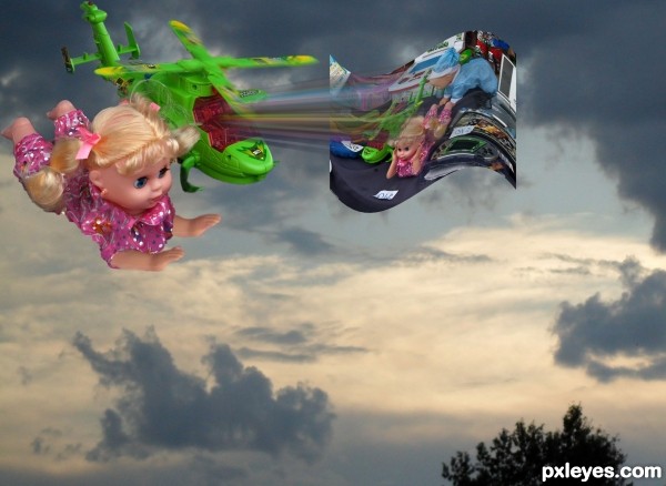
Inspiration from my 4 year old.
Clouds photo from personal stock. (5 years and 3178 days ago)
sorry... don't understand your concept 
Easy. It is from eyes of a child's imagination of toys who fly around saving other toys from yard sales that might get "abused by bully kids". Those are my daughters words. Leave it to Pixar to plant these seeds in our kids minds. LOL.
Sometimes it is fun to let a child pick your theme and help you place the items.
That´s funny! Good!
Howdie stranger!
If you want to rate this picture or participate in this contest, just:
LOGIN HERE or REGISTER FOR FREE
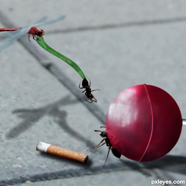
this is the view of some insects, in two scenes intertwined.(oh not! my candy) I hope will forgive me for losing the anonymity, but I could not resist, I liked the idea, I mix a little drawing with real images (5 years and 3197 days ago)
if the hanging ant is the other way round (showing the top of the ant) maybe better
the ant on the ground should reaching out one of its 'hands' and looking upwards 
I think this is great! And how have u lost anonymity?
IS THE SECOND PART OF ANOTHER ENTRY CALL, "OH NOT! MY CANDY" ASI is better understood, SCENE, THANKS FOR YOUR COMMENTS
Howdie stranger!
If you want to rate this picture or participate in this contest, just:
LOGIN HERE or REGISTER FOR FREE
Simple but hopefully effective (5 years and 3224 days ago)
right on target.. good luck author
This entry got pulled for no sbs. Sorry everyone but i though it such a simple logo didn't think it needed one.
If you don't have any sources, then it's not unreasonable for you to demonstrate that you created it yourself. Erring on the side of caution, i.e., posting an SBS just in case, would seem to be the better part of valor, as it were.
I really like this logo but I'm not going to try to recreate my explanation as to why. I was probably foolish to waste my time commenting on a sourceless entry with no SBS—we all live and learn.
Howdie stranger!
If you want to rate this picture or participate in this contest, just:
LOGIN HERE or REGISTER FOR FREE
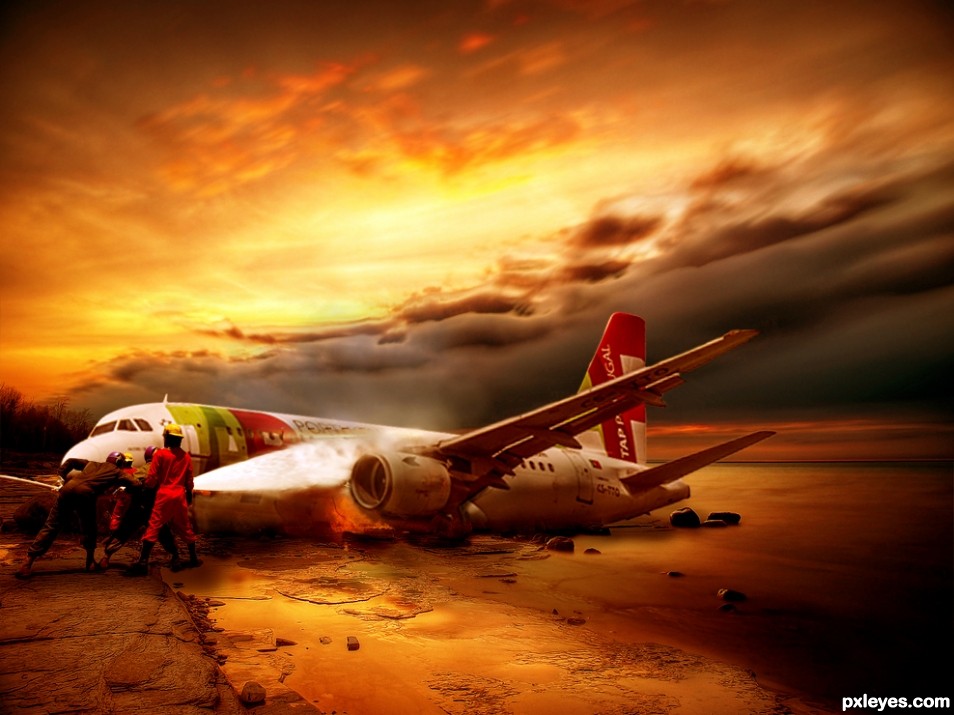
nice idea and colors.......... but the plane looks too small...
The scene and everything looks really nice - I think the firefighters are a little out of proportion unless that is a model airplane. It still looks very nice.
Howdie stranger!
If you want to rate this picture or participate in this contest, just:
LOGIN HERE or REGISTER FOR FREE