(5 years and 3191 days ago)
1 Source:
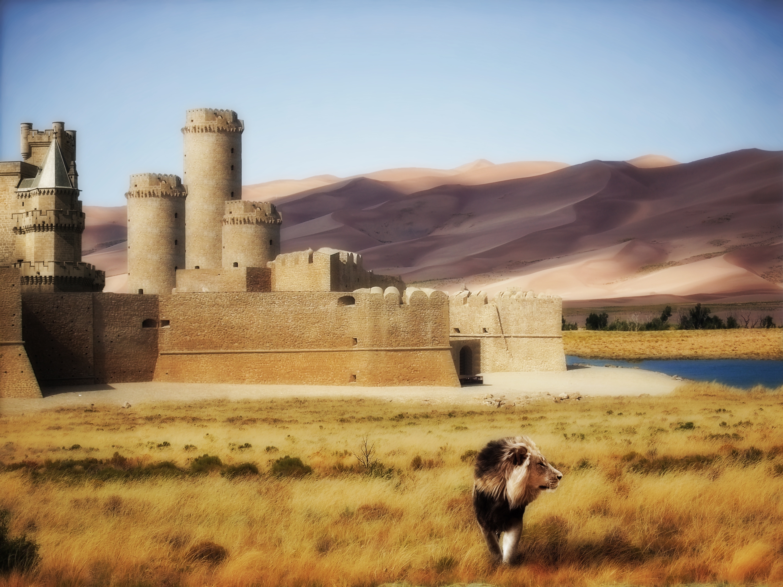
Summer is just around the corner, for this reason the somewhat hot landscape, and I've been reading The Chronicles of Narnia, hence the lion :-) (5 years and 3807 days ago)
Nice, warm feel to this image.. good luck!
very nice image! gl
It is a nice image indeed, my only suggestion is that the main idea of your work, should be the castle. You have two objects on the foreground, a lion, that looks ok, but the bush, is like a dark spot in this image, and it is taking my view away from the castle. Probably, coloring a little, to go with your image, you have lots of browns, and ochres, it is up to you author. All the rest is nice! Remember this is just a suggestion. Good luck.
Thanks George  I agree, I should have gotten rid of that bush before
looks better author.
Beautiful dreamy image
Something is not ok with the ligting....u cannot have dark on the dunes and light on the grass,both are on the same side....but whole composition is very very nice...gl author
Thanks for your comment Erathion! If you take a look at the original Sand Dune source image, you'll see that the grass and the dunes belongs to the same image. Dark on the dunes is just the shadow of clouds somewhere above
clouds make sence. GL nice work
glad i waited to vote on your image. I like the changes you have made since i first looked at it.
Howdie stranger!
If you want to rate this picture or participate in this contest, just:
LOGIN HERE or REGISTER FOR FREE
Only my own personal source,
along with brush credit.
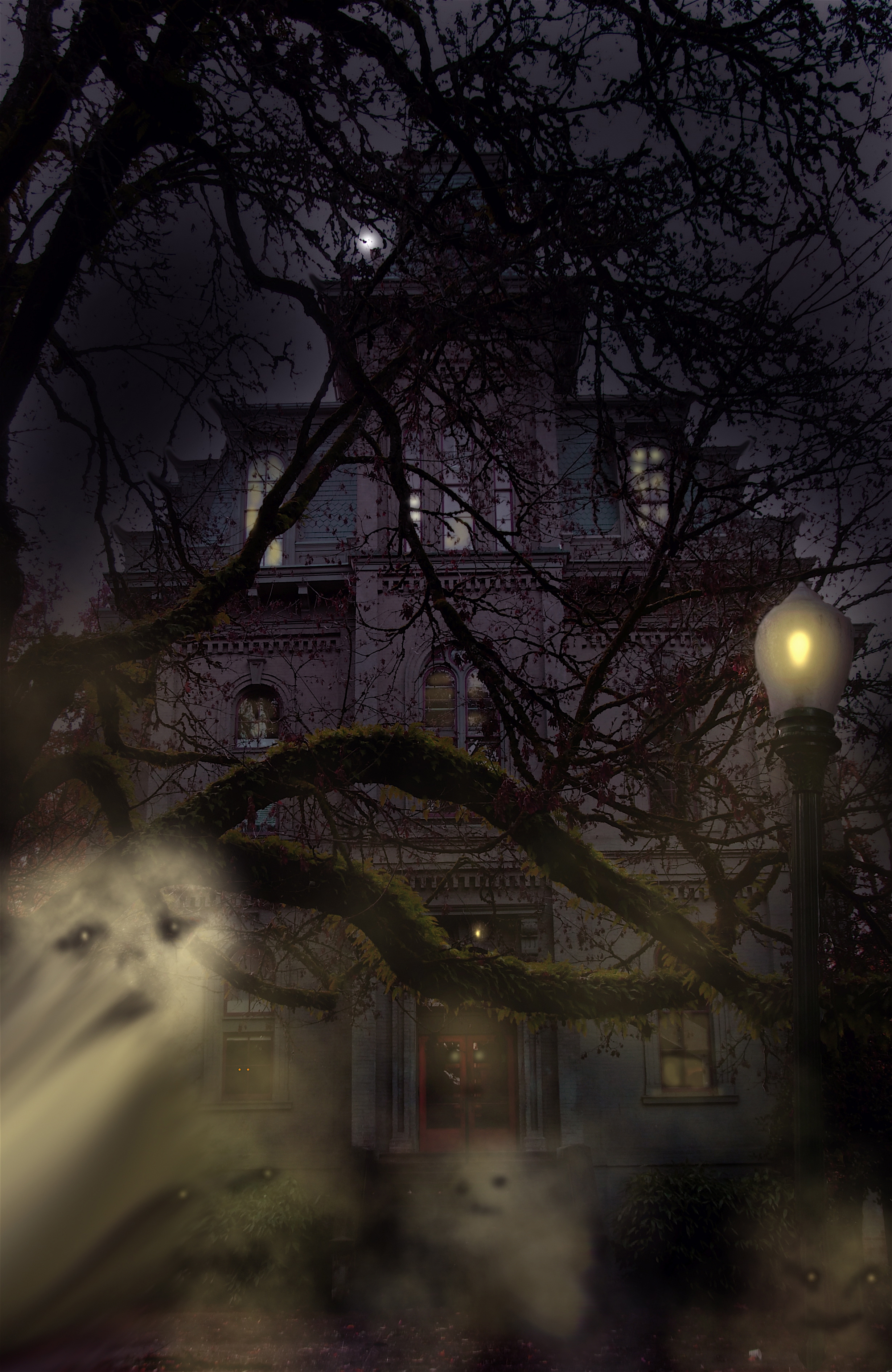
Image taken at a University (5 years and 3808 days ago)
Nice work. I like the ghosts. For some reason, the lamp looks a little odd (my best guess is that the edges of the lamp are too sharp). But apart from that it's a nice job.
nice
luks creepy
Thanks for the tip dustfinger> fixed it, and thanks for the compliments people.
Lamp looks like a sea shell and its not simetric,light from here is to weak and u cannot have that big ligting spot on the trees...but whole composition is very nice...gl author
lamp looks fine to me.GL ghosts were a nice touch.
nice colour choice. dont know that it would be my dream house well constructed image.
Howdie stranger!
If you want to rate this picture or participate in this contest, just:
LOGIN HERE or REGISTER FOR FREE
Photography and photoshop contests
We are a community of people with
a passion for photography, graphics and art in general.
Every day new photoshop
and photography contests are posted to compete in. We also have one weekly drawing contest
and one weekly 3D contest!
Participation is 100% free!
Just
register and get
started!
Good luck!
© 2015 Pxleyes.com. All rights reserved.


Interested in the inspiration for this one...if you don't mind?
IMO sort of silly.
If you remove the hand with the knife will look much better for my opinion.
Good work anyway.
Kind of like the mystery of the whole image hehehe, good luck author
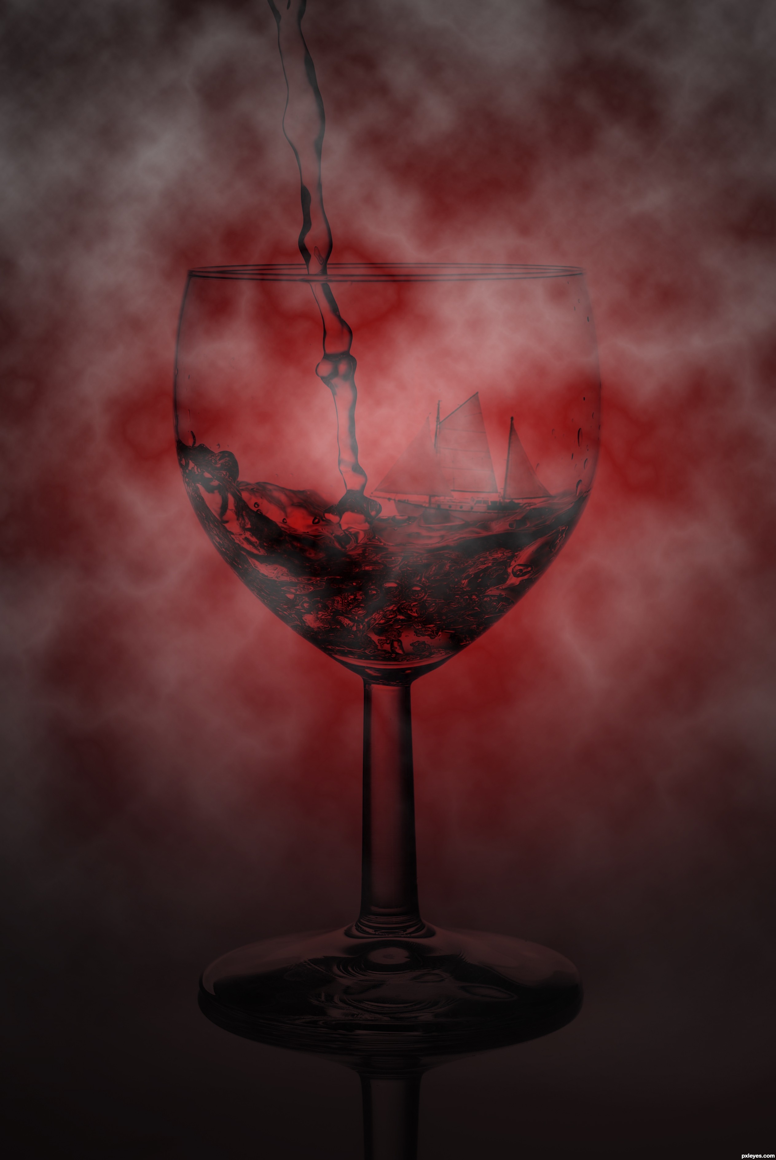
Some people don't understand that not understanding is part of it all. I like everthing about it... maybe change the water to a red color to get more red in there... but it's awesome!
Edit: I was thinking red when you had the knife and stuff on there.... don't know now for sure... it looks awesome but listen to others on this one... keep up the great work!
Thanks for your comments!
@Johailos: Thanks for your suggestion! I'll fix it!
I changed it a bit!
@ woodztockr: i havemade the water more red
Hi there, nice attempt on the idea behind this creation. I'll give a little suggestion if you don't mind. First of all, I would like to give the water a little highlights as well as the ship.

The clouds are good but it's a little distract the main object. I think it could be a little blurred with the Gaussian Blur or masking > temporary remove some areas in the main object.
But it's all up to you, Author. It's your great creation anyway.
Howdie stranger!
If you want to rate this picture or participate in this contest, just:
LOGIN HERE or REGISTER FOR FREE