(5 years and 3349 days ago)
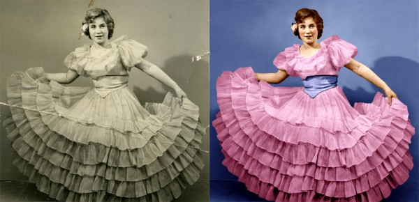
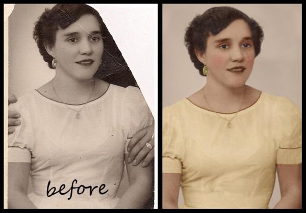
This photo of my mother was taken in 1954. This is the most difficult thing i ever did in photoshop. Don't know wich background works best green or blue?? Hope you like it :-) (5 years and 3844 days ago)
Very very good indeed! =) The hair could do some tweaking, but the resti is good! =)
Excellent work! Wow..!!
I tried fixing the hair, but i keep on messing it up. I will give it another try. Thx for comments
 ..........this is wonderful....the skin tones, and the colors in the dress are remarkable.......someone in this contest said they did this work professionally, this is way above the entry they have submitted.........keep up the good work.
Great theatrical makeup!
Fixed hair, changed color of flower and used a little color in the eyes. Thx for advice. Always welcome
xcellent wrk.....................................gl
Also has have a tip for you. Cutting or masking the selection should be based on the sharpness of the image. By this I mean how sharp or how much in focus the image is. For example if you blow up an image to 200-300% and see how far the pixels merge or overlap between to objects. It may be in a high resolution image this is only 1 pixel but in a lower resolution or scan of an old photograph with large grain, it may be 3 or 4. It is this “focus†that your image selection should be based on.
good advice, but you didn't do this in your coat rebuild......there are large differences there...
Phew! PhotoRepair, I don't think i understand what you mean :-b. Is there a problem with the image? Please let me know 
Is it a problem that i cut out everything with the pen tool, and that the edges look too sharp...?
author, stick with your instincts, this is a great job, don't be put off by comments.
You did a great job. I did see that you cut out part of her neck. If you zoom in on the neck you can see the collar bone line is missing from your final image.
yes, I see this, I missed it first time. You have mistaken shadow for body line!!...in the original, it is not easy to see, so i think you could be excused..........
Yess i can see it now, i'll try to fix it if i still got time, thanks anyway 
Thanks adeincyprus & dmspaulding07, fixed it. Boy that was a nasty gap  I was going to print it on a large canvas. Glad i could fix it first.
Well done! One of the best I've seen. You got the colors perfect! Good luck to you! 
FYI: If your concerned about comments and who you should take advice from, I'd stick with someone who well.. has a higher level, since they probably know what they are talking about. All opinions can be good but when it comes down to it, only yours really matters  2nd opinions are good too.
My opinion? This is a winner 
Agreed!!....this is a great piece of work...........the very best of luck to you.
Perfectly restored! 
This is awesome work!
nice one
I thinks that this is awsome , color are used in maximum..
great job 
Congrats on your placement. 
Congrats for your second place, Clinge!
Congrats,
Thx for nice comments to all 
congratulation =)
Congrats!
Wow, really well done, you know there are people that do this for a living = )
Howdie stranger!
If you want to rate this picture or participate in this contest, just:
LOGIN HERE or REGISTER FOR FREE
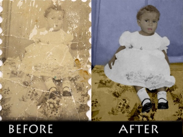
I actually made this restoration for my mother in law, it was the only pic she had as a child only because she took it from her fathers wallet when he died. I thought this would make her day as i gave it to her as a birthday gift on 5-6-2009.... I hope you enjoy it, I took a good few hours in order to get those missing pieces to look right. (5 years and 3846 days ago)
You're supposed to color it too.
i appologize i didnt realize that it had to be colored too, thank you
Very good indeed, but yes you need colour. =) Also, I'd add some contrast since the image is really washed out. Colors are gonna make this pop too. GL! 
excellent restoration work...........have fun coloring it.
The amount and quality of restoration here is amazing. I like the scalloped edges and wish you had kept them. Just my opinion. Color will do wonders too.
Very good job Author and a wonderful gift  :
:
thank you all for all the great comments... working on the painting part of it... up in about half hour or so
Nice job 
the whites are excellent considering the condition of the original shot. The skin tone is not so good, it doesn't look real. The rug is good, and the wall is not too bad, although I would not have chosen this color for it.
Great work on colouring the sweet baby girl! 
great 
Howdie stranger!
If you want to rate this picture or participate in this contest, just:
LOGIN HERE or REGISTER FOR FREE
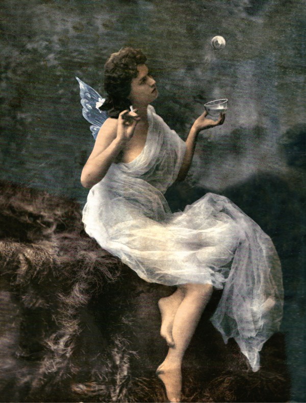
This image was taken around 1900, i've never done a restoration like this before. It involved a lot of clone stamping and colouring, as well as a lot of adjustments. I used levels, curves, brightness contrast and colour balance to rey and create a newer feel. I hope it looks okay
Thanks to Falln-Stock
I apologize about the scan lines, those were impossible to get rid of, hopefully they don;t distract too much from the actual restoration.
Please look at the step by step guide, it shows the original image. Sorry i didn't save any steps to show, but i've been having some problems with this computer lately. (5 years and 3846 days ago)
wow that is great it looks like a painting  ps the scan lines, which i am asuming are the horisontal lines across the whole picture give it a nice touch like when paintings have a bumpy surface
Thank you very much kayaklovegirl! Yes those are the scanlines, i gave up trying to remove them because in the end the detail of the whole image was gone. Thanks again 
fantastic work............it would have been nice to see a few more intermediate steps along the way to this.
It's very good, but those horisontal lines are so distracting... =/ Also, some cloning/stamping is clearly visible in some parts (you can spot where it was cloned without even seeing the original), so I'd fix that. But don't get me wrong I still like it very much, I'm just to nitpicky. =)
Thanks very much to the two of you, i'll see if i can save some more steps. Wlado thanks for your advice, i'll remove the cloning stutter.
Edit: I have added more steps to the SBS and re-clone the areas of clone stamp stutter.. thanks 
great 
Howdie stranger!
If you want to rate this picture or participate in this contest, just:
LOGIN HERE or REGISTER FOR FREE
(5 years and 3846 days ago)
Good job removing the hands...
dt forget about the hair i had to guess how it was
The final image is blurry and it's not much of a high res... Try messing with sharpen and high pass filter. =) Also, add some shadow to the background. =)
waldo thanks for the comment,blurry maybe a bit and is not 2 much,about shadow light is coming behind,as u can see in is chin,thanks appreciate your comment,i fix blurry latter
I think you did a great job on restoring the hair and removing the hands. It seems a bit grainy in the "slightly" higher resolution (it's not very high) and being too blurry is probably more opinon than anything. GL!
very nice 
Howdie stranger!
If you want to rate this picture or participate in this contest, just:
LOGIN HERE or REGISTER FOR FREE
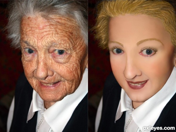
I would put some texture/pores into her skin.
Yes I agree! And for some reason I would like someone to change clothes and/or generation look of the picture, but this one is right on theme!
 Maybe even a photoAlbum theme!?
Edit: I would love to see a: 70's, 80's, and then like 2011 look?
I agree it would be better with some skin pores. SO many effects help you learn how to smooth skin texture, but I've yet to find a decent one to add back pores (without using another source, which is verboten for this contest...). The Healing Brush tool allows you to retain some skin texture, but it totally trashes the skin tones, leaving a horrid, mottled effect.
I like the idea of a "progressive" effect through the decades. Maybe that will be a future contest!
Its a very good effort, however there would be more shaping shadows in the face as well as the texture of the skin.
Shadows to define the mouth - for instance:- the curve below the bottom lip and dimples under the nose that shape the top lip. As one ages the muscles soften and drop the fine edges of a structure and if there are false teeth they push the top lip out and straighten it. The Older face actually has higher cheek bones than you have given credit for and there would be deeper hollows over and a slight shadow under the eyes . Cartilage grows all of ones life so the nose may well have been shorter and slightly turned up at the end.
Good work. I will come back and vote later.
what about trying to take a small portion of one of the less wrinkled parts of her face (maybe nose) and use that as a pattern for some texture in her face? Or just painstakingly put millions of tiny dots on her face for pores. lol
U did good work author but she looks more like wax figure...try to add some skin texture here to achieve more natural look...best of luck
You did a great job... just need to make it a lil more realistic,,and since we could not use other skin it was hard
She looks like a porcelain doll - you just went too far with it, author, tho you have the right idea. The trick is to leave some pores there, and soften her skin overall. Nice lip shape, tho.
Howdie stranger!
If you want to rate this picture or participate in this contest, just:
LOGIN HERE or REGISTER FOR FREE