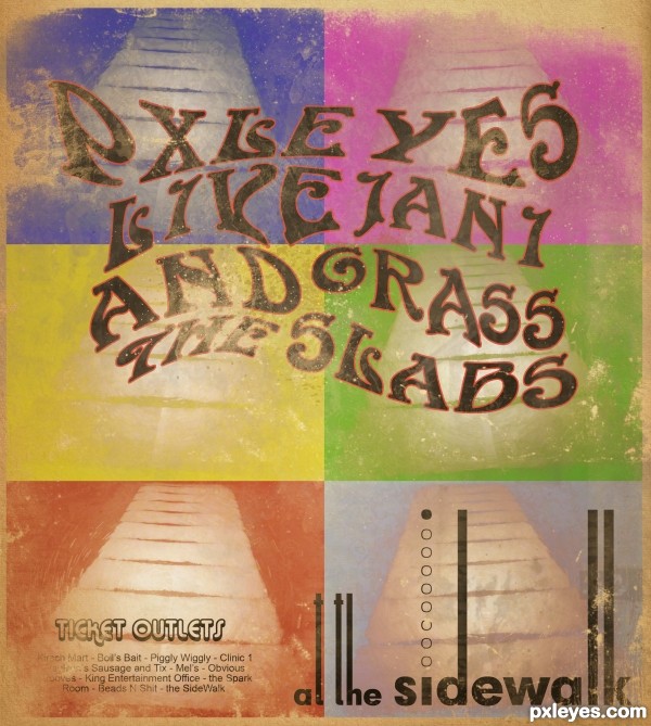
Quick and dirty. Wish I had more time to commit to this, it could obviously be better but at least I flexed my brain for an hour. Enjoy :)
Paper texture thanks to Bleeding-Dragon
(5 years and 3374 days ago)
- 1: font
- 2: font
- 3: Paper Texture

Quick and dirty. Wish I had more time to commit to this, it could obviously be better but at least I flexed my brain for an hour. Enjoy :)
Paper texture thanks to Bleeding-Dragon
(5 years and 3374 days ago)
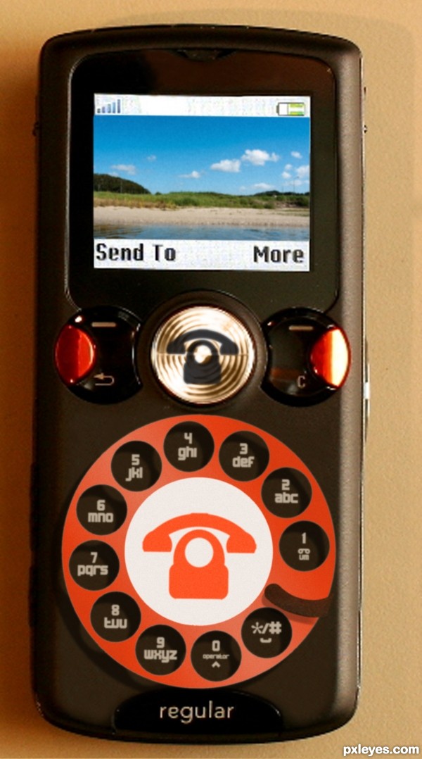
Texting made easy with the new Regular Brand Retro Dialer.
h - dial 4--click--click--click--click-
dial 4 again --click--click--click--click-
i - dial 4 --click--click--click--click-
dial 4 again --click--click--click--click-
dial 4 again --click--click--click--click-
space -dial */# --click--click--click--click--click--click--click--click--click--click--click-
had to make some changes to avoid possible copyright infringement. (5 years and 3379 days ago)
Ohh I see  Clever !
Thats pretty cool. Kinda makes you think how far we've come. Imagine a cell phone in 50 years...
hahaha.. so clever.. great idea.. though i don't want to have some of it.. LOL.. GL
I wonder, how mobile producers haven't come up with this idea yet!
Needs more dimension. The idea is good but the execution isn't realistic.
now that's funny! Roder (sp) dialing sucked!!
I have to agree with CMYK, you could make the dial embeded in the cell, and that little bar below 1 the of the same texture and blended in the frame of your phone - clone sample after merged layer would do.
Agrees with Bob.
 Love it! I assume you comment (all the clicks) is you trying to text with this phone
Howdie stranger!
If you want to rate this picture or participate in this contest, just:
LOGIN HERE or REGISTER FOR FREE
made from only the source image. everything else was made from shapes and pens. (5 years and 3450 days ago)
COOL!!
VINTAGE!!!
Flower powered!!! 
good attempt
Howdie stranger!
If you want to rate this picture or participate in this contest, just:
LOGIN HERE or REGISTER FOR FREE
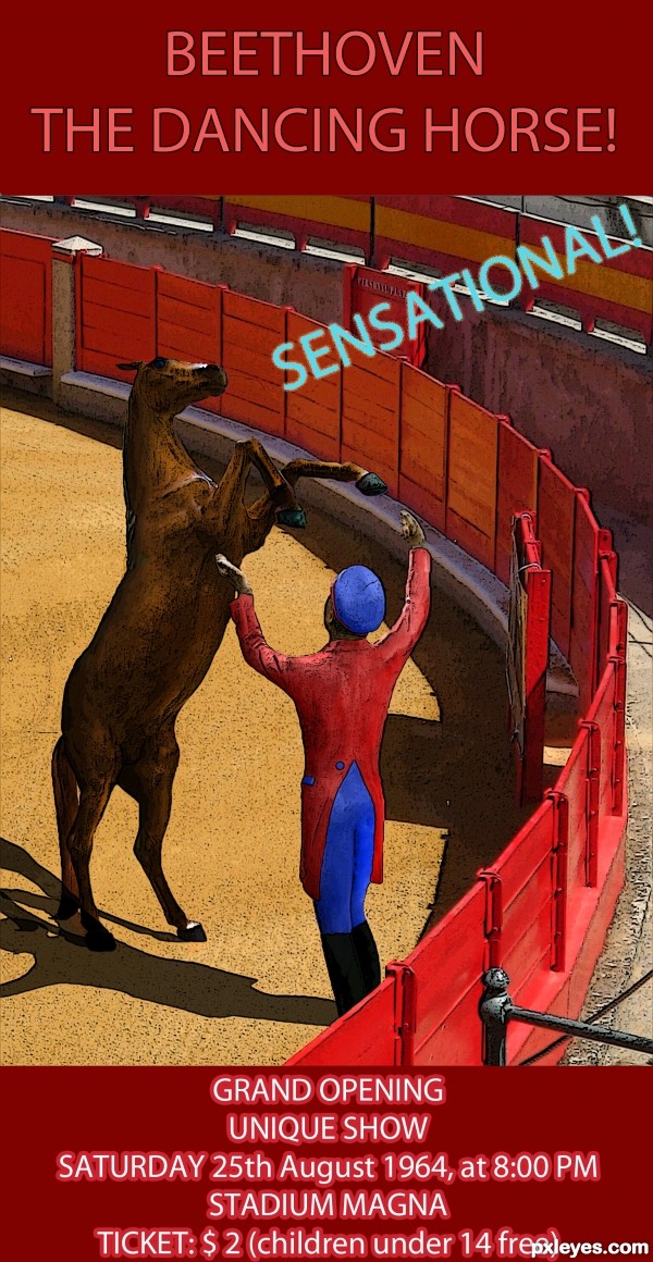
You still go to circuses...? Are they just memories? (5 years and 3512 days ago)
wow, love the idea!
Very Nice, GL 
GREAT IDEA . I LIKE IT. . GOOD LUCK
Very nice idea indeed and good colouring!
Just one thing... I think you should toggle the "n" and the "a" in "sensatioanl" 
Good to see something from you again. I suppose you ran out of excuses? 
Thanks for the comments!
Lelaina, I made the changes, you have a good eye  And yes, today I REALLY ran out of excuses
i like it
Nice mood. It seems people were good to children in the old times... nowadays (in my country at least) free entrance only for children till 3 or 4 years old. And a teen of 14 pays adult ticket! 
Very clever idea. Well done!
very nice work author...i like different approach to the source...best of luck
Pretty well done. Tiny suggestion: you added shadows for the horse and the guy. But there where the 2 shadows hit each other, it's like the one adds more shading to the other (it's darker), wile -I assume- there's just one light source. Therefore there should be only one shadow too (so the shadows shouldnt overlap each other but just be one). Good luck!
Great idea and execution (shadows kind of looks outlined), but really great take on the subject.
Thank you for the comments!
waz, you're right... now that I think about it. I should have done the shadows like you said, but it's late now 
Thank you anyway, I'll know from now on 
good and nice
Congrats for your third place, Giulia! See, having no excuses isn't a bad thing 
Congrats! for 3rd place 
hi,.....congrats,.....very nice entry....
Congrats for your third place
Congrats miss Giulia...
Congratulations! 
And your blog is excellent! 
Oh, thank you very much for the congrats!!! I missed this, finally to have a chop and get comments ♥
And erikuri, i'm glad you like my blog :P
Howdie stranger!
If you want to rate this picture or participate in this contest, just:
LOGIN HERE or REGISTER FOR FREE
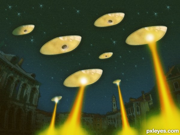
A Sluggish look at old school alien invasion.
Thanks to Francesco Marino (5 years and 3530 days ago)
i like this...lol....oh
good luck !!
How did you do the beams? I never got to make one nice... 
I used the straight lasso tool for the shape, feathered the edge and filled with the orange then did the same with the yellow on another layer. Finally, a feathered brush to give the glow of the beam and explosion at the bottom. Hope this helps erikuri.
it is nice good idea ,but i belive you can make it better comparison with your talent,good luck
Howdie stranger!
If you want to rate this picture or participate in this contest, just:
LOGIN HERE or REGISTER FOR FREE
thats's just really ingenieus
love the old school style
just a great idea, imo no down sides at all..
Nicely done.
cool interesting work author...best of luck
Sounds like it's going to be a pretty Gooooooovy concert, man!!


Especially with a name like "Grass and the Slabs"
GL!
Has a Grateful Dead feel to it!
Howdie stranger!
If you want to rate this picture or participate in this contest, just:
LOGIN HERE or REGISTER FOR FREE