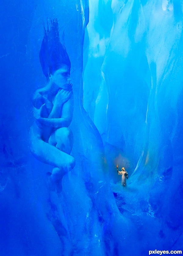
This one was done for the Ice People contest. I always felt I could improve on it. It is great to have the opportunity to do something although the changes are subtle I think it is improved???
Thanks to bgraphic at sxc.hu for the Glacier Tunnel
And to Marcus Ranum for my Ice Goddess and Priestess (www.ranum.com) (5 years and 3216 days ago)
- 1: Original Image
- 2: Ice Tunnel
- 3: Ice Goddes
- 4: Priestess


I think it would look even more awesome if you put some very subtle cracks and also have some light reflecting on the ice to make it look real.
Thanks K5683, I have added some crack and highlights. Kept it minimal but I think it improves a bit more. There were some cracks in the image already but they weren't too noticeable in the original Hi Res ...so I uploaded a larger one.
Maybe I'm wrong but I think that there should be more reflexions of the torch (don't know why but my first impresion is that they are mising). Maybe in the ice wall behind the guy...
Anyway it's a great image!!
Thanks minnie ... I had some light in the ice behind the Priestess but it wasn't very strong so I strengthened it ... your feedback is appreciated!
much better
Nice composition. I would almost think a nice darkening soft vignette around the whole image would look nice too.
wonderful image
@pixelkid ... thank you so much for the suggestion. I am camping right now so very limited internet and no PS so wasn't able to try the change you suggested ... I will give it a whirl when I get home ... thanks again!
Howdie stranger!
If you want to rate this picture or participate in this contest, just:
LOGIN HERE or REGISTER FOR FREE