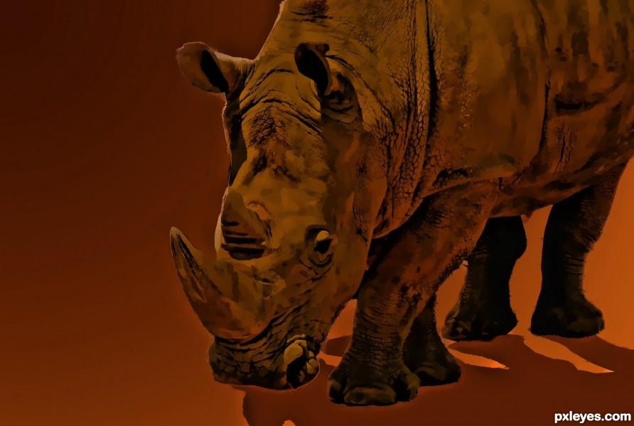
i have created this in Photoshop (5 years and 2523 days ago)
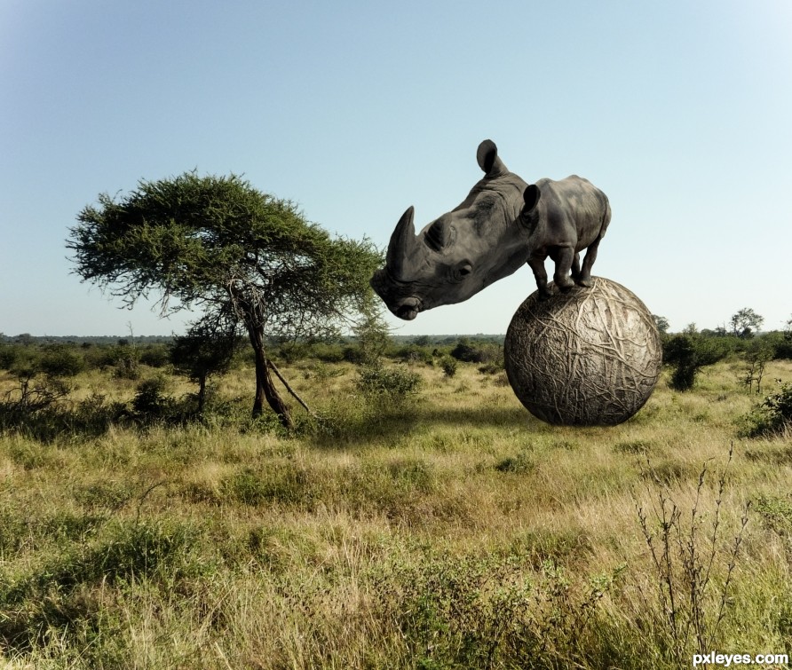
An over-sized head requires innovation on the African plain. (5 years and 2523 days ago)
Funny, but rhino is too distorted, and the ball should be sinking into the grass more, with grass fronds overlapping the curvature.
I like this one very much, it should've done better!
Thanks, that's the way it goes!
Howdie stranger!
If you want to rate this picture or participate in this contest, just:
LOGIN HERE or REGISTER FOR FREE
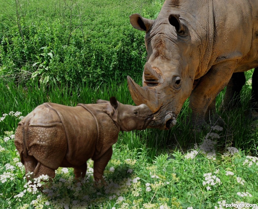
Thanks to Candyschwartz from flickr, for the pic of the baby rhino. Also thanks to Paul Williams from flickr, for the pic of the river grass. (5 years and 2523 days ago)
Good chop & lighting. 
Thanks Bob!
Howdie stranger!
If you want to rate this picture or participate in this contest, just:
LOGIN HERE or REGISTER FOR FREE
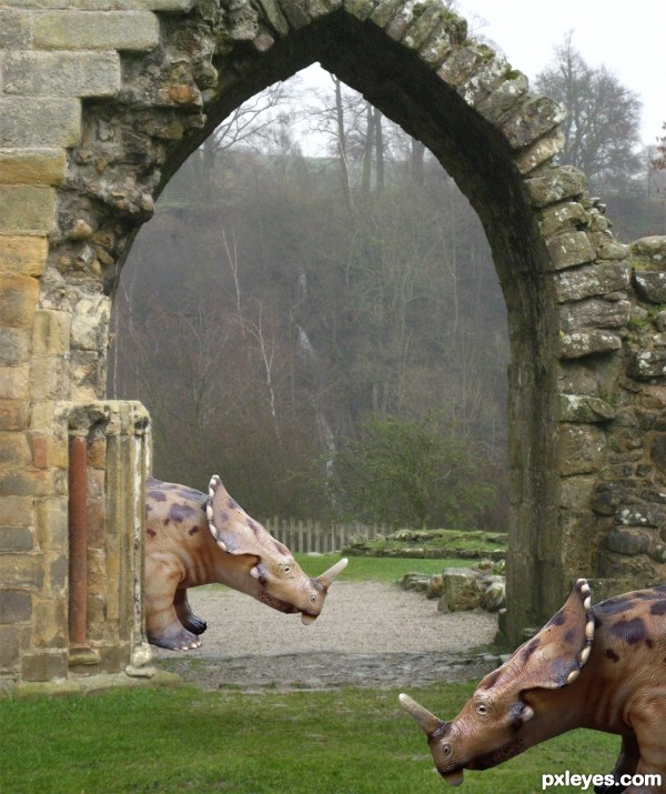
(5 years and 2902 days ago)
nice concept.....
nice ...
Try to create some shadows under the feet 
that dino behind , he look like emerging from the middle frame it can be better than that IMO...
Nice, but the dino on the left looks like he's walking out of the rock
Howdie stranger!
If you want to rate this picture or participate in this contest, just:
LOGIN HERE or REGISTER FOR FREE
(5 years and 3187 days ago)
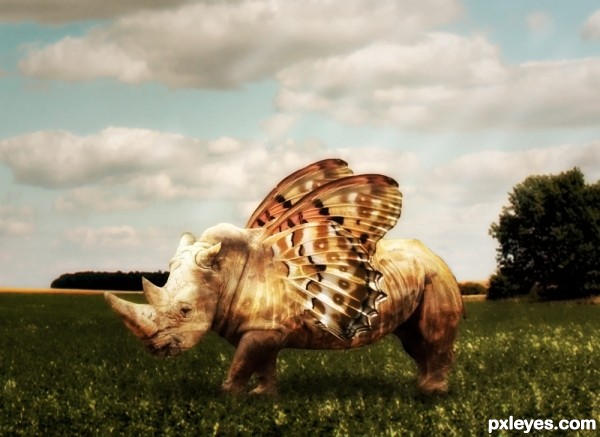
very clever addition of the texture to the body.. really helps with the blending GOOD LUCK!!!
blend is ok. suggest lift the wings up and show more of the wings at its origin (something like a flying horse) 
Howdie stranger!
If you want to rate this picture or participate in this contest, just:
LOGIN HERE or REGISTER FOR FREE
Curious why you put the rhino's shadow to another direction. Good luck!
Howdie stranger!
If you want to rate this picture or participate in this contest, just:
LOGIN HERE or REGISTER FOR FREE