(5 years and 3152 days ago)
1 Source:
Photography and photoshop contests
We are a community of people with
a passion for photography, graphics and art in general.
Every day new photoshop
and photography contests are posted to compete in. We also have one weekly drawing contest
and one weekly 3D contest!
Participation is 100% free!
Just
register and get
started!
Good luck!
© 2015 Pxleyes.com. All rights reserved.

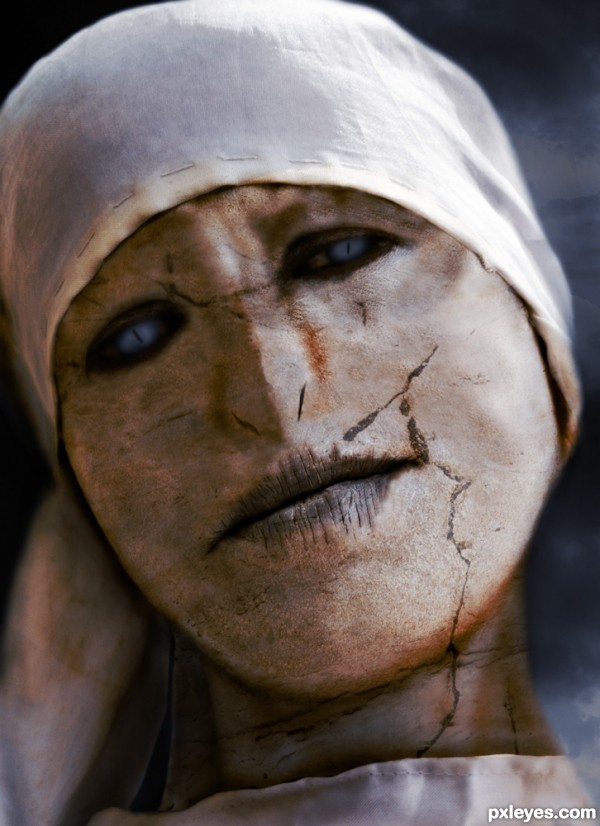
Great concept, but the nostrils are sloppy and offset. The one on the left goes up into the cheek, and the one on the right is noticeably thinner and is placed too high compared to the one on the left.
They are also obviously painted on, appearing solid black, instead of trying to match the darker tones of the rest of the image.
Better, but now they are a bit too small and "slit like," and the addition of the weird cracked stone texture is very distracting - especially the heavy diagonal mark above the lip. It doesn't really look like a statue, nor like "Tom Riddle's sister," it looks like a facial mask treatment gone bad...
Howdie stranger!
If you want to rate this picture or participate in this contest, just:
LOGIN HERE or REGISTER FOR FREE