hes gone..updated
i trie to fix it ;D (5 years and 3622 days ago)
All source ;)
with References...
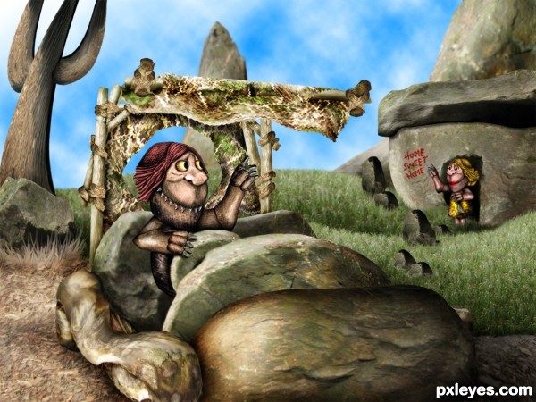
EDIT: Added a caveman's wife by the door... (thanks for the suggestion Langstrum :)
Flipped tree ,to correct lighting...,tx Annabat :)
(5 years and 3623 days ago)
zoom zoom zoom .. hehehe
Nice constrcution and great work. Where is mouth? 
He has a bad overbite hey..no good dentists back then ;P

 I wish that there is the caveman's wife standing in front of the door
  . Love your imagination
Langstrum, I thought of adding a wife into the picture... didn't want to fill it too much... but now I'll think about it  :P
:P
outstanding work ..... Goodluck author
Reminds me of a character from where the wild things are. 
I suggest to make her sitting on the roof waving her husband 
Caveman now has a wife  hee hee
I prefer them looking to each other, feel like they have no connection now 
EDIT: That's okay now 
flinstones...kiddin..its great
This is great ! 
I like his stone car lol
Yabadabadoo!!! 
Oh hey, on second look, I just noticed that the light on the upper left tree (kind of looks like a cactus) is wrong, unless there is something above blocking the light, everything else in the pic has the light source coming from the left, and it's shaded on that side, and above.
Thanks Anna.. I 'll flip the tree  I think that will fix it...
Yep, Better! 
nice job love the car 
well done 
The car is fantastic! 
Wonderfully done......I love this, goes into my favs for sure......Best of luck!!
so creative... Very nice idea! GL
Congrats for your third place, Loopy! Good to see new entries from you 
congrats.....
Congratulations for 3rd
congratulations!! for 3rd place...
Congrats Ria and caveman's family, good news today  )
)
congrats 
Congrats!!!! 
Congrats!!
Howdie stranger!
If you want to rate this picture or participate in this contest, just:
LOGIN HERE or REGISTER FOR FREE
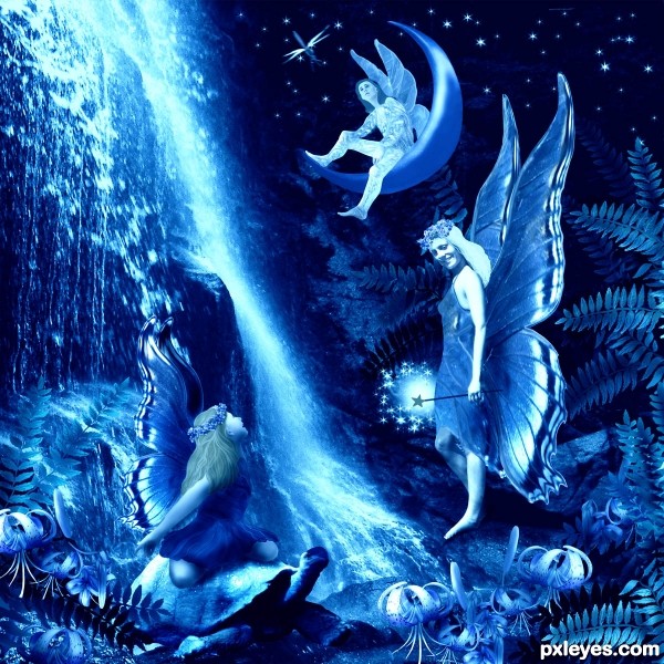
Happy Birthday, Mario, from Blue Fairy Land. But, what tremendous competition!!! How will you ever choose?
I wish to thank the following talented photographers at morguefile.com: dravenh for the girl on her knees; nathalia for the tortoise;earl53 for the girl (standing) in bathing suit, and also for the beautiful lilies; dorne for the boy on the moon; kevinrosseel for the moon; klebom for the waterfalls;katmystiry for the butterfly; the ferns and dragonfly I drew by hand, and flowers on the fairy heads are from my own photos. (5 years and 3651 days ago)
beautiful fairy tale composition....stunning ....good luck author
that's what i call fantasy ! great work author ! 
very nice
brilliant!
lots of work on this, very nice composition. good luck, author.
great job...gl
love all these parts 
Howdie stranger!
If you want to rate this picture or participate in this contest, just:
LOGIN HERE or REGISTER FOR FREE
no outside sources (5 years and 3670 days ago)
Howdie stranger!
If you want to rate this picture or participate in this contest, just:
LOGIN HERE or REGISTER FOR FREE
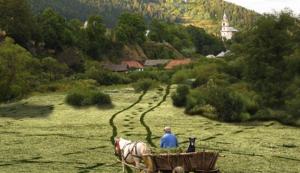
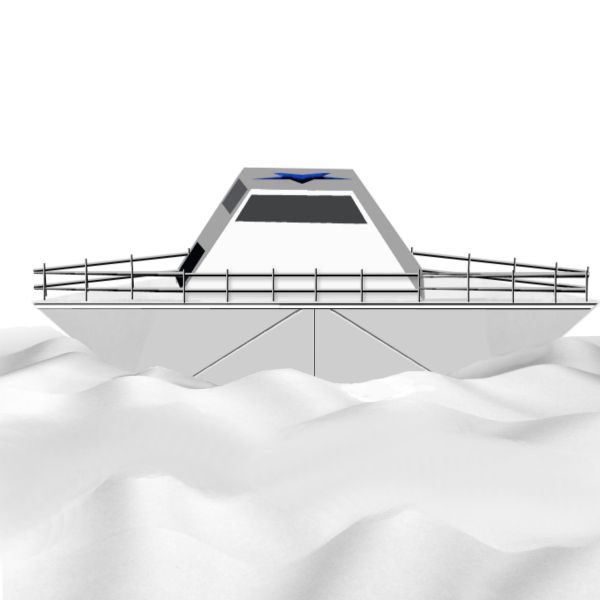
Thank you to:
ReapRevenge: for the pic of the dog.
Giulia: for the picture of the village.
razvamioveni: for the pic of the cart. (5 years and 3683 days ago)
Perspective on the cart and the ground is different and theres a shadow from the trees in the original picture under the patch of grass on the right so it looks like it;s floating. If you can adjust those two things it'll be a very nice image. Good job!
Thanks Ponti, I think the perspective, from my point of view,is right, the cart will follow a path, which, if you follow the lines, they will make a curve to the right, where the cart is. You're right on the shadow, will correct that. Thank you for comment.
you made the big tree disappear, but you left its shadow on the ground  pay more attention to shadows, otherwise it's nice, i like it. good luck!
Shadow was corrected. I added more vegetation to the right. Thanks for suggestions and observation.
For me the perspective of the cart it's ok ( it's just imagining the cart going down a slope). But I think that bushes on the right side are a little blurred... 
Thanks erikuri....bushes in the right side corrected.
Mw? I like it just move some edges of the additional grass! nice work :p
More corrections made....
fantastic...
Excellent corrections author.. (sorry to keep nagging) but on the right hand side the blending of some of the vegetation is a tad odd, maybe add a shadow underneath the vegetation and darken up the bottom. Again - great image, just a few slight alterations to make. Good luck author!!
Ponti55: Added the shadows underneath the bushes, and darkened the bottom. You are not "nagging" you are giving me suggestions for a better entry, and I appreciate that. Thanks.
Great work......and great corrections.....
I'm glad to see someone take all the advice on the chin.. great corrections - the image looks great now 
looks good 
Nice feeling to this but the cart path should be a bit narrower toward the houses. Otherwise well done.
Thank you for comments: Glockman: I think there is no much distance between the cart and the the end of the lines. It could have been narrower to the top of the little hill, but I think it looks ok, the way it is. As a matter of fact, it is to late to make corrections now...
nice one!
Excellent work, looks very convincing. Love the whole thing!! Best of luck!!
Congrats!! 
where w e go
Howdie stranger!
If you want to rate this picture or participate in this contest, just:
LOGIN HERE or REGISTER FOR FREE
very nice tech work.. great job at cloning
Excellent job with removing the horse, good luck
Love this!
Very good
Awesome work author
 . The moment I saw your work I could not stop myself from praising you.Good Luck.
 .
.
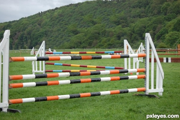
Pretty impressive. The white jump visible in the background between the top rails of the mid-ground and foreground jumps has disconcertingly repetitive marks on its horizontal cross bar that just screams cloning. Additionally, I think cloning out the people on the ground as well as the jumping horse and rider would yield a more elegant final result.
Great job!
Looking pretty good. You pulled the trees to much downwards, there should be some grass above the highest red,blue,yellow bar. The green trees in the middle that kind of pop out the other trees that have a lower saturation don't fit the rest of the trees. Make those lighter trees also less bright and with a lower saturation.
it almost looks as if someone has the new CS5 with content aware fill...
nice job
very good work
Very, very neat work, author! I like to see your evolution, how you're growing on your works! Just one thing, visible only in hi-res: the 3rd. backward bar, on blue part, it needs a little adjustment on its shape. The rest is perfect, I wouldn't do better!
Gud job.. Clean
Good work!!!!
Nice work....gl
clean work......... i love it......... all the best .............
congrats!!!!
Congratulations for 3rd
Congrats for your third place, Kevinice!
Congrats little one on 3rd place! you did a great job!!!
Congrats!!
Congrats!
Howdie stranger!
If you want to rate this picture or participate in this contest, just:
LOGIN HERE or REGISTER FOR FREE