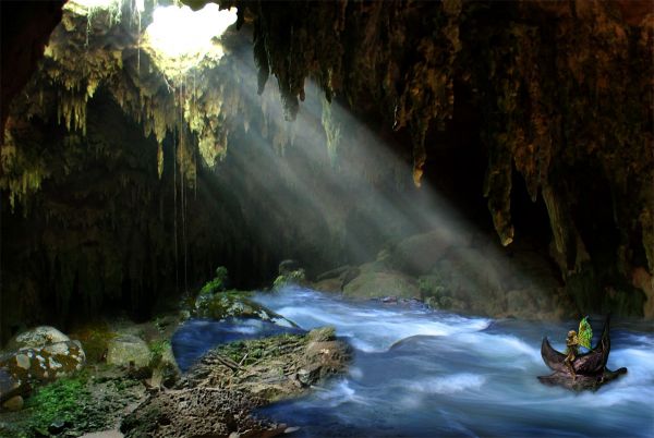
Thanks to the Content users at http://www.morguefile.com for the river file and the Faeries (5 years and 3686 days ago)
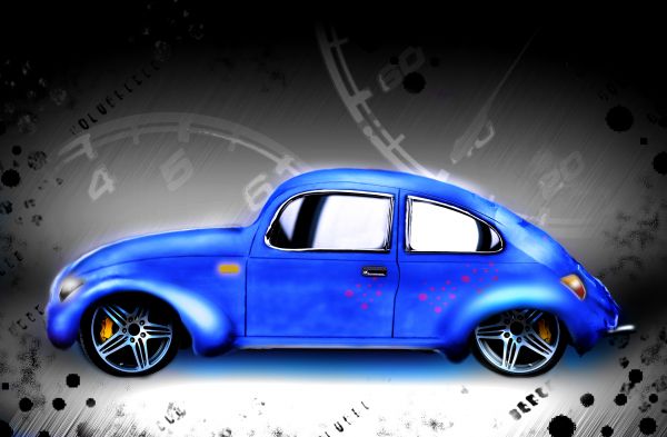
thanks to EAOS forBack to the old days image
thanks to mzacha for A red car KOMBI image
thanks nandoseiji to for REV UP!!! 3 image
thanks to BRANOX for wheel2 image
(5 years and 3688 days ago)
The Beetle is nicely done but... where's the original source?
the sand car is the original source!!
i transformed the sand car to this car
really nice!!! Good job converting sand car to amazing
great work author GL
Doubt solved! GL!... 
Great transformation.......
Howdie stranger!
If you want to rate this picture or participate in this contest, just:
LOGIN HERE or REGISTER FOR FREE
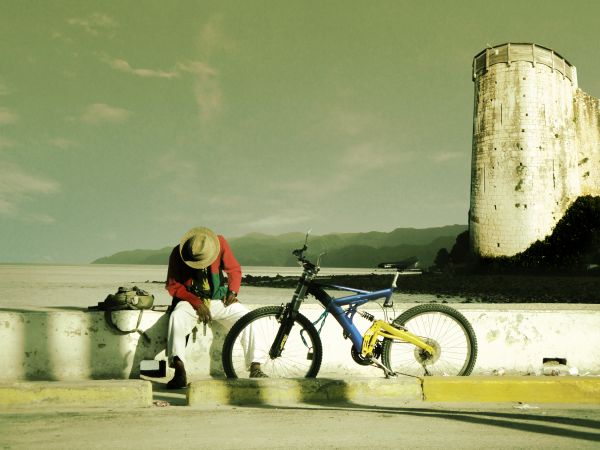
Thanks to
jard_jard - http://www.sxc.hu/profile/jard_jard
OeilDeNuit - http://www.sxc.hu/profile/OeilDeNuit
gironside - http://www.sxc.hu/profile/gironside (5 years and 3693 days ago)
Nice, GL. Bike shadow? 
its not the bike shadow........watch in the stock image
Clinge is asking... "why doesn't the bike have a shadow?." Actually.. the bike doesn't fit there, it looks like the bike is leaning toward us, judging by the perspective of the handle bars.
Edit: if it was leaning against the wall, his leg would be in the way. Also, "evening ride" ? He looks kinda out of breath for a gentle cycle in the evening. Or, is he crying ? :S
i get ur point.................bt please see the image in high resolution n u'll see that the bike is not leaning plus it does have a shadow.............regarding the title "Evening Ride", i wanted to depicit a guy resting in the midst of a ride.......thnx
Yep, bike has a shadow; if you look at the wall paying attention, you can notice the handle below the bag's strap. And the man can be out of breath, crying, resting or even thinking... It's up to the imagination of who sees the picture... Am I wrong?
@erikuri - yeah u r right, thnx for the support...
Nice composition, blend looks well done too. Good luck!
Nah, Looks to me that the sun is in a 3-4 o clock position, there is no shadow of the bike on the wall, like the shadow of the guys legs. And there is no way the pedal would hold up the bike.
pretty good work author... Im still stumped when it comes to getting the shadows perfect myself  but I can see yours in High Res and looks pretty decent to me
  goodluck.
nice idea with source 
Good belnding
it catches my eyes!good
i love the blending ..... well done...
Howdie stranger!
If you want to rate this picture or participate in this contest, just:
LOGIN HERE or REGISTER FOR FREE
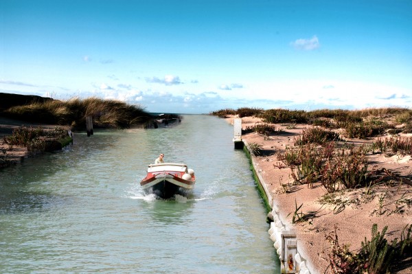
I used one external source of Lake
thanks to http://www.sxc.hu/photo/856002
Author: ralev_com (5 years and 3770 days ago)
Pretty decent work except for light source...
Great blend
The left side is great, the right side still needs a little work, but the overhall look is very good.
nice work but the proportion of the two sources are way different. The plants look either gigantic or the boat and man so tiny. Looking at Hi-Res the blending in many places is too soft for my taste.
Like the blending in the foreground. It looks like it could do with a bit more work near the horizon though.
thanks for your comments.
well done author
Howdie stranger!
If you want to rate this picture or participate in this contest, just:
LOGIN HERE or REGISTER FOR FREE
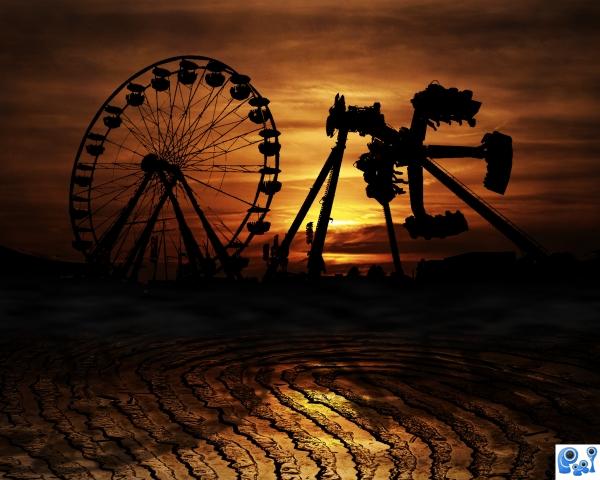
Thanks to *somadjinn (5 years and 3774 days ago)
nice lighting and shadow work
Great colours,nice mood!
Great image.
this is such a great photo i love it
I agree with other posters. lovely colour choice. Great mood in final image.
Howdie stranger!
If you want to rate this picture or participate in this contest, just:
LOGIN HERE or REGISTER FOR FREE
Good try, good luck. Probably a little more blending.
Howdie stranger!
If you want to rate this picture or participate in this contest, just:
LOGIN HERE or REGISTER FOR FREE