(5 years and 3884 days ago)

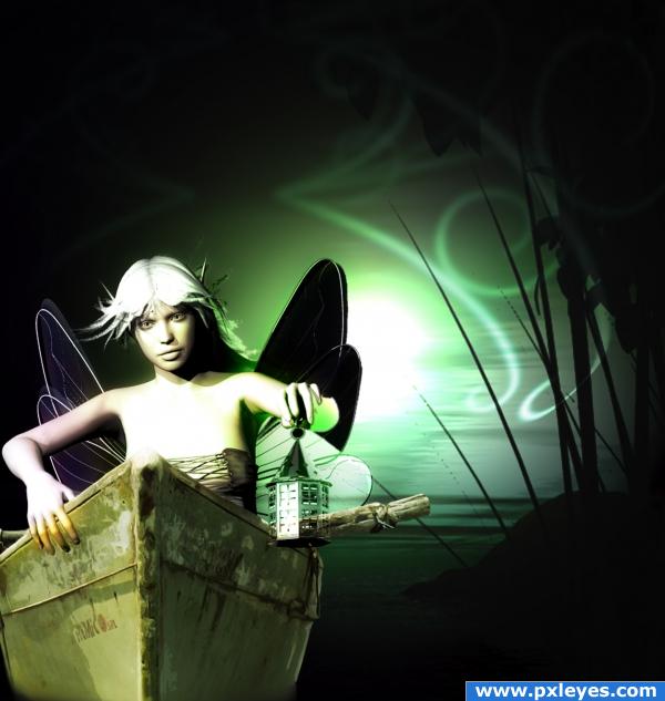
I again combined both of my favorite programs to work on another entry....Programs used: Photooshop CS4 and Bryce/DAZ Studio.....Source image used only, all other work created by me on Bryce/DAZ. SBS includes model and scene details. (5 years and 3895 days ago)
very nice!
Part of the lantern is transparent, and you've got the light source behind her but she's lit fron upper left...
i like the image but i think it would look a bit better if the fariey wasnt animated
yeah, even i have to admit i'm not a big fan of this one...i do like the colors though, very serene. I might add green into my color scheme now....
Well....I don't know about others...but I like the result on this one! Maybe she is a bit too bright and the lantern is slightly transparent....but you're right about the overall feeling! As I can see you've used Daz Studio and I would have a question for you since I have the programme and would love to start learning it, but I don't quite get some stuff: do you have to purchase sets, models, textures, clothes and accessories, or you can simply create them? I still can't figure that since I don't really find anything inside the menus, only one initial model! Thank you, and best of luck!
Howdie stranger!
If you want to rate this picture or participate in this contest, just:
LOGIN HERE or REGISTER FOR FREE

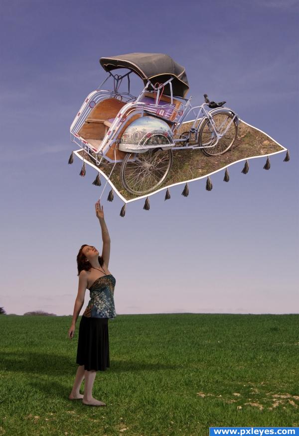
Started doing an out of frame image and then heard the song "Magic carpet ride" on the radio. Decided to evolve the image in that direction.
The riksja was a nightmare to mask out.
Thanks to the source image authors WolfcatStock, Katherine Davis and litlnemo.
Please view High Resolution as compression kills the detail. (5 years and 3909 days ago)
nice work on the masking and a very nice result
looks like a truck load of work!! Very nice end result, very magical. Good job!
Nice job...needs to be a bit more saturated IMHO.
Amazing draw! Aladin version 2? :P Joking, it's really nice, great mood.
looks nice
the colors are a bit washed up but it looks nice 
looks really good, imaginative idea. good masking but i also agree with the colours. needs more saturation. If it´s wanted, o.k. if not check this out, to check your calibration http://www.pxleyes.com/forum/viewtopic.php?f=11&t=40  Good image
I removed the cloud effects that was over the image to increase the saturation. I hope that this is what you guys meant.
cool
Great masking and nice result 

Great!! G/L Author.
congrats Rob!!!! 
Congrats!
great imagination, congratulations 
Congrats Solkee! Beautiful picture 
Congratulations for 2nd
Congrats on 2nd, a beautiful piece of work 
havnt see your changes til now. may it was better with the clouds. (cant say it now) but it´s a great image, so, congrats 
Congrats!
Congrats! 
congrats!!
Congrats!
congrantulations Solkee....sorry for pipping you at the post. Was a close one.
Congrats!!
Howdie stranger!
If you want to rate this picture or participate in this contest, just:
LOGIN HERE or REGISTER FOR FREE
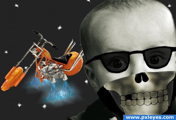
i think you need to work on the blending between the skull and the child
its a bandanna. at least its supposed to be.
whats with the skull?
you need a little shadow by the nose then to make it look like there is space between the bandana and his face. Cool though!
i see what your trying to achieve. dont think you quite made it. good idea. with a few more skills your work will display your ideas better. try exploring tutorials, step by steps and look at work created by others. GL
Howdie stranger!
If you want to rate this picture or participate in this contest, just:
LOGIN HERE or REGISTER FOR FREE