Thanks to:
MJ Ranum
Krista Johanson
(5 years and 2800 days ago)

(5 years and 2836 days ago)
this is so CUUUUUUUUUUUUUUUUUTTTTTTTTTEEEE
I like to move it move it LOLOLOLOLOL
We like to, "Move It"!!!  Thanx for the fav Ernest
Oh, this is priceless! Nice work.
Thank you photogirl723, I'm glad you like it. 
That's a extreme sport!! Good job author! 
Thanx minnie
Amazing entries in this contest,this one is very nicely done..love the colors.
Thanx for the positive feedback and fav Jordy. Much appreciated
congrats for 3rd
thanx
Congrats on 3rd place 
Thanx Valerie
Congrats rusvelt!
Thanx Irene
Congrats Roberto!!
Thank you Rein
congrats on your win
Thank you
Howdie stranger!
If you want to rate this picture or participate in this contest, just:
LOGIN HERE or REGISTER FOR FREE
(5 years and 2840 days ago)
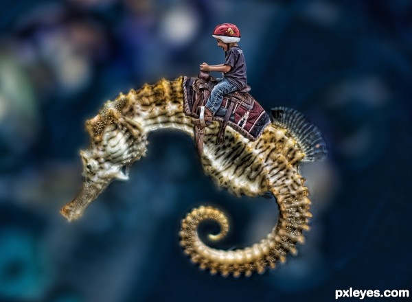
wow this remind me my entry http://www.pxleyes.com/photoshop-picture/4fb100d6794fe/Race-with-me-.html IMO if you blur some part of the boy too it will look more natural to the rest of the composition. Otherwise good work pal 
actually I did add noise to the boy ever so slightly when I enhanced his coloring, I'll look into it, THANKS!
Nice work, I like the way this pops out at ya' in Hi Res.
How cute, I've always thought of making something like this with the seahorse, great work =)
Howdie stranger!
If you want to rate this picture or participate in this contest, just:
LOGIN HERE or REGISTER FOR FREE
(5 years and 3085 days ago)
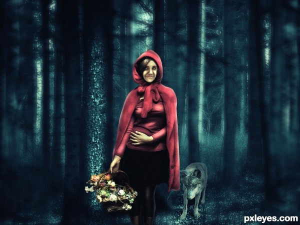
This is a wonderful image. However, for a little feedback. If you examine the face and hands, the face looks very soft and a little cut and paste.
Sorry, I do not have the skills to fix this issue. Maybe someone else could provide better feedback for this area.
GL and nice concept.
The face looks very strange to me. Great blending overall.
Nice image. The tones are confusing a bit with the cool blue & the warm red.
congratulations for second place 
Congrats!!
congratulation for 2nd
Howdie stranger!
If you want to rate this picture or participate in this contest, just:
LOGIN HERE or REGISTER FOR FREE
(5 years and 3189 days ago)
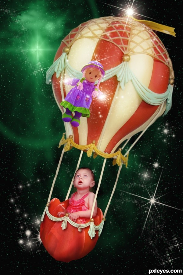
This turned out really well. The baby's skin is a bit too purple for the rest of the image, though. A warming filter (Image>Adjustments>Color Filter) would help blend her better with her surroundings.
Clean chop. Good work.
Thank you MossyB. I have made some changes to skin color. 
if the baby is looking at the doll, the doll should be higher up to eye-level.
take care of light of the balloon/doll, should be same direction as the baby's face.
nice dreamy idea 
Thanks aheman. I have changed placement and color of doll.
ooo... much better 
Up Up and away...
Howdie stranger!
If you want to rate this picture or participate in this contest, just:
LOGIN HERE or REGISTER FOR FREE
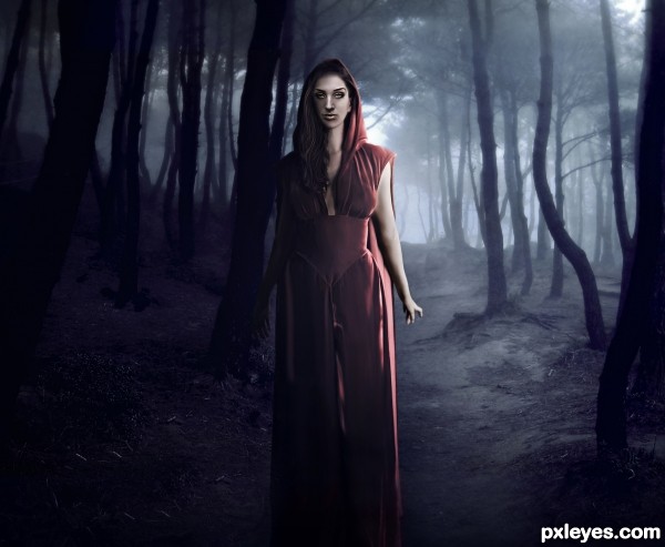
almost looks like an illustration for a movie poster.. great job GOOD LUCK
Thank you so much, Driven!
Good mood & color! Maybe it's just me, but the mouth looks to be slightly crooked.
I dont know, CMYK, maybe not even good, I think too much sharpen 'highlighted' the contour of the lips... hmmm...
Author, if you don't mind a suggestion, I think there are too many highlights & not enough shadows on the shadowed side of the lips. See what you think.
I fixed her mouth, you were right, was crooked!
I also added a shadow on the darkest part of the face (and lips), I did a 'before and after' (on SBS section) to compare. I hope i'm done!! Thank you!!
Much better author...good luck!
Nice colors, and nice setting for the girl. It gives me an eerie feeling of murder by deception. (Just me) Good job!
Thank you so much, George!! I liked your interpretation of the scene!!!
Howdie stranger!
If you want to rate this picture or participate in this contest, just:
LOGIN HERE or REGISTER FOR FREE