(5 years and 3415 days ago)

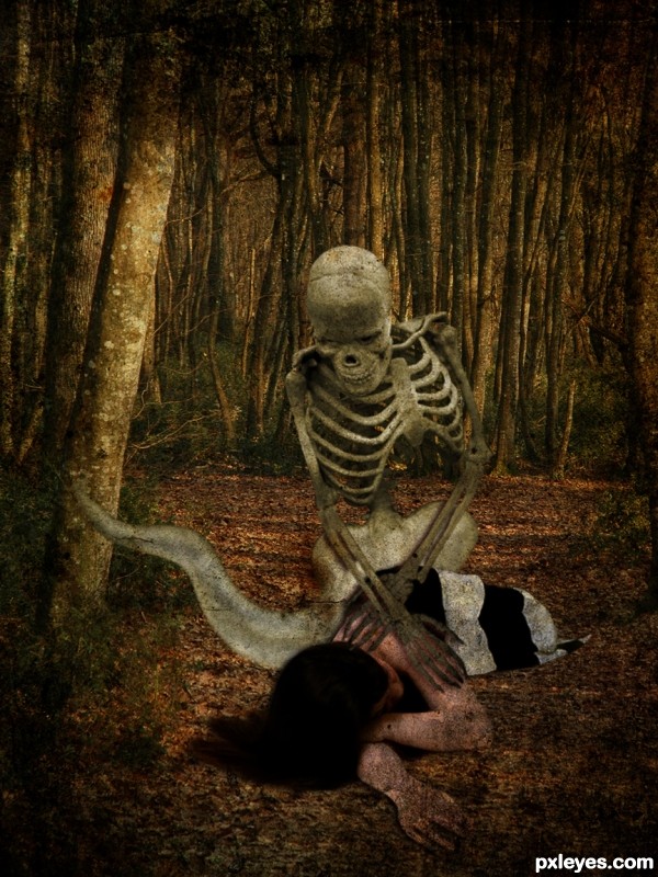
It came to take her...
Thanks to:
- LadyInBlack and Loic LE BRUSQ @ Photoxpress;
- TWS @ Sxc.hu;
- calebkimbrough @ Flickr. (5 years and 3465 days ago)
nice concept
Woah!! Happy Holloween!!!
@donarkz: Thanks, HH to you, too!
HAPPY HALLOWEEN TO ALL MEMBERS OF PXLEYES! 
Nice Idea...
The ghostly tail thing should be transparent, but good mood & texture. 
ookie bookie boo 
Not Sold on the Tail but Awesome Job!
I love it.... spoooky and creeeepy.... Happy Halloween and good luck author.
Thanks everybody! 
@CMYK: Yep, Bob, I thought about it. But I didn't have time to fix the image, so... Thanks anyway! 
idea is good, but the tale part is not matching with the other areas.
Looks like he's sympathizing with the girl's sorrow: "sleep well, baby, I'm still here by your side" lol. Agree with others about the tail, but good image in general  . Happy Halloween my dear!
Fantastic image,great texture,fabulous mood and colors...well done author
Nice one, he seems so gentle with her, as if even though he's death, he cares.
Howdie stranger!
If you want to rate this picture or participate in this contest, just:
LOGIN HERE or REGISTER FOR FREE

(5 years and 3730 days ago)
love it, great idea.
Good idea, but source link doesn't lead to image used...
need to improve on shading & lighting bro!
Good idea... link is wrong thou...
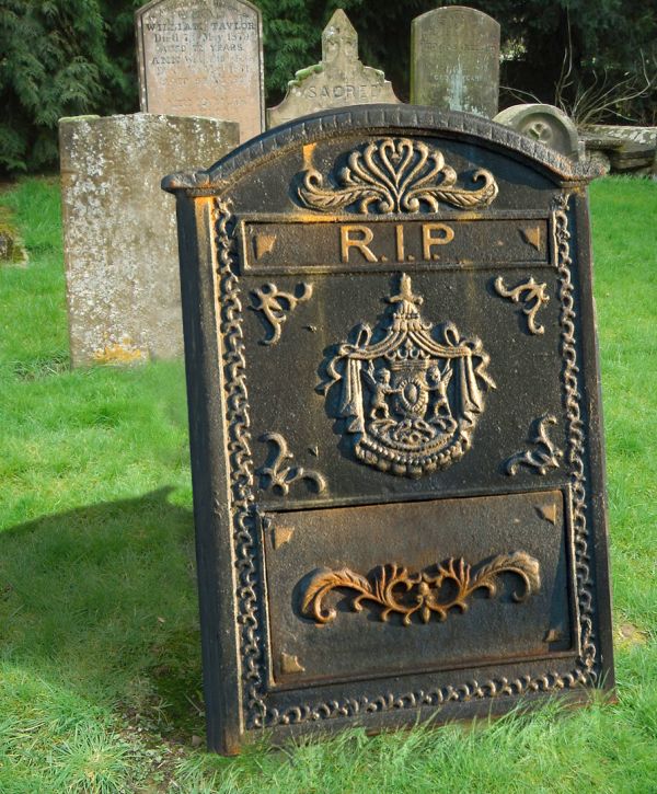
you need to make it look like its sticking out from the ground... otherwise... good idea... maybe also match the shadows in the background.. as the other stones aren't creating any...
A little shading and the thing if comes from the ground.....it would be even better...
From some reason I can't modify my entry so I will place the rightLink here: Thanks To giselaroyo for http://www.sxc.hu/photo/758903
Some problems with the perspective here, as it looks like it's a bit twisted.. also doesn't match with the angle of the other stones. Like the idea, maybe you could add also some name or something to it.. (And yes, blending with the ground needs more work..I vote later if you decide to improve this..)
I would improve this chop but from some reason, I don't know why, I can't reedit my entry, so I can't change anything, nor the source of the image, nor the chop. I hope some moderator will take a loot at the settings and do something about it.
I agree with CMYK,u dont need shadow at this toomb stone...everything else is great...
I have to disagree here erathion, if you look at the strong shadowing on the sign/tombstone, there should be a shadow behind it. The trick will be to match the light and shadow on the rest of the background image so it doesnt look 'pasted on'
why is the grass behind the gravestone blurred/smudged?
very nice RIP and realistic the texture! 
You can't edit an entry after Friday, say 2:00 MST. I honestly think the only thing wrong with this image is the fact it doesn't look like it's sticking out of the ground (like it's just leaning on a stilt or something) that's all. You'll get the editing thing figured out in time, if you keep submitting. GL!
great 
Howdie stranger!
If you want to rate this picture or participate in this contest, just:
LOGIN HERE or REGISTER FOR FREE

Everyone is going this way.
School the suicide! :)
only source. (5 years and 3802 days ago)
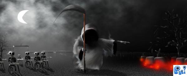
Pretty neat idea...maybe you can add some more shadows/highlights...It looks kind of flat right now...
I like the idea, maybe add a little different shades of yellow/red to the candles.
nice
Creepy good
Love this entry,damn good and very creative...good luck author
creative use of source. like the glow of the moon balanced with the red on the right
Howdie stranger!
If you want to rate this picture or participate in this contest, just:
LOGIN HERE or REGISTER FOR FREE
You could have kept the nails, burn those letters into the wood, choose a rough font, and place it like a sign post. on a field or even in the original BG. It would have been easier to recognize the source this way.
I agree, this is totally not noticable that it was the source image. Sorry :/
cutting the board from the middle and using clone stamp tool ...make result look like as in step 1 of subs
Howdie stranger!
If you want to rate this picture or participate in this contest, just:
LOGIN HERE or REGISTER FOR FREE