Photoshop Pictures: Rise (page 2)


results 6 - 10 of 13

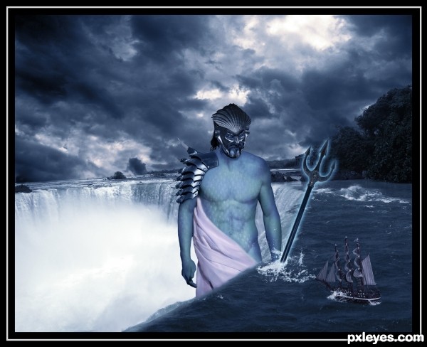
Rise Of The Poseidon - created by erathion


Rise Of The Poseidon
Favs: 3SBS: 9Hi-resRank: 15/22Score: 56.1% (0)17158 views

Jennifer-http://cypherstock.deviantart.com/

Derrick M./Gregory L.-http://sadistik-stock.deviantart.com/

Jenny-http://decemburr-days.deviantart.com/

Andrei-http://vishstudio.deviantart.com/

Aximili-http://deaths-stock.deviantart.com/

Str8-http://str8flush.deviantart.com/

Julia Starr-http://www.sxc.hu/profile/night_fate

Kriss Szkurlatowski-http://www.sxc.hu/profile/hisks

White Wild Flower -http://rinymph-stock.deviantart.com/

Name pending...-http://jaqx-textures.deviantart.com/

Thanks guys for the great resources...


Happy B-day Mario,best wishes...This Poseidon is made in honor of your day... (5 years and 3516 days ago)

10 Sources:

avatar Mario
Mario [banned] says:

Awesome ...I'm speechless...good luck author

avatar Drivenslush

very very pretty..I'm always amazed when some one can blend SO MANY sources and make it work.. GREAT JOB (a very hard thing to do)

avatar ikrumon
ikrumon says:

wonderful but it doesn't looks like he is holding it, the weapon's angle is the cause for that kind of feeling. but I like this very much.

avatar erikuri
erikuri says:

Simply superb...

Howdie stranger!
If you want to rate this picture or participate in this contest, just:

LOGIN HERE or REGISTER FOR FREE


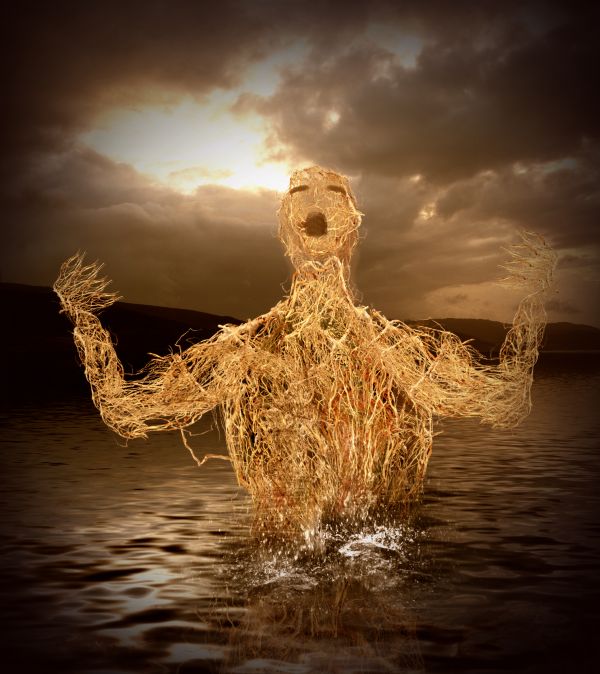
Rise - created by nasirkhan


Rise
Favs: 0SBS: 14Hi-resRank: 8/22Score: 57.3% (0)3877 views

Thanks to mqtrf for sky image

Inspire by Giallo entry (5 years and 3523 days ago)

3 Sources:

avatar langstrum
langstrum says:

@puppetized: author mentioned that in the description (I don't know that this is the original description or the changed one). Honestly, by comparison, the Giallo's entry is much better (because you said that you were inspired by Giallo's entry, I consider it as your reference, please don't take me wrong, I don't know Giallo, I just want to see how you came with from this reference). Author, with your skill you can bring more effort into this work, it's good but more editing might be much more impressive (some parts on the body can be more defined, especially the face, this kind of improvements is within your reach). Good luck to you

avatar Drivenslush

Very neat... would have to put this under HOMAGE.. hehehehe.. Great way to use a great entry in a totally different way (one hand is hard to see.. unless in high res..... good luck author)

avatar erikuri
erikuri says:

I don't know why, but it reminds me a poster of "Ruins"...

author says:

puppetized , my first incomplete attempt was this

http://img215.imageshack.us/img215/264/38498426.jpg

but then stop working on this project because its not looks good to me. I searched for another pose and decided to used pose reference, used by giallo entry http://www.pxleyes.com/photoshop-picture/4abc9cf1b25ea/trapped.html. Langstrum no doubt Giallo is great artist, but this image already take too much my time and my layers are now going out of control, until and unless I merge them

avatar Lamantine
Lamantine says:

nice idea great work !

avatar hereisanoop

I agree that you have done lot of work here... since giallo made such a fantastic entry.. This one need to be more effective.. Here the human's body details are totaly missing.. ( even it can be considered as weins or root branches U shuld have used the burn dodge tools under the neck and chest areas.. to get some body feeling.. Only my opinion.. welldone work though.. and Good luck...!!!!

avatar langstrum
langstrum says:

I understand your situation and I also don't want to keep the psd file with merged layer. In my case, I made the second psd file and merge all layers, taking risk and added something more. Maybe we need to take control of layers more efficiently, sometime it brought headache to me also

avatar erathion
erathion says:

great job...good luck author

Howdie stranger!
If you want to rate this picture or participate in this contest, just:

LOGIN HERE or REGISTER FOR FREE


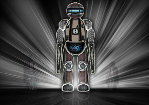
Rise of the Robots - created by Graphopoly


Rise of the Robots
Favs: 1SBS: 11Hi-resRank: 10/22Score: 57.3% (0)6799 views

(5 years and 3583 days ago)

4 Sources:

avatar langstrum
langstrum says:

I see the glowing effect in some areas makes the composition of this robot less connective, especially the foot. Overall, it's quite good

author says:

that was the idea. To connect them only with the glow

avatar Clinge
Clinge says:

Nice one, GL

avatar loopyluv
loopyluv says:

Very cool :P

avatar jawshoewhah
jawshoewhah [banned] says:

looks like a fabulous, creative entry to me

avatar sebykxxx
sebykxxx says:

great,gl

author says:

thanks everyone!

avatar Suky04
Suky04 says:

nice work!

avatar Govindrathod

Well the robo looks disected which gives a nice effect...Beautiful work...

avatar CorneliaMladenova

Very nice robot and the image looks good in high res

Howdie stranger!
If you want to rate this picture or participate in this contest, just:

LOGIN HERE or REGISTER FOR FREE


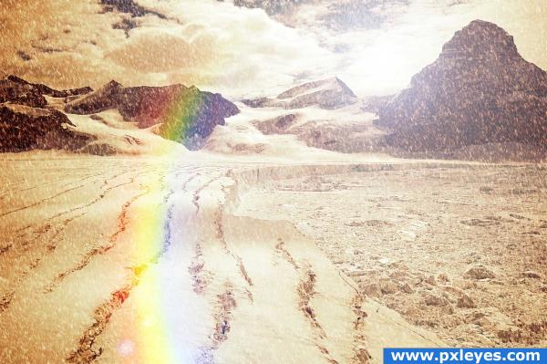
sun rise in the glacier - created by rajiv


sun rise in the glacier
Favs: 0SBS: 2Hi-resRank: 21/22Score: 49.3% (0)6294 views

no external sources have been used.. the sun rise thought has been used.. the glacier still experiences snowfall !! :) (5 years and 3673 days ago)

no avatar
jesus says:

I love the snow !!! dont quite get why the scenery is sepia tho xD

avatar sparklen
sparklen says:

A warm glow on a glacier? Looks like 'global warming' would have been a better title!

Howdie stranger!
If you want to rate this picture or participate in this contest, just:

LOGIN HERE or REGISTER FOR FREE


sky rise - created by rgb49


sky rise
Favs: 0SBS: n/aHi-resRank: 2/22Score: 58.8% (30)10341 views

sbs:
duplicate source image
erase/delete all but the 'top floors'
make several duplicates of the 'top floors only' image
drag all layers to new blank document 700w x 2450h
stack & overlap 'top floors only' layers to fill new document
adjust size/shape of each layer using transform tools
create new layer below/behind all exisinting layers
fill with gradient for sky background
(5 years and 3724 days ago)

avatar lchappell
lchappell says:

GREAT EFFECT...NICE WORK

avatar Siminho90
Siminho90 says:

yea very cool ;D gl

avatar ponti55
ponti55 says:

Very good use of source, a great end result!

avatar freejay
freejay says:

Good idea....nicely executed

avatar ZaphodQB
ZaphodQB says:

This needs a guy diving off the balcony at about the 58th floor and it would be perfect!

avatar Akassa
Akassa says:

Very creative!

avatar nehayash
nehayash says:

superb!well done author

avatar RichieMB
RichieMB says:

I love the way this pic moves with the scroll wheel, great job.

avatar loopyluv
loopyluv says:

Nice...:P thought it wud never end

avatar pixelkid
pixelkid says:

Congrats! Way to go!

avatar Lelaina
Lelaina says:

Congrats for your second place!

Howdie stranger!
If you want to rate this picture or participate in this contest, just:

LOGIN HERE or REGISTER FOR FREE