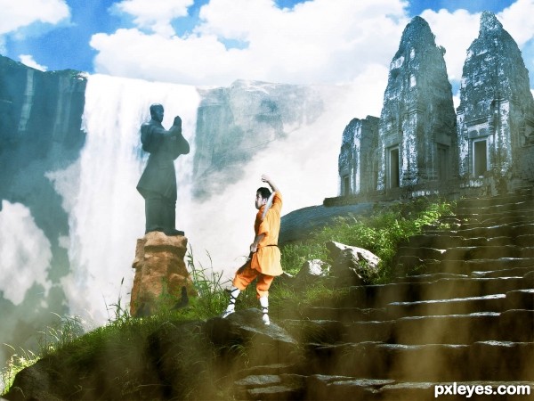
(5 years and 2890 days ago)
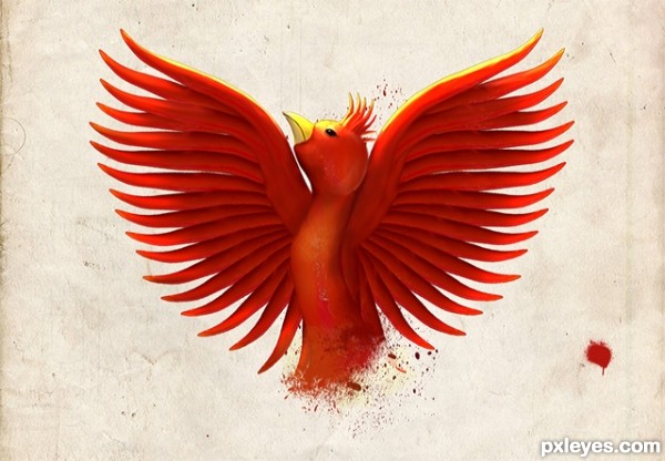
(5 years and 2975 days ago)
Beautiful creation author...well done
So pretty!..love it
instant fav!..
Thanks guys 
Very creative. Nice use of warp/liquify tool and lightning. Like it a lot =]
awsome work \m/...
Loved it..
This is a really cool image... although I'm not sure why the source was needed to make it
cute entry....
Very nice 
Beautiful image but HighRes resolution left a lot to be desired. Good Luck!
Beautiful entry.... good use of the source.... good luck
Congrats, beautifully done 
Congrats!!
Thanks, all! 
congrats for the first place
Congrats
Howdie stranger!
If you want to rate this picture or participate in this contest, just:
LOGIN HERE or REGISTER FOR FREE
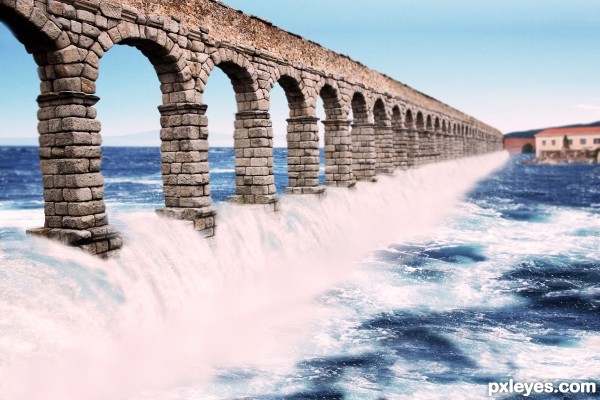
(5 years and 3058 days ago)
very pretty construction and great idea.. GOOD LUCK!!
I really like this, good luck
Howdie stranger!
If you want to rate this picture or participate in this contest, just:
LOGIN HERE or REGISTER FOR FREE
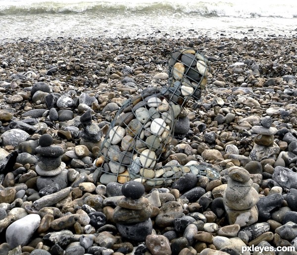
(5 years and 3307 days ago)
more like a camouflage , spot the stones in the rocks 
Good idea combined with great source! 
Where's rockman?
Great concept!
Nice, and if it wasn't for the frame he would blend right in = )
Great find on the source..Wish you all the best..!
Howdie stranger!
If you want to rate this picture or participate in this contest, just:
LOGIN HERE or REGISTER FOR FREE
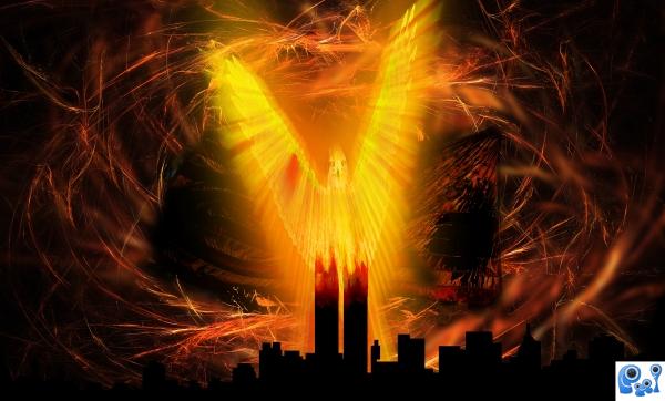
This is my first real attempt at fully photoshoping (not just using layers and masks). I hope the guide isn't too detailed (my first attempt at a guide). (5 years and 3804 days ago)
nice work, love the background- after I saw the step by step it made me wish you hadn't stretched the bird quite so much
Not bad, but flip the flag part...
Thanks for the comments. I did try to flip the flag, but it just looked off somehow. I tried a few different "stretches" of the bird. The less elongated ones didn't really give a Phoenix feel...just a big bird on a building. I'll keep at it though. 
This is a wicked cool but you warped the original source I can barely tell how you used it. But this is still wicked cool nonetheless 
Thanks jawshoewhah. Actually, the source image is the only part I didn't warp. I even masked out the bird face in the final step so that you could see the source. It's been changed into a "firey brightness" (hopefully), but in the Hi-Res you should be able to clearly see the source image. But I agree. It's wicked cool. Didn't think I was going to be able to get it to turn out the way I envisioned, but it did.
creative use of source. fantastic outcome
Thanks you scratzilla1 for the wonderful comment.
Howdie stranger!
If you want to rate this picture or participate in this contest, just:
LOGIN HERE or REGISTER FOR FREE
Would be better if the figure wasn't distorted, and he seems a bit small.
Right ive not notice it. I over use the sharp tool on it. Good critique thanks cmyk
Howdie stranger!
If you want to rate this picture or participate in this contest, just:
LOGIN HERE or REGISTER FOR FREE