(5 years and 3340 days ago)
3 Sources:
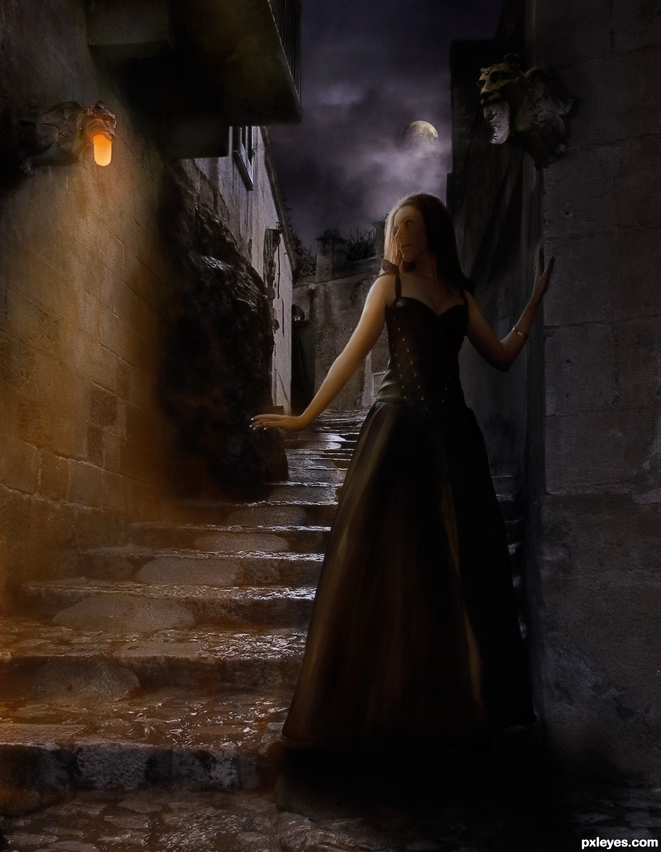
They say it is dangerous to walk Gargoyle Road when the moon is full; that if the Gargoyle lamps glow red then danger is near. They say the Gargoyles can sense the hunger for blood and it is that prescience that turns the lamps red. They don't say who is hungry. Beware!
Thank you to Elandria at Dreamers of Avalon (see SBS for permission) and to lindowyn-stock. The balance of images are my own. See SBS. Step 17 is animated gif. (5 years and 3347 days ago)
A Girl.. walking in a skimpy dress on Gargoyle Road... in the middle of the night.. this reminds me of that black comedian who used to say they should just rename all Horror films as "Attack of the Stupid White People".... .. If you are looking to buy a house and when you enter it and it says in a super scary low voice "GET OUT" you don't move in.. but stupid white people will move in.. so I guess you get a movie out of the deal.. LOL A black family would say, "Lovely house... But we can't stay..." sometimes they leave skid marks LOL
Very lovely moody piece.. very professional.. NOW GET THAT STUPID WHITE GIRL HOME.. before she gets her self killed... (at least she's not in skimpy white underwear running through the forest with a blood stained killer WALKING after her just waiting for her to sprain her ankle....
GOOD LUCK.. and GREAT JOB.. very beautiful and instant fav 
 You never know who is the hunter and who is the hunted. And the skimpy dress, what better bait for a hunter trying to draw it's prey into a trap. That poor, unwary traveler skulking around behind her may just find stalking to be a dangerous passtime

spoken like a girlie girl author.. LOL.. (I've roomed with Lesbians.. and I'll tell, they scare the crap out of me) LOL
to true.. you can be the biggest MALE monster, but nothing beats the pissed off female..
BIG SMOOCH.. hehehe (you little devil you)
Extra points for the consistent lighting! Good on ya,for not making it so damn dark you can't make out what you're looking at! Really nice job on the side of her waist. Great work!
Superb work author...really really great scene...with lighting like this overall look gives nice mystical mood...well done
SBS is done! Whew! Sorry for the delay but thought I would run out of time and was not sure I would be able to get more than the GIF done.
Wonderful concept with perfect excecution... Love it.. Great job... And @deae slushy... 
Thank you for the wonderful comments and the favs ... personal thanks coming as soon as voting is closed 
WOW, incredible work, author! Good job on all the different lighting details. Your sbs would make a great tutorial!
Scenic beauty is great......... Nice execution.....Great Work........G/L Author.
nice second place congrats
Well deserved. Beautiful work, Arca!!
Congrats arca!
congratulations...
Congrats!!
congratulations...
Congratulations!
Congrats on a beautiful second place
Howdie stranger!
If you want to rate this picture or participate in this contest, just:
LOGIN HERE or REGISTER FOR FREE
(5 years and 3347 days ago)
I'll just turn around thank you very much LOL very neat Idea author.. good luck
very good idea and neat work author...mood is very very nice...IMHO this could be your best entry for now...best of luck
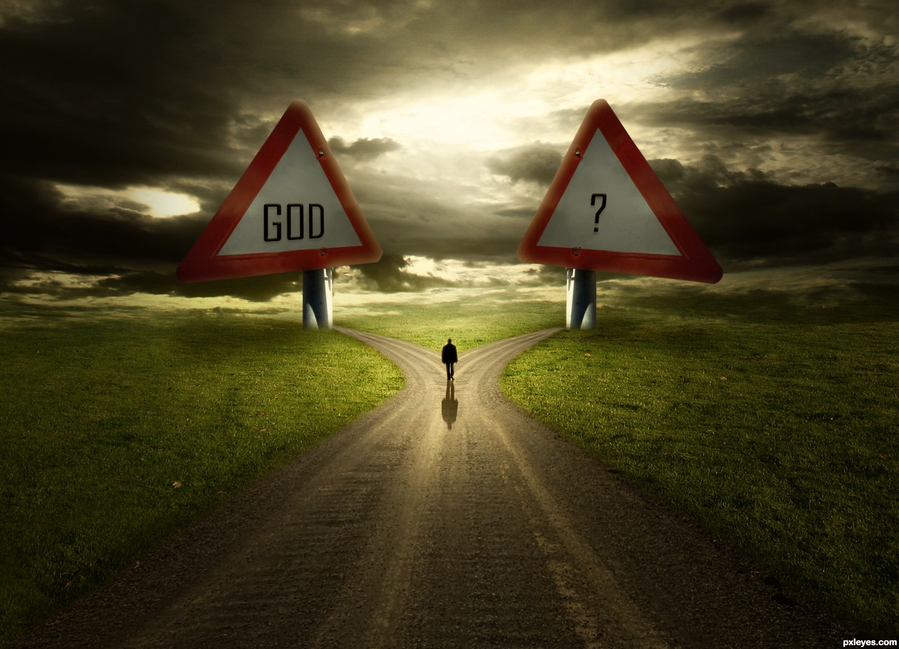
I suggest you have a look again at the traffic signs, the positioning and perspective is completely wrong. Not to hard to change that.
It's very nice, just fix some things, I think the size is too exaggerated, the screws lose the sense at this size, and I think that would give you center a little more plates to the base. GL
Wanna see the SBS too, i will hold my vote
very good concept.. good luck
Agree with above, especially the perspective.
There's no difference between "GOD" and "?"...just a matter of perception. But please try to revise the image as per the suggestions above.
I like it and the idea is great.You got my vote.
@erathion Wow...thanks mate. @petersheep You're right about screw. It fixed.
Thanks everyone for your words. And to point out mistakes about perspective. Can you clearly describe .. ?
Hi author, i see the modification...nice!!! about the perspective, I think if you centralize the center of the plate with the base would be perfect.......nice Job GL!
Hi author, i see the modification...nice!!! about the perspective, I think if you centralize the center of the plate with the base would be perfect.......nice Job GL!

great image!!!
Excellent work, loved the lighting! Dramatic and expressive! My fav!
Love the idea and the lighting. Would have loved it even better if the source was a finger post and not a warning sign. But since it is, I find this just great. 
congratulations...
Congrats!!
congratulations...
very nice.., congrats
Howdie stranger!
If you want to rate this picture or participate in this contest, just:
LOGIN HERE or REGISTER FOR FREE
(5 years and 3354 days ago)
Excellent shadow work, nice effect!
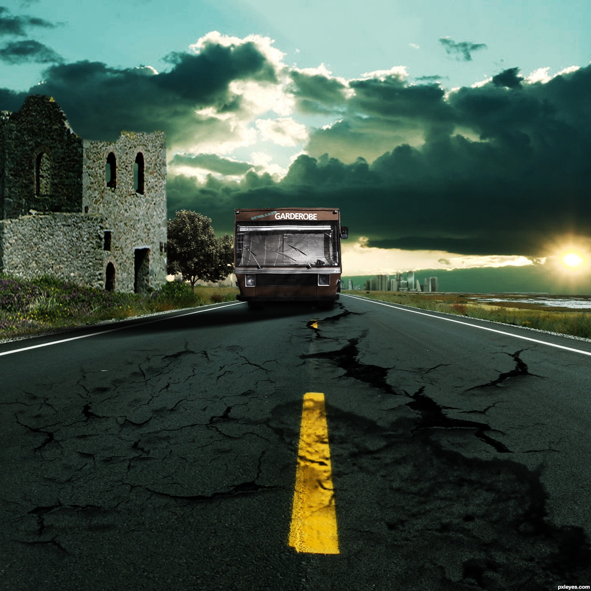
Shadow should probably be a bit longer, considering the angle of the light source, and there's a horizontal bar shaped artifact in the sky at mid left. The tree & building are too small to be in scale with the bus, which is in the same plane with them. Author, this is a good concept, and you have plenty of time to post a revision...good luck!
you created the dramatic scene very beautifully. GoodlucK!
CMYK46 is correct !!!
Thank you Guys and thank you CMYK46 for advices,i took them in consideration , thank you , i edited it , just lemme no whats wrong again
Looks fine now!
Thank you
very cool moody work...gl author
Thank you Nebojsa ,
Great work. Like the corrections. The whole mood is great!
Great job
thank yoy Arca
thank you too ibmaxed
Cool. The bus seems like it's squished down but I like the image overall!
yeah i meant to squished down that gave it lil of realism
btw thank you for ur comment
Very nice use of texture!
Howdie stranger!
If you want to rate this picture or participate in this contest, just:
LOGIN HERE or REGISTER FOR FREE
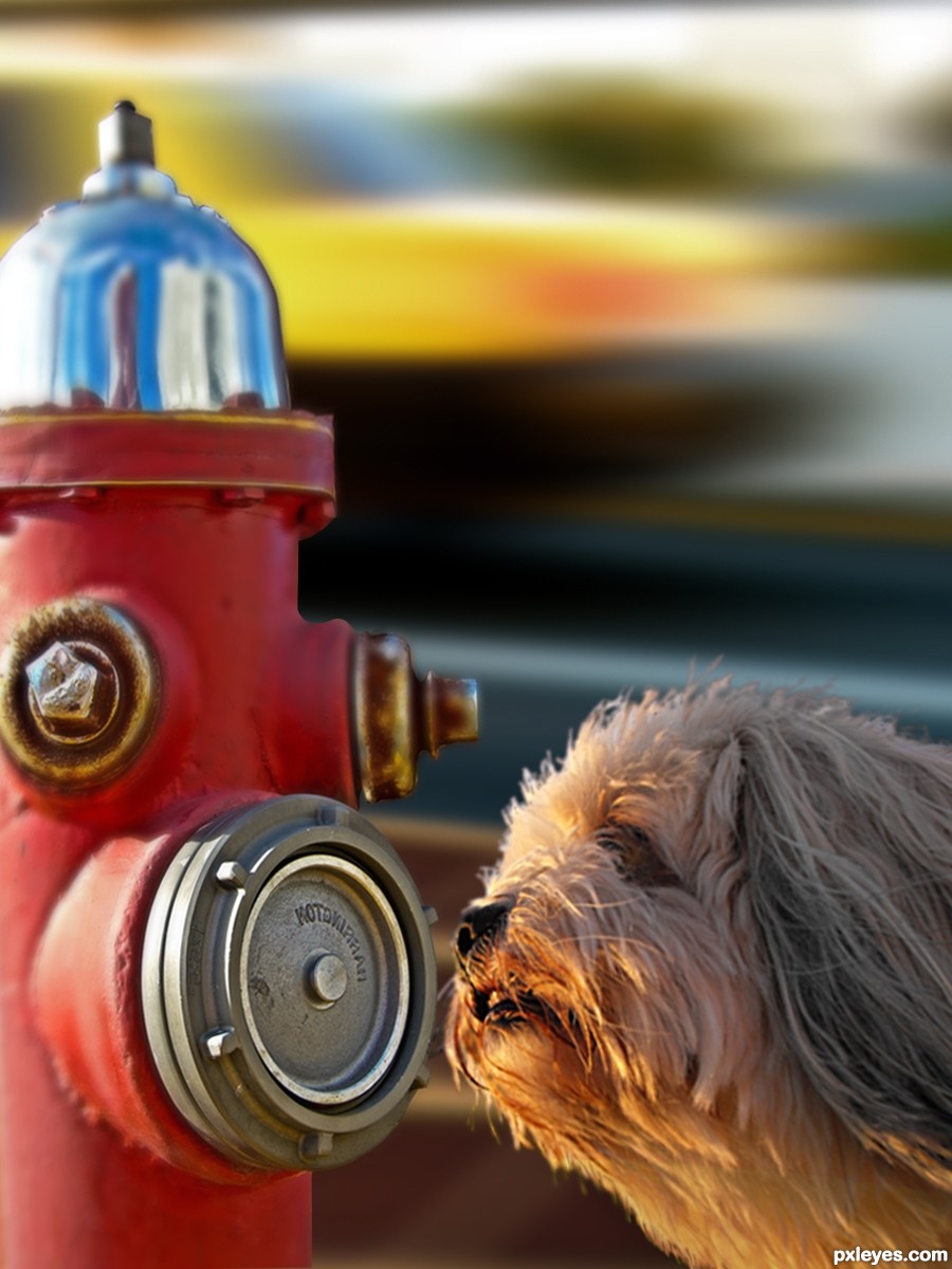
Gave a dog's photo near the hydrant. She smelt a new guy.
(5 years and 3371 days ago)
nice chop but the blur doesn't really work for me...gl..
Author I think you should give the hydrant the same blur as the dog, they are about at the same depth in the image. Another tip for the dogs hair: they look a bit hard edged... maybe try if this works: open a new layer on top, select a small blur brush (3 or 4 pixels) then check "select all layers" on top in PS and go over the edges of the hair. You'll see they'll blend much nicer that way, it's worth the time you put in it.
But it's up to you, it's your image.
Thanks Toothpick134 for the suggestion.
I think you are mentioning hydrant cause the car with road and footpath without blur grabs away attention from dog. I tried hydrant mouth without blur, the prespective wr2 dog goes bizarre. Moreover that mouth becomes too prominent.
Suggestions are most welcome.
Don't blur the hydrant, blur the dog just a bit.
Thanks robvdn for a good suggestion on dog hair. I did changes using select-modify- contract and inversed it, then gave it a blur. It blended nice as you suggested. Toothpick134 intended depth correction, yet perspective remained same, out of match with hydrant. I tried to give hydrant's shadow on dog, then dog no longer looked the hero of image. Enlarged hydrant and perspective changed for worse.
Changed shadow angle of hydrant and dog using soft brush, then car source image had to be changed because of its shadow angle. As CMYK46 suggested, I tried to keep hydrant as it is and blurred the dog a bit, it seemed the dog is looking at somewhere else and not at hydrant. also the hydrant becomes too prominent. Thanks CMYK46.
I couldn't find a good background better than this car at such angle as hydrants used to be adjacent to road and regrets, couldn't find a better angled dog smelling intelligently.
Finally, I think, oopps, was it wrong compilation  (
(
dog hair edges have green color no need that, beter same background color.
[only edges]
Idea is nice and images fits together but u could make it even better...Blur is still to big IMHO, and u should work on that a bit more...As for the dog,use small smudge brush ,strength around 80 to create basic fur on hard edges part...be free and loos your hand when u do that...then u will get the best result. After basic fur play a bit with the size of the brush to make fur even more realistic. Now is good but with few adjustments this could be very very good entry...best of luck
I am with CMYK on this one
If it was up to me I would scrap the background and use the original background of the dog. I would expand the background a bit horizontally and finish the base of the hydrant and place it in the background. Making sure to match the depth of field to the surrounding area where the hydrant is placed. Good luck!
Thanks Chalty for the suggestion. I appreciate that.
@robvdn. I saw and realized, then decided.Thank you very much, I done the changes as you suggested.
@Toothpick134, hope the reduced blur confirms your comment. Thanks for pointing it out first.
@CMYK46, you suggested an altenative, thinking I may accept any one. Thanks. I did changes with first and for me, it came out nice. Thanks CMYK46.
@Sanjugs, Thanks for the minute observation on hair. I did the work as you and robvdn suggested. Hope the changes are satisfactory.
Hi! erathion, thanks very much for your ideas. Best was your 80 with smudge. robvdn, I think it is about version.
@Mario, Thankss for pointing out.
@Chalty669, Thanks. I wanted to put my hydrant on roadside. So I didn't try the grass.
Howdie stranger!
If you want to rate this picture or participate in this contest, just:
LOGIN HERE or REGISTER FOR FREE
Photography and photoshop contests
We are a community of people with
a passion for photography, graphics and art in general.
Every day new photoshop
and photography contests are posted to compete in. We also have one weekly drawing contest
and one weekly 3D contest!
Participation is 100% free!
Just
register and get
started!
Good luck!
© 2015 Pxleyes.com. All rights reserved.


great use of sources.. good luck!!!
Very nice! good luck!
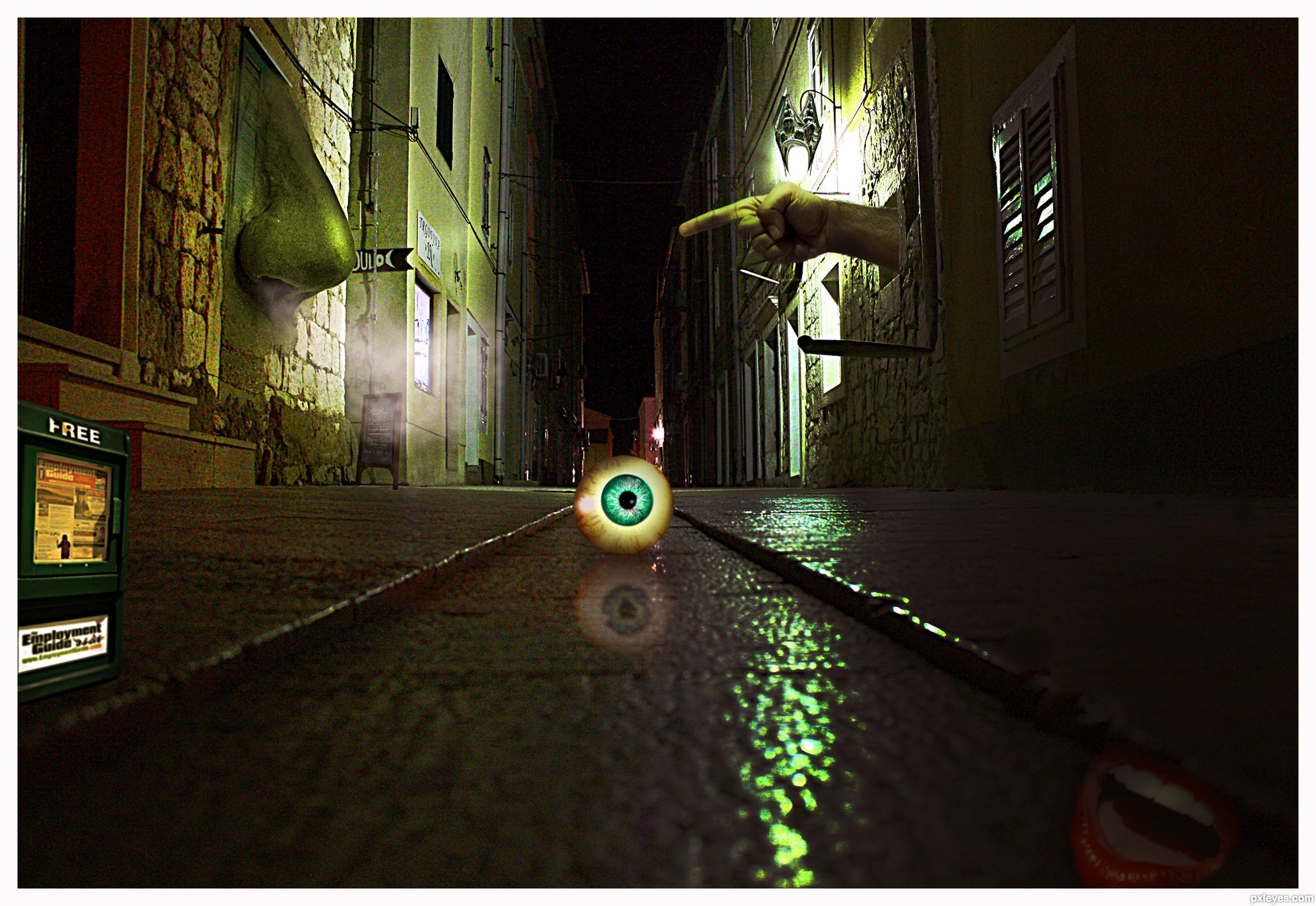
Fantastic work author...really really great usage of the source images...Eyeball is top notch...extra and more extra points for that...IMHO mouth in the lower right corner are to much...they create small distraction and they do not contribute to the image...but maybe is just my impression...any how love this entry and goes straight to my fav gallery...best of luck
Good use of 3 out of 5 pics, but the columns are just CBR.
Dear CMYK46, what is CBR ?
Thanks to all for your comments.
chopped beyond recognition, some members find it distasteful so they coined this acronym on this site.
Not against the rules though
Thank you very much cabldawg71 but maybe you forgot to write the name of the site in question...
Contest Moderator: Adding more photos is allowed as well... But the 5 presented photos have to be visible
The five pictures are visible even if they are small....
Hand and nose position is priceless imo !!! Love this !!!
Looking at this again, if you had made the hand from the hippy's hand I'd appreciate it more.
Amazing!
Congrats for your second place, Lolu!
congratulations...
Congrats!!
Howdie stranger!
If you want to rate this picture or participate in this contest, just:
LOGIN HERE or REGISTER FOR FREE