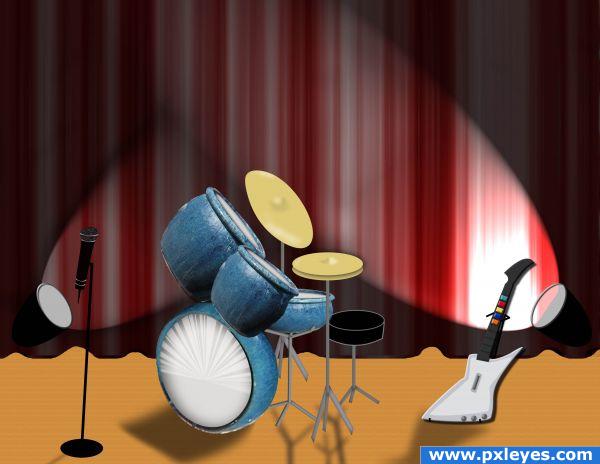
Who's ready to rock?!?! (5 years and 3932 days ago)
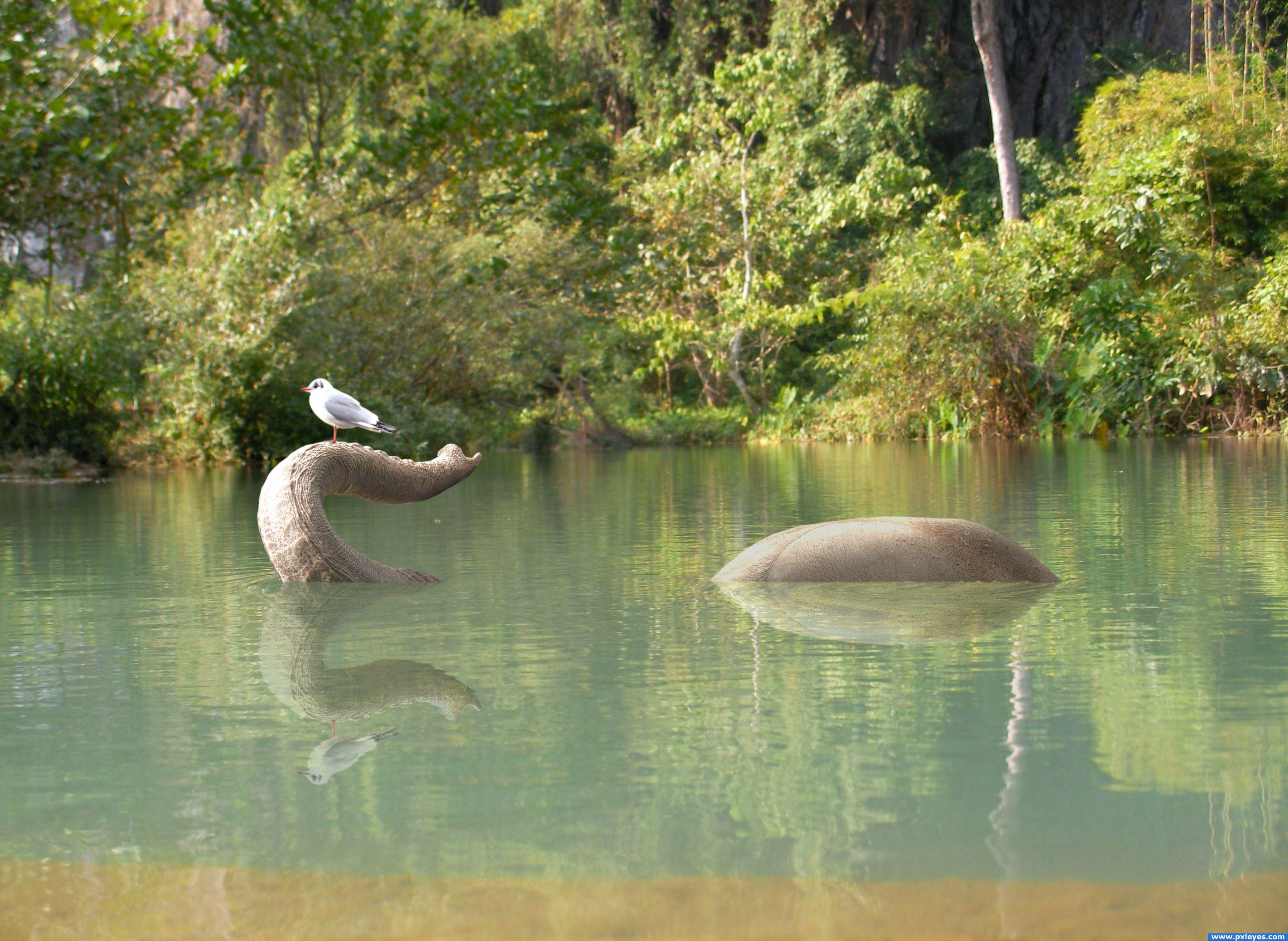
Just another quiet day on the river... (5 years and 3937 days ago)
Nice blend and great reflections. The seagull is a great touch to this! Thank goodness for that trunk, huh? 
lol
Amazing idea! Love the reflection 
Very cute! The reflections are a nice touch.
not bad ...maybe darken the elephants skin a little around the water line to give it the wet look might be an idea
excellent job
best so far in my opinion. well done
Great entry! g/l
Oh great! Fantastic idea and execution. You really have to look twice to see, what's going on. Good luck 
refection is very well done fits the water very well-- bird is a nice touch
Congrats for being in the top 7, Bob!
Lovely! It's has a magical feel to it. Not surprised it; in the top winning entries.
Howdie stranger!
If you want to rate this picture or participate in this contest, just:
LOGIN HERE or REGISTER FOR FREE

Well I think I went overboard... But I loved the headphone stock... Wanted to use all, but could use only 4 outta 12...
But using the same person/ model does bring good consistency in this template...
Yes, I made it in a template, but it's a a mock template, coz it's not in the actual size...
Based on a 3 piece girl modern/soft rock band called "Gaussian Resonance" XD
There are some white line between the covers... Those are not border but rather gaps..
The top most leaflet is the double type fold able front cover...
The middle leaflet in the inlet cover...
And the bottom is the back cover and the cd itself...
Oh man, did this took lot of time... Editing the pic was fast... It was the text and lay outing that took away most of my time... Now I know why people want huge pay for lay outing lol...
The font I use is mentioned in sbs... Also the headphone link provided leads to a zip file... It's a pack... I didn't find separate images... So if you want to validate my source, you have to download the zip file...
Also permission is show in sbs as well...
Hope everyone enjoys this template...
View in High res to be able to see the song list properly...
And very much thanks to these person...
Thanks to da ~xopion for his awesome mockingbird guitar shot...
Thanks to da ~Lina-Tsu for her gorgeous and sensual guitar playing pic...
And most thankful to da =TwiggXstock which is the really the bulk of my template... XD (5 years and 3953 days ago)
This is absolutely incredible! This image is creative, catchy, cool, colorful, and careful in preserving even the most minute details found on CDs. Only a few things I can say that might be improved, and it's mainly a matter of my personal taste so don't feel the need to take my suggestion: first, the nude girl is not playing any chord which makes sense (though this neither matters nor can be avoided); second, the dots in the border around the picture of the nude girl should be blue and silver as opposed to blue and red, to preserve the color scheme.
I ran out of room, so let me continue. Third, the picture of the nude girl has too stark of a transition between itself and the sorroundings; maybe a fade effect could make it less harsh on the eye. Also, since the catch phrase is "blurring the blur in the music" you could perhaps find places to add blur in the image, such as faded edges or slightly blurred fonts to make this catch phrase more evident in the image. Other than that I can't really say anything. AMAZING image!
Thanks vibs... Well I agree with your suggestion although I am happy with the end result for now... Also my eyes are tired now... Will get some rest and then try tweaking it... And about that girl not catching any chord, I noticed it but I liked the pic so much I had to include it lol...
Edit: @ Golemaura I was waiting for someone to say something about the white space... Glad it was you... But I made this not a chop but rather a template... So I don't really care about the white space... Also if i try to expand the bottom cover, it would really really mess up the proportion of the covers... Coz even if the covers are not of actual size, they are proportional to each other... Maybe I should add an invoice to Gaussian Resonance in that white space...
@Akassa I was also expecting that... Knew some people won't see that as a rock cover... But I mentioned that the band is modern/ soft rock maybe with some element of pop... And band that is totally rock is quite rare now a days... And I made the album according to contemporary style... At least it is not emo lol... Well each has it's own opinion...
Thanks for the feedback peeps...
Edit: Added an cd to the white space...Just for you Golem cause I LUUBBB you ROFL  ha ha ha ha... enjoy...
Also made the color scheme more consistence in the inlet cover... Got rid of the orange red color...
hehehe... things get out a hand every once and awhile..LOL.. the huge white space on the bottom right corner is a big NO NO.. but I know you know that already author.. LOL.. you could just expand the bottom image and lengthen the whole piece.. no big whoop .. good luck.. hehehe
EDIT: Simple excellent fix.. great save author
I love it, great creativity.
Very nice, it really looks like a real cd cover! Love the model but doesn't look like a rock cover to me.... maybe pop? :P
cool
Congrats for your third place!
Congratulations for 3rd
Congrats!
Congrats...
Thanks...
Congrats!
Howdie stranger!
If you want to rate this picture or participate in this contest, just:
LOGIN HERE or REGISTER FOR FREE
Ophthalmologist alter ego (5 years and 3954 days ago)
Howdie stranger!
If you want to rate this picture or participate in this contest, just:
LOGIN HERE or REGISTER FOR FREE
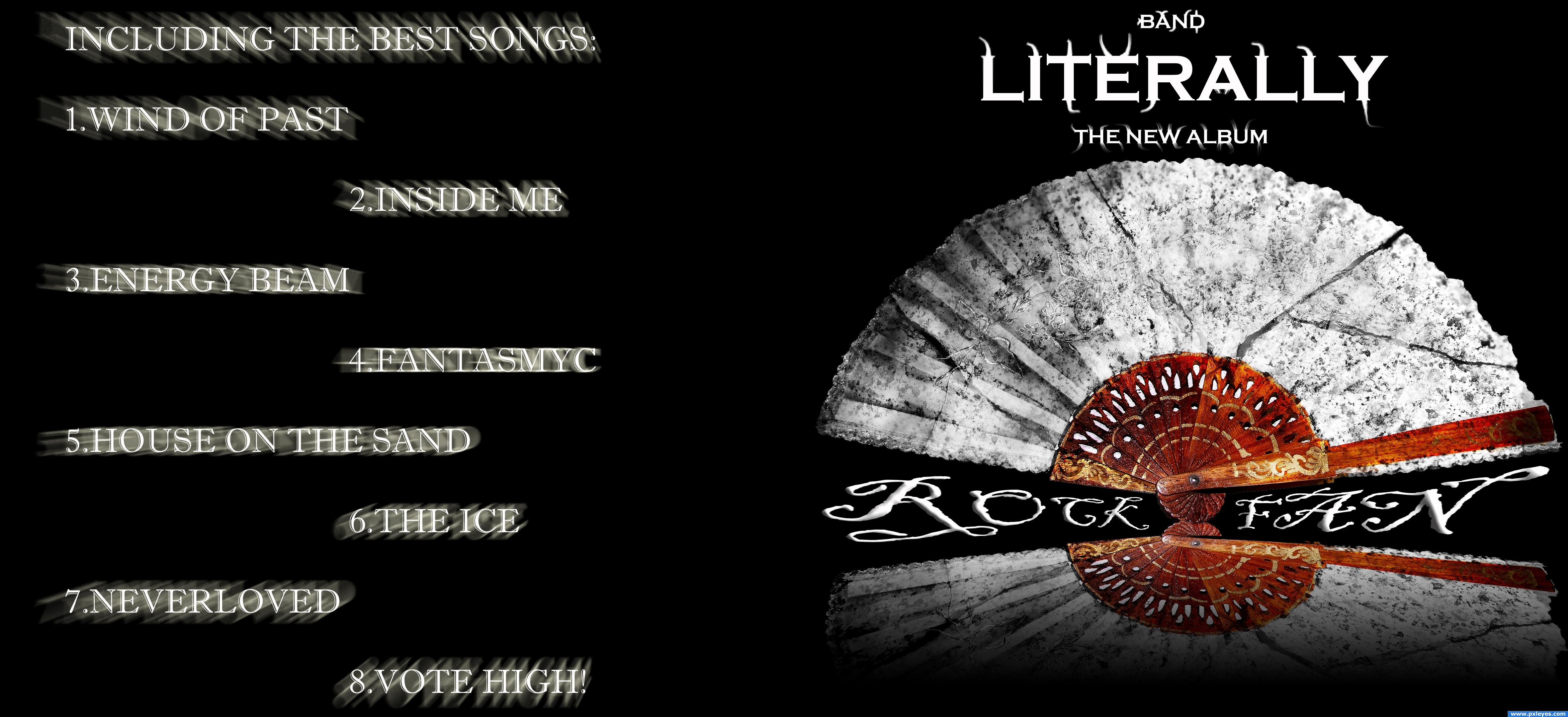
Think this is on theme? :D
Have used masking to shop the texture from the stone and then overleyed it onto the fan.
Used basic text fonts, and then smudged them to make the ornaments.
Used radial blur on the song list....
...
... (5 years and 3955 days ago)
Cool... Btw whats the actual size of the high res in inches??? Just curios, the high res is cool in fact and the text doesn't looks blurry at all in high res... But however in small size it might become unreadable... But who the hell tries to read song name from a album from 10 feet far away... Most common and optimum distance is 15 to 30 cm... Other than the blur issue in small res... This is neat...
My favorite track is #8: Vote High. Funny. Is that supposed to be subliminal? I like it!
Yes, actualy it is a subliminal... Now that you have discovered it it is going to work only even better... Ahahahaha... My plan is going to be a trumendes success...
Subliminal messages! How scandalous  I really like that "rock fan" wordplay, very clever! Good luck
Blurred type never works. Dunno what you were going for, but you didn't get there.
Howdie stranger!
If you want to rate this picture or participate in this contest, just:
LOGIN HERE or REGISTER FOR FREE
Photography and photoshop contests
We are a community of people with
a passion for photography, graphics and art in general.
Every day new photoshop
and photography contests are posted to compete in. We also have one weekly drawing contest
and one weekly 3D contest!
Participation is 100% free!
Just
register and get
started!
Good luck!
© 2015 Pxleyes.com. All rights reserved.


Great imagination and use of source and drawing and... weeellll... overall superb entry!
awwww geez.. NOW I want to see what the Band looks like very neat work
Creative and nice effort!
Yes! Guitar hero!
cute idea
Howdie stranger!
If you want to rate this picture or participate in this contest, just:
LOGIN HERE or REGISTER FOR FREE