hehehe
just for fun (5 years and 3983 days ago)
A rocky face teetering on a stick.
*** created using only source image and personal photos (5 years and 3993 days ago)
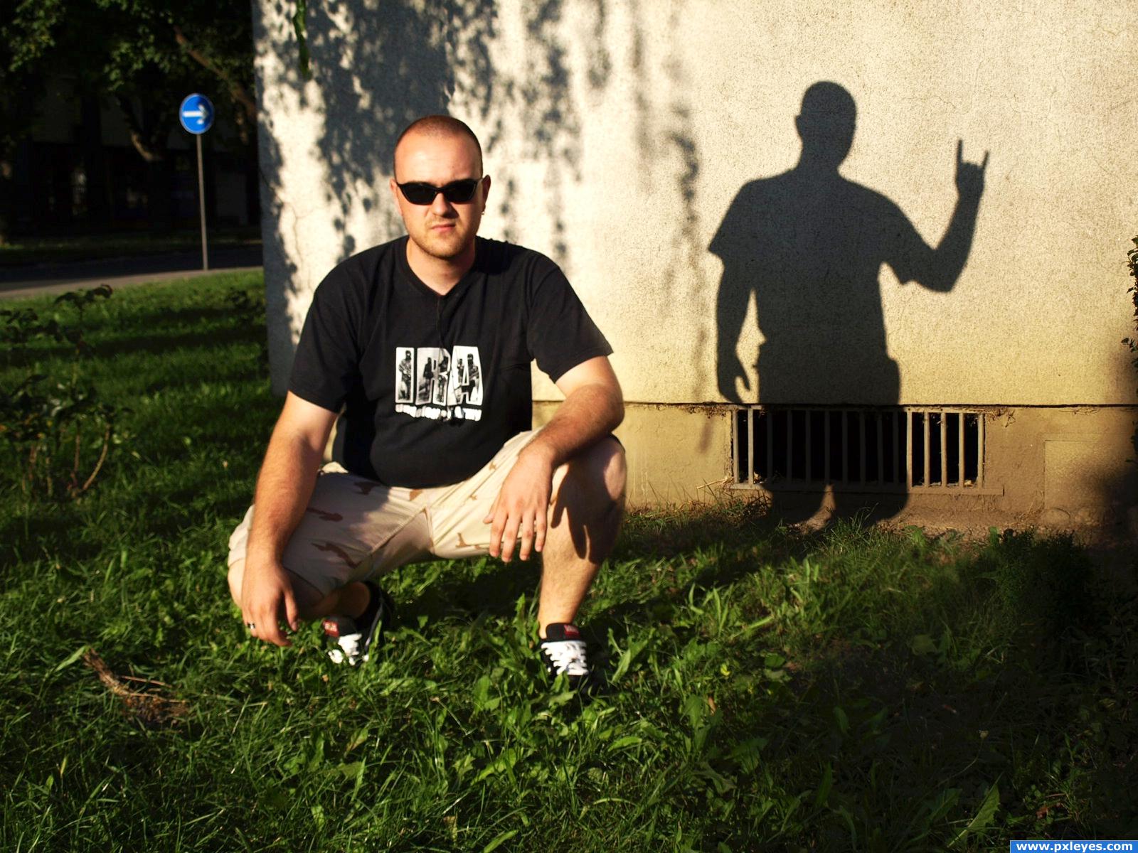
I don't understand what i'm seeing, the difference in contrast isn;t very effective in my opinion. I think the shadow could also use a bit of work.. maybe a blur it a bit and then soften it. Good luck!
the colors dont match at all and i think the rock needs a shadow or reflection or some thing so that it looks as though it actually belongs there
Howdie stranger!
If you want to rate this picture or participate in this contest, just:
LOGIN HERE or REGISTER FOR FREE
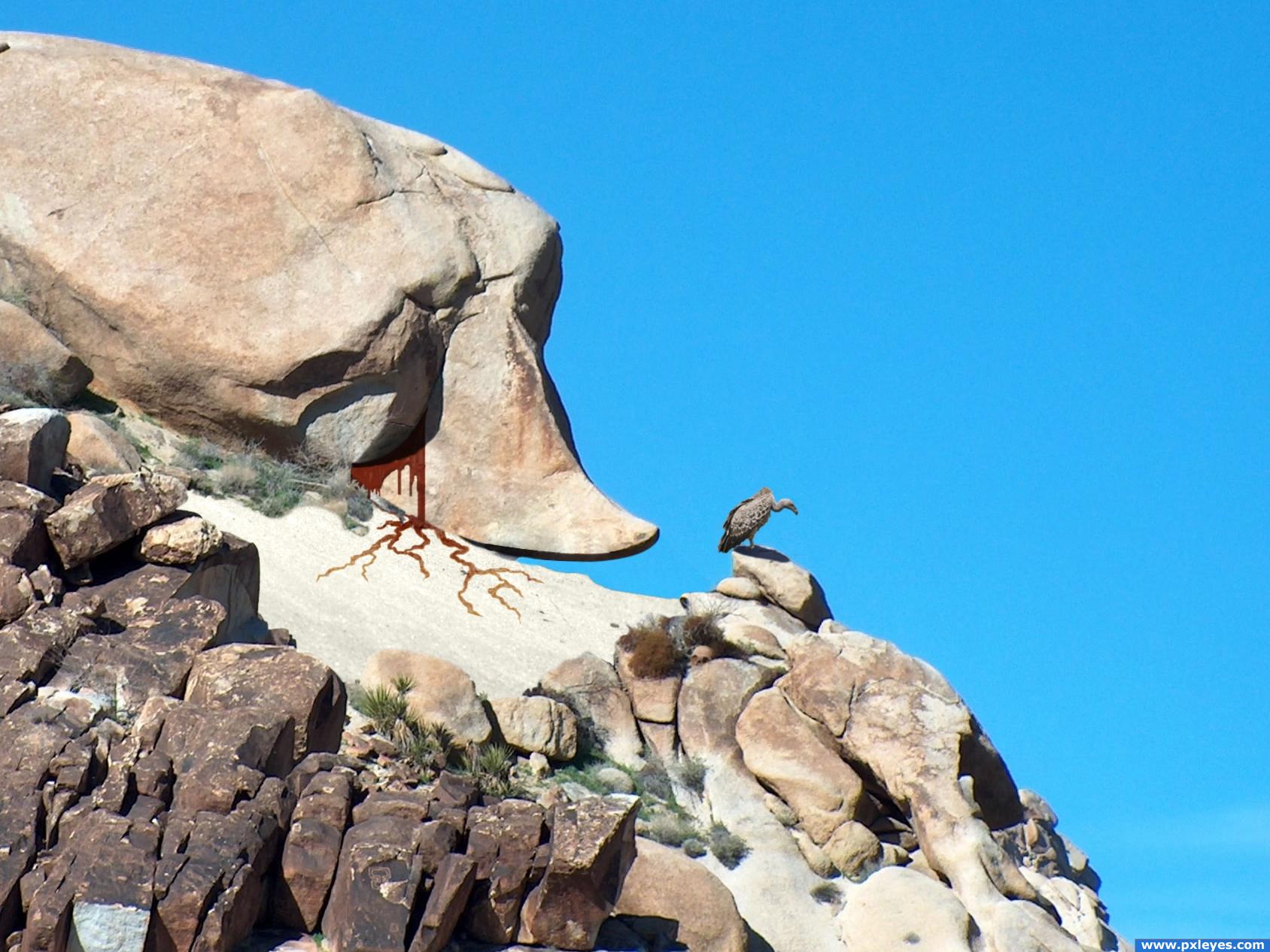
This is a bit of an understated one -- I wanted to keep as much of the feel of the original scene as possible, while making the face even more recognizable as a face.
The "story" running through my head while making this involves the stone giant eating passerby and, each time, experiencing regret and weeping its victim's blood.
Easter egg: find the skull...
Only used 3 outside sources, referenced below.
I'm a bit of a Bézier curve junkie so there was a fair amount of clipping and masking, along with some pixel-by-pixel touch-ups on the desert brush by the rock.
Thanks to Lip Kee for the vulture, Sam Felder for the sand, and Eris for the skull.
Please let me know your thoughts! Thanks! (5 years and 3995 days ago)
i think it has a nice story behind it, and trying to find the skull will keep some people entertained xD Very nice, different image that involves the viewer as much as possible. Good luck!!
i had so much fun with this image... it reminded me of searching for Waldo in one of the newspapers... and i found the hidden egg... but i am not going to say where it is... lol very original...
nice work.. as simple as it seems as an image.. you can really appreciate the work.. the WHERE"S WALDO effect is very well done
nice image i just love the blood its very cool and the descripton is awesome! the cracks look good and so does the overall image!
Howdie stranger!
If you want to rate this picture or participate in this contest, just:
LOGIN HERE or REGISTER FOR FREE
(5 years and 4003 days ago)
Cool! Maybe blur the shadow a bit?
hehe, check my sbs 
AWESOME AND ON THEME... perfect shadow...  Hi Hi marks
oh right sorry i commented before the sbs was uploaded perfect image in that case Good luck!
nice
Am I wrong or is this Mario before the failed experiment? Looks pretty good! Good luck!
haha yep, that's him
Congratulations for 3rd
Aaaand congrats again! Mike was pretty successful this week
Congrats!!
congrats!!
Congrats!
congrats
Congrats!
Howdie stranger!
If you want to rate this picture or participate in this contest, just:
LOGIN HERE or REGISTER FOR FREE
Thanks :mrMark: (5 years and 4027 days ago)
I have sat and starred at this image for like ten minutes trying to figure out what it is that is standing out...I think it's the light on the rocks...A little too bright...Good Luck
Really nice idea.. i just think it needs a little more omph.. like a wow factor..
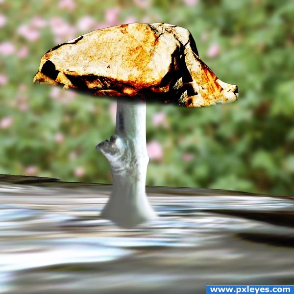
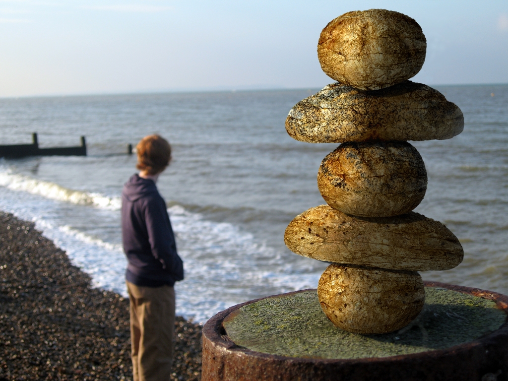
nice transformation of the bread
funny
Level the horizon!
Bread stack thingie looks a bit too sharp. Nice job otherwise. I like the way you created the light source from the existing one onto the figure. 
Seems that fellow had better watch out - they may tumble his way. Maybe they need to be leaning his way to get that WOW factor!!
Nice suggestion artgirl.. i agree! :P
good
good work
Good Luck
very nice
Howdie stranger!
If you want to rate this picture or participate in this contest, just:
LOGIN HERE or REGISTER FOR FREE
Photography and photoshop contests
We are a community of people with
a passion for photography, graphics and art in general.
Every day new photoshop
and photography contests are posted to compete in. We also have one weekly drawing contest
and one weekly 3D contest!
Participation is 100% free!
Just
register and get
started!
Good luck!
© 2015 Pxleyes.com. All rights reserved.


Nice. Very creative imo. Good luck
i really love this!
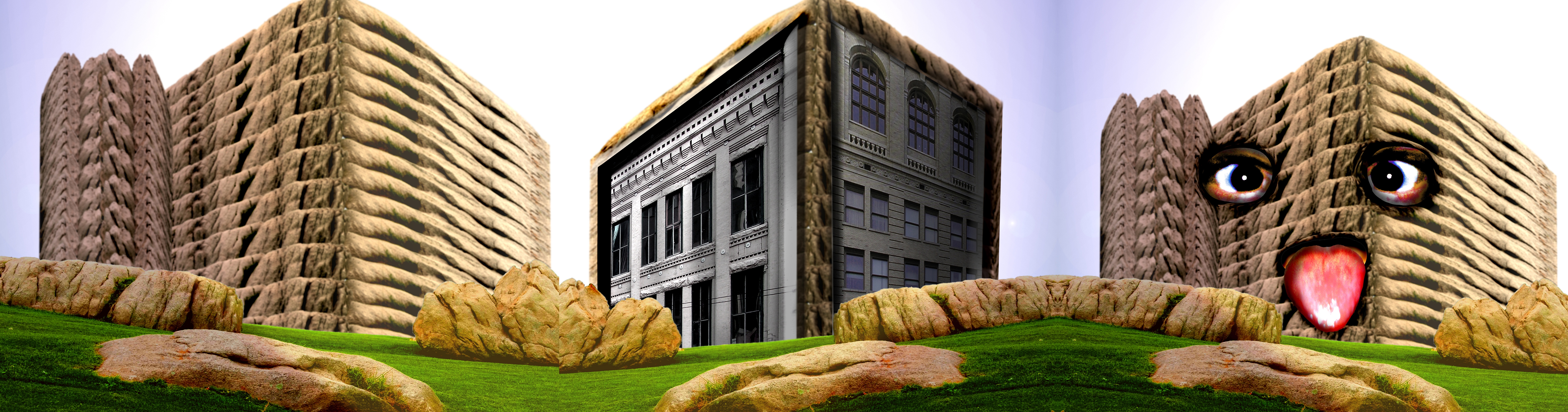
it looks too repetative
hmm i kind of agree with elficho, but then again, if it's a building then it should be the same all around.. so i'm having kind of mixed feeling about this.. i'll vote later on i think, when i can make up my mind xD Good luck!
I agree with you - you did a great job with the lighting. But I'm still with the others about the repetative feeling. Even though thats how the condos may look (I have no idea), there should be at lest be some difference in the texture. So, I'm sorry, but i'll vote later in hope of improvements.
Oh no! Shame on all of you for bullying him into changing it.. damn.. ahh well, i'll keep the high score. Good luck
Not too sure about this on my behalf, seems just a little bit too random and out of place for me, but blending and perspective is good on the building
I agree with ponti55. They shouldn't have bullied you into these changes. I liked the building the way it was. I already voted, anyway.
I like the idea of your entry
I recently watched a tutorial on making tryptych..and this is exactly what it means.. i'm just happy that the author took advice on board and made good changes according to that. Good luck.
Well............hummmmm...........Good luck
Howdie stranger!
If you want to rate this picture or participate in this contest, just:
LOGIN HERE or REGISTER FOR FREE