(5 years and 3289 days ago)
(5 years and 3323 days ago)
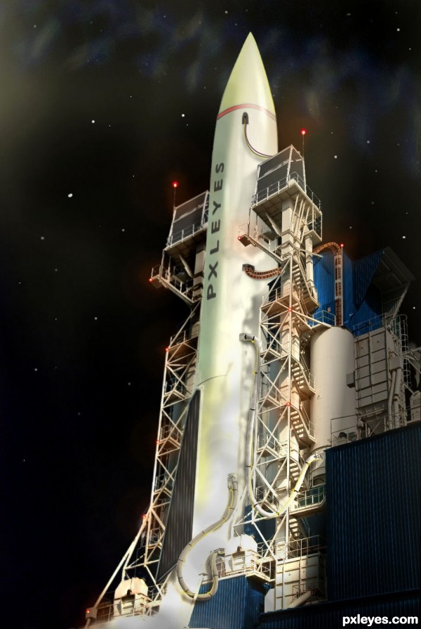
fantastic image author! very well composed..only thing i would change is the spelling of "pxleyes" on the rocket..good luck!
osthir(awesome) idea///... ..high marks from me
The bright values at the bottom are a bit "blown out" and too bright, and I agree that the rocket should be spelled "Pxleyes," but otherwise this is a very nice entry!
Well done! This is very cool, author. It's clever, wtih great additional elements.
ok i have made some corrections 
Well done Author.....
Great job author! Fantastic!!!
cool...
Amazing, perfect! O_O
lovely image you got here 
Very very nice construction author...rocket and all about launch ramp is great...IMHO u should work a bit more on a sky...stars looks a bit unrealistic...best of luck this is great work...my favorite in contest for now
Great job!
great one 
Great use of the source, well done author 
Houston, we have a cool PxlEyes rocket here 
nice! good luck!
Great blending and a great image.... good luck author.
Incredibly well put together image ... great work!
Great entry - but I hope Pxleyes doesn't get blown away again!!!!!!! lol GL
Congrats on your second place.... nice work....!
Congrats on your win
Congrats...
Congratulations!
Congratulations...
Congrats 
Howdie stranger!
If you want to rate this picture or participate in this contest, just:
LOGIN HERE or REGISTER FOR FREE
(5 years and 3536 days ago)
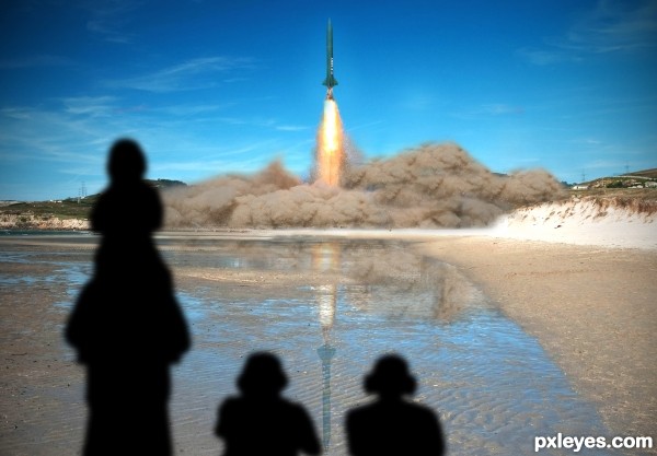
I would've been cool if you had made the rocket from the tower which was already there. Nice entry and good luck!
Author, Chalty had a good idea...it's not too late! 
PS: The reflection would be foreshortened a bit.
Nice idea. And also agree with both. 
The shadows are way too dark. Also the perspective of them (especially the left side) is way off, they're cast on the ground as there are no obstacles, so it shouldn't cover things from the hills.. Now it looks like the shadow is both out of perspective and also miles long.. Scale them smaller and use the perspective tool
are those shadows or silhouettes? either way, they don't really work with this lighting
Howdie stranger!
If you want to rate this picture or participate in this contest, just:
LOGIN HERE or REGISTER FOR FREE
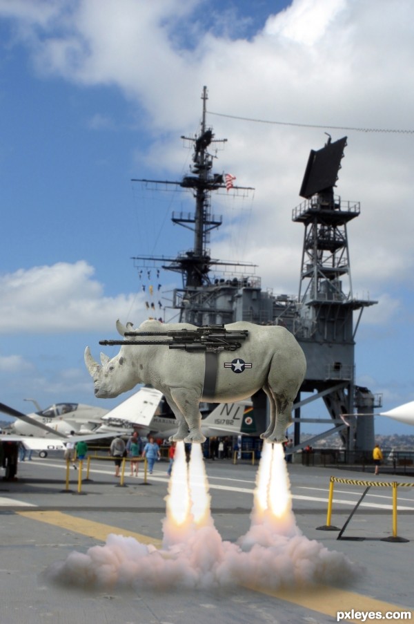
Carrier or land based, able to carry a variety of weapons systems. Range limited. (5 years and 3587 days ago)
Rhino tough haha! I would blend the Airforce decal on his belly a bit and give more vapor clouds around the deck for the amount of thrust it takes to get this weapon airbourne. Good idea Author.
Dawg, not sure what you mean by "blend the decal more", but thanks for the suggestion about the vapor clouds...I think it's a lot better now! 
Kevin, read the description again. It's fine and perfectly on theme. I would just suggest giving the Rhino just a hint of Gaussian blur to make it seem to blend but other than that, excellent idea, unique and well executed. GL!
@Kevin: "The animal must be flying using their own power (eg. by adding wings, a propeller, ....) "...so what's wrong with rocket power?
Josh, the rhino is in focus, the background is blurred because it's the rhino we want to see! Check the SBS.
Rhino must be used to fly, as it looks so cool... hehehe!... 
Nice entry, author, very funny! 
Wow!! Wished I had come up with this idea. lol..
...heat haze....think you could add a little heat haze?...
I came across a chapter in the library the other day. They select and use the ocean ripple.
wow...now live power force...great idea author...gl
nicely done 
haha love it!
Really well done! I especially like the highlights on the lower part of the rhino. Only suggestion would be to change the black point on the rhinos head to match the gun. Good Luck!
hahahaha lolll

Author what i meant on the decal is maybe duplicate it, set to overlay,
then back off opacity on the under layer a bit.
But you did very well with the vapors so it is looking much better 
Good luck to you 
nice work on the smoke and the over blending
 Nice rhino machine
Congrats for your second place, Bob!
Congratulations, Bob! 
i think this should've won
Thanks, Rick!
Howdie stranger!
If you want to rate this picture or participate in this contest, just:
LOGIN HERE or REGISTER FOR FREE
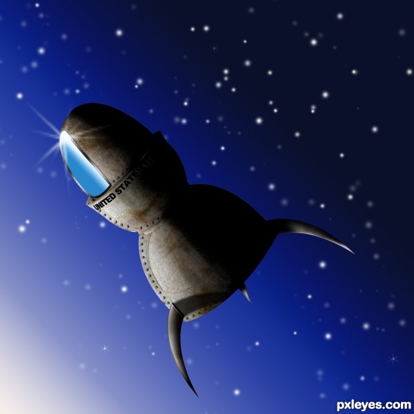
Used layers, styles, brushes, gradient, texture (see credit), dodge and burn, etc. (5 years and 3653 days ago)
love this, just a couple of things you could tweak: the fins wouldn't have any shadow, they're in space and not up against anything; try to give the letters some bevel/emboss for depth (they might have a tiny shadow), bottom fin might have light at the left edge like the back one. love the rivets and rust look, though!

very nice
great idea ! different and wonderful job 

Thanks for the Favs and kudos everyone. Pearlie, I agree with all your critiques as well. The fins I created with a layer style (looking for a metallic effect on the fill) and didn't even realize that I gave them a drop shadow. Honestly, I didn't even see this until I zoomed in on the high res after I submitted! I tweaked per your suggestions (and a few others), and resubmitted. Thanks for the constructive input.
Rofl! Great job, and the title is epic! 
The one fin would have a shadow, but it needs to rotate clockwise about 5 degrees. Good job with the texturing.
Great imagination and creativity.....Good work....
Very good job author...best of luck
great idea  nice work

good and good and good job.... 
very nice and... tasty 
Very very creative! Very creative! 
Thanks all!
good job author 
very good entry! gl
congrats!!!...
Congratulations!!! 
Howdie stranger!
If you want to rate this picture or participate in this contest, just:
LOGIN HERE or REGISTER FOR FREE
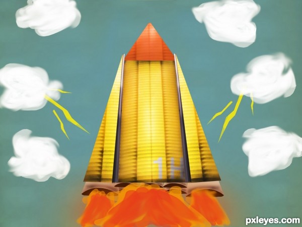
SBS?
you can make the paint brush flames better if you use smudge brush on them
Sbs rdy
Very nice use of the source, GL!
I like the drawing style & the colors you used.
Howdie stranger!
If you want to rate this picture or participate in this contest, just:
LOGIN HERE or REGISTER FOR FREE