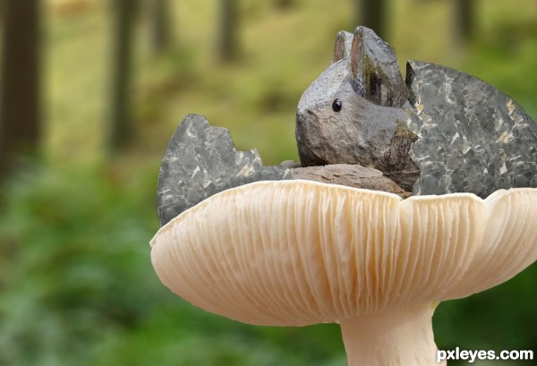
(5 years and 2964 days ago)
- 1: Egg
- 2: Mushroom
- 3: Forest
- 4: Rabbit(Eye)
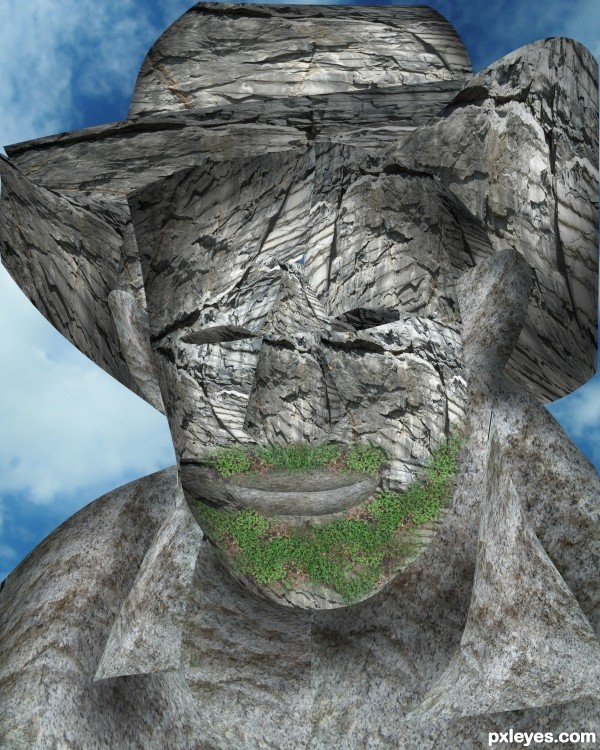
Here's my first try with extensive use of the burn tool...... (5 years and 3266 days ago)
author, you can also put the original pic over all the work you've done and see if any of the blends will help you burn it even more... (I think soft light might work, but the black leather can cause some wonky ness
Good luck though, it's always great to try new things!!!
The idea is pretty cool author,hear what Drivenslush advices,it'll only make your entry look better GL author
thanx for the comments people.... unfortunately i was buzy all week and loged in today.... cant edit my entry now....... anyways i tried your suggetions....and also found out that by desaturating the original image and keepin it above all my work with the soft light blend added a bit of realism and dept....
Howdie stranger!
If you want to rate this picture or participate in this contest, just:
LOGIN HERE or REGISTER FOR FREE
(5 years and 3353 days ago)
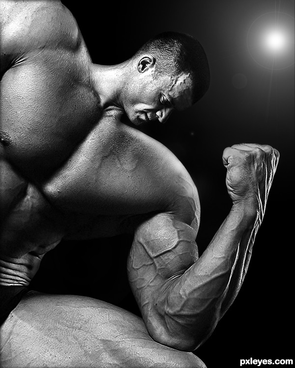
Nice reconstruction of the forehead, but in high res the neck is badly blended into the body, and you need to continue the strong highlight on the shoulder where the head was. This could be great with a few tweaks...GL author! 
Thanks for your advice CMYK46, i try to change that...
hope it's better now.
Looks much better to me, author! 
(If I could be permitted one more small nitpick, maybe blurring the sharp edges you've created would fit better with the rest of the original image, but I love your concept and choice of source material...good luck!).
GREAT JOB!!!!!
wow!
whahaha  Amazing job.. This guy needs a very small pillow and a very big bed.. Great source and great execution! GL author!
Thanks to all for your comments !
GOSH! impressive!!!
no good blending! neck is way too bright!
Shiza you're wrong.  Why so negative?
Dont worry author, Shiza is annoyed for being caught cheating in another contest...... its very nice work..I cant fault it 
Nice chop....Confusing light on this image. To justify the wonderful contrast on this image is to lose the light source (spot light, camera?) in the right hand corner. Get rid of it. That corner should be the darkest part of the image. Looks great otherwise.
The light in the upper RH corner does not match the highlights on the skin, I'd suggest losing it, and I would tone down the neck lighting to match the rest of the body, but overall a nice job!
Top work author...this one will be in top 3 i am sure...listen to me i am pxl prophet...just joking...
My fave, great creation, and love the B&W here = )
Yikes, this would make a great image for a steroid ad! Well done, and the B/W works well for this. 
Congrats!!
congratulations...
Howdie stranger!
If you want to rate this picture or participate in this contest, just:
LOGIN HERE or REGISTER FOR FREE
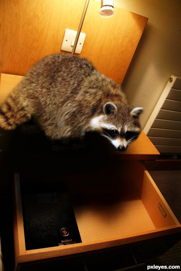
Rocky Raccoon
Checked into his room
Only to find Gideon's Bible (5 years and 3635 days ago)
Good luck 
Nice! Just the angle of paws isn't matching... 
good one,
Very nice work author...great shadow...good luck
beautiful job.... 
cool
just had to leave this in your comment box. :P totally funny link to a youtube video of this song. sooo funny
http://www.youtube.com/watch?v=nucSvl7VXVM
good luck author!
Nice work...gl

nice work........ all the best........... 
Congratulations for 3rd
Congrats for your third place, Loyd!
Congrats CHAPPY!!!!
My friendieeeee, congrats on 3rd!!!! 
Congrats Chappy! 
Congrats!! 
Congrats!
Howdie stranger!
If you want to rate this picture or participate in this contest, just:
LOGIN HERE or REGISTER FOR FREE
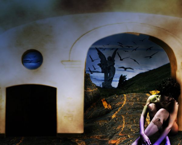
thnkx to all these fantastic people which allowed to use their stock:) (5 years and 3697 days ago)
Howdie stranger!
If you want to rate this picture or participate in this contest, just:
LOGIN HERE or REGISTER FOR FREE
great idea ..... the egg still looks a bit flat. maybe stronger shadows too , otherwise very cool image .
good luck
Howdie stranger!
If you want to rate this picture or participate in this contest, just:
LOGIN HERE or REGISTER FOR FREE