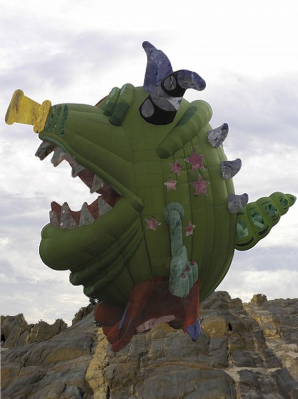
i posted it because i think it needs something but dont know what it is (5 years and 3681 days ago)
- 1: "monster"
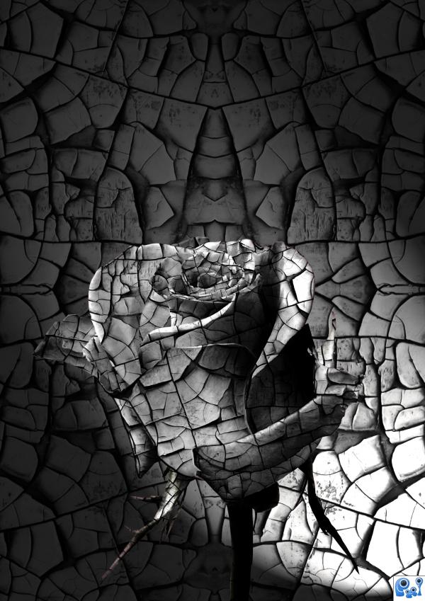
(5 years and 3789 days ago)
looks great! 
nice one
simple but very nice
Some color to make the rose pop from the background will make this better...
I agree that a little color will enhance this image. I like it anyway! 
agrees with color enhancement. NJ.
great!
beautiful in its simple colouring. B & W brings its own beauty in this image. GREAT WORK. one of my favs.
wonderful 
Howdie stranger!
If you want to rate this picture or participate in this contest, just:
LOGIN HERE or REGISTER FOR FREE
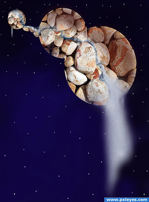
Designed in Adobe Photoshop Elements V. 7 (5 years and 3860 days ago)
try dodging and burning the planets to add depth, they look very flat right now.
I'd try to find a source for real water, but good idea...
Thanks for the meaningful comments ponti55 and CMYK46. I will keep that in mind for future entries.
If instead of cropping image into exact circle,u may go for some uneveness ,so to enhance the effect of rocks.however good concept ,nicely done
Thank you nehayash. I like your idea...Will keep that for future reference.
Howdie stranger!
If you want to rate this picture or participate in this contest, just:
LOGIN HERE or REGISTER FOR FREE
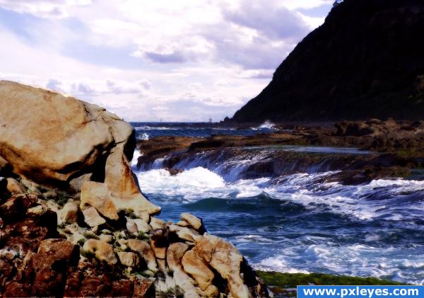
these are free stock
images from turbo photo please any help is appreciated (5 years and 3893 days ago)
its a nice image but you might want to darken the rocks a tad they are kinda taking away from the beautiful background but the image, overall, is great! 


much better!!!!!!!
Looks nice!
very nice...
Please fix link 1 so it leads to the individual image.
why is the hill so dark? it looks almost like black fill
Howdie stranger!
If you want to rate this picture or participate in this contest, just:
LOGIN HERE or REGISTER FOR FREE
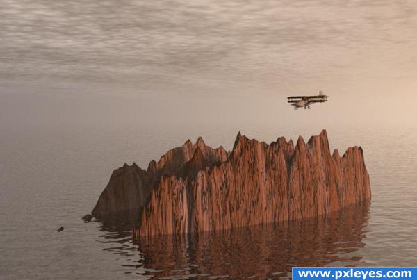
The job of a rocky island aviator is to discover, explore and land on the rocky islands. Usually they are hired for a single mission, no life insurance included..
Bryce 5.5 and 3DS Max.
My first contact with Bryce 5.5 , a free and friendly 3D graphic software .
Also see a very good tutorial for beginners in Bryce made by Robvdn ( ? ) , here
http://www.pxleyes.com/tutorial/Photoshop/1218/Beginnersguide-to-Bryce.html
Edit. Using for the first time Bryce I used on this entrie some preset materials. Only today I discovered the fabulous Mat Laboratories which allow the user to make his own map and materials. Nothing against the rules but I'd like that you know what you vote. (5 years and 3895 days ago)
I don't think that would be the worst job.. it would be scary as all get up.. hehehe.. and you'd have to put a gun to my head to get me to do it LOL.. awesome job of getting the ball rolling author... GOOD LUCK!!!
great image!
Looks good.. not necessarily a bad job.. to make it seem worst you could add more cliffs.. a lot more.. Good luck!!
Good job. I think the propeller should be spinning, though...
terrific entry, CMYK has a point about the propeller, great sbs too 
I'm not sure about the sky and the ocean line, it should be more realistic. Good luck.
Thanks for comments. CMYK, the propeller is spinning now with some motion blur from Photoshop, thanks. But according to the pilot mission this will not be for long time 
japanese suicide airplane flying people would be perfect for this job 
Nice work on this....& top job for your first go with bryce! would have been nice to see some more rocky islands in the background just to break it up a bit....
Howdie stranger!
If you want to rate this picture or participate in this contest, just:
LOGIN HERE or REGISTER FOR FREE
You could start with removing the ropes...
Almost, still some rope under the chin...
EDIT: got it...good luck!
hehehe. took me forever to figure out where I've seen him before.. hehehe.. what a wonderful source to merge in.. good luck author (MONSTER...dot com...)doot da do
clone the text away =)
Monster? It's not so scary...
How about putting slightly a shadow under the "monster"? Note: slightly, because it's cloudy on your pic...
Author, your image was better before...he's not against a flat background, so remove the shadow on the clouds and leave the shadow on the rocks.
PS: I'm hoping you'll heed my suggestion, so I'm giving you a good vote now in hopes you won't mess this up.
Ah, CMYK is right, the shadow is only under the subject. You can't see shadows in the air... Fixing it everything will be nice!
LOL...very nice work...good luck author
haha funny
Howdie stranger!
If you want to rate this picture or participate in this contest, just:
LOGIN HERE or REGISTER FOR FREE