If you want to see the picture really really close, take a look at the hi-res. ;) (5 years and 2644 days ago)

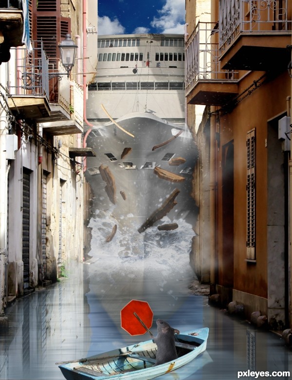
A cruise liner makes a wrong turn...poor little rodent. (5 years and 3734 days ago)
Excellent image! Very creative.. great job with the debris and the subtle details like the broken pipe... very, very good!!
The water area in front of the ship should be a bit darker (because of the ship) and the waves should be stronger (by looking at the debris, I can imagine how fast and strong the collision is). Also, these debris seems to be big (I feel like the houses are made of ... wood or they are going to be collapsed before the collision). What I like the most is the water splash from the broken tube (high marks in this, because you have to think about the detail very well). Just some suggestions to make it more realistic, IMO. Aside from that, you did a nice job with creative, funny idea, good luck 
Thank you very much ponti, and thank you langstrum.  Both your opinions are much appreciated. Langstrum, good call with darkening the water. As for the waves, I wasn't quite sure to begin with...do you think a splash would work better? As for the debris chunks, are you saying they're too big? Sorry, I didn't quite get what you said there. Thank you.
Great job on the debris. That was my first response. Lighting, etc. Impressive. I do agree that the waves in front of the ship should be a bit bigger...If it can push buildings, it can push water.  Great work, and very creative idea.
Alrighty now...BIG SPLASH!! I also darkened it a bit as per Langstrum's request. I tried to do darker but it destroyed the boat's reflection. Any better now, everyone? Thanks! 
I really like this one. There are a couple things I would change, but overall you have the WOW! factor.
Really cute and funny idea! I think the wave still needs some work IMHO. Thanks for the laugh!
What a pity that you can't edit it anymore. The wave needs more works (it's darker but in the top of the splash, it's always brighter  ). Anyhow, it's better, stronger than the first one
I know, Langstrum.  I just managed to get the wave uploaded around 2:30 yesterday before having to run, and I only later saw some things that could have used a little work. Still, I'm glad it looks better than before. Thank you for all your feedback.
This is Great work! well done 
Good work and best of luck!
is sandra bulloks driving this
It reminds me that movie... Speed 2! Great work and effects!
Poor residents, too! 
Howdie stranger!
If you want to rate this picture or participate in this contest, just:
LOGIN HERE or REGISTER FOR FREE

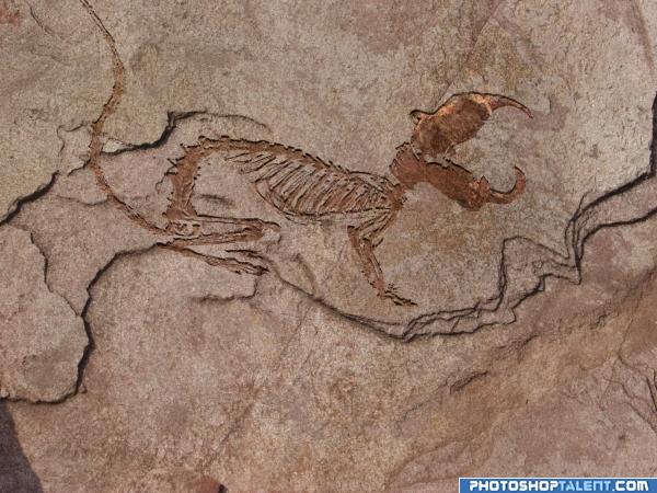
A small rodent with rather large teeth. (5 years and 4028 days ago)
way cool great
nice work 
nice
nicely done this.
Nice work, very realistic, and scary to think what the rodent looks like 
RIGHT ON TARGET.. Locked and Loaded... excellent job
Well done Author ......G/L.
Congratulations for 2nd
Congras!
congrats
congrats
congrats Animmax! 
Howdie stranger!
If you want to rate this picture or participate in this contest, just:
LOGIN HERE or REGISTER FOR FREE
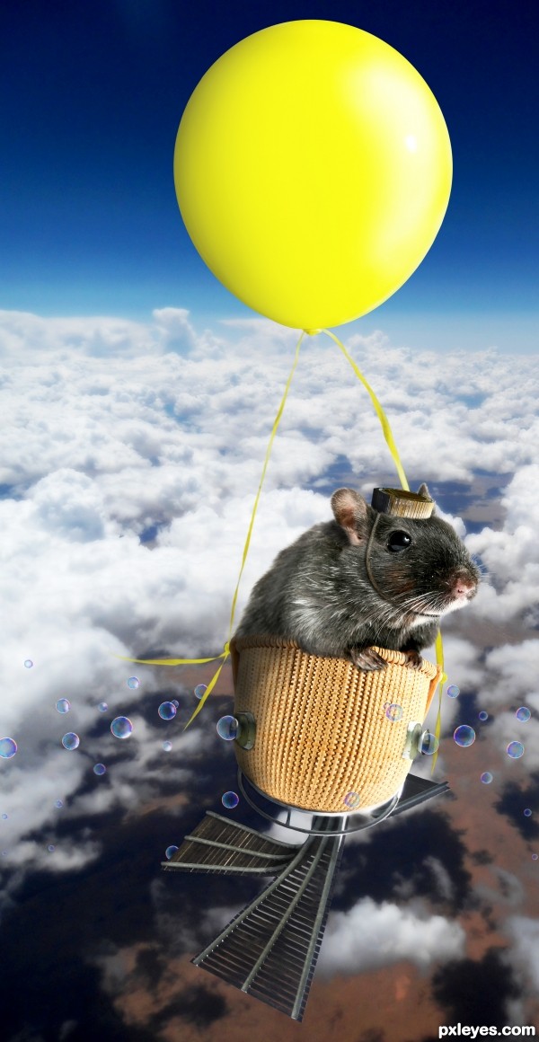
Nice work, I like the bubble machine on the side of the basket.
Thank you for the nice comment!
Poor boy... or happy boy, depends of point of view... good job! GL
I wanted to create a happy atmosphere so I hope he seems happy. Don't forget he has those bubble machines so he has the situation totally under control!
It´s the cuddly, cute, and adorable version of Felix Baumgartner
Nice work! Very imaginative image. Playful and fun. Love the bubbles!
Thank you!
Nice image
Howdie stranger!
If you want to rate this picture or participate in this contest, just:
LOGIN HERE or REGISTER FOR FREE