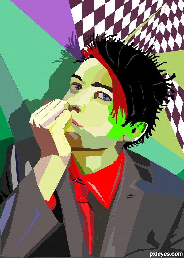
Used pen tool to create a path for every shape using only straight lines.... please see hi-res. (5 years and 3144 days ago)

This is my second entry on a contest. (5 years and 3706 days ago)
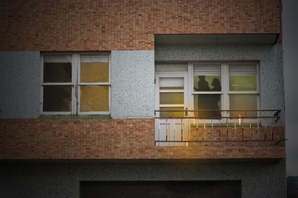
If it's a real couple, they are a little small comparing to the window and the door, and where are their feet?
Ooops. I had another view of the image. Thanks! I edited it. I hope this time the size is ok.
Ah... a silhouette... romantic!
Another suggestion: try to see an actual silhouette like that behind a window glass... Maybe it needs a little bit of blur and less opacity.
It doesn't look romantic :S , Looks like she has him against the wall and is threatning to thump him. Perhaps use lanters instead of candles, the flames look orange,
@Barnacle,damn man u are right looks like some naughty game,but for some people maybe is this romantic...@author...nice work,,,try to use real candles this look a bit unnatural...good luck
Howdie stranger!
If you want to rate this picture or participate in this contest, just:
LOGIN HERE or REGISTER FOR FREE

To create this I have used: blending options, filters, masks. (5 years and 3723 days ago)
u need to add the link for the source image
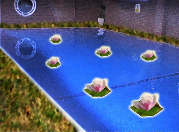
pool image is my own
Very arty 
nice idea
nice....
Howdie stranger!
If you want to rate this picture or participate in this contest, just:
LOGIN HERE or REGISTER FOR FREE

Thanks to eirian-stock
http://eirian-stock.deviantart.com/art/Romantic-VII-105857985
Thanks to kelly63
http://kelly63.deviantart.com/art/Early-Morning-Stock-102100060 (5 years and 3954 days ago)
very nice usage of sopurce and good selection of image. want to see high res image
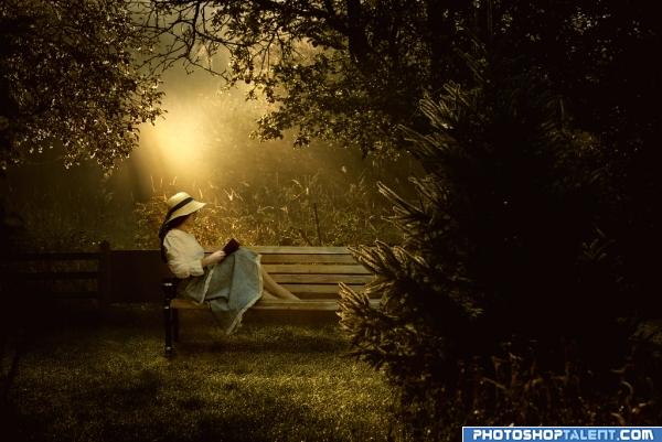
Really nice. Almost a Thomas Kincade look. Shadow work is outstanding.
Good blend and mood! 
great mood
very good masking, i like the mood, good job
very hug myself feel.. good luck author.. great use of source
Excellent image....great colors, beautiful lighting! Maybe you want to mask the fir tree just a touch better, I can still see in high resolution some white/yellow lines around the branches! Best of luck!
wow wonderful photo...intense... 
real nice effect 
Awesome Entry.......... Nice lighting........ Great Mood............ Good Luck Author.
Really well made, excellent blending.
Thanks to all for comments. Nellista thanks for pointing out masking issue. fixed it 
Wow...what an amazing piece...you are really good.
Very atmospheric piece of work very skillfully done!
Wow...what an amazing piece...you are really good.
good job authur
neat picture
BEAUTIFUL! Mood is amazing!
Very good.... good luck
Nice atmosphere.
Very nice mood. I love it! 
nice
Beautiful. Nice job!
i love this one as well!! good luck 
wow......gr8 job......Just love the mood of the image....gr8 source selection.
beautiful 
Lovely


Nice mood. The only possible problem is maybe that in the original girl photo her feet are hidden behind the seat of the bench (I guess because the seat is a bit lower in the middle), while in this image you can almost look upon the seat of the bench. Because of that, the feet look a bit chopped off, especially her left foot. In case you'd like to fix it (maybe give some elegant ballerina shoes?), would be great. Good luck!
beautiful!
Indeed romantic.Very good image.
beautiful!!! 

Well done and well-titled! Very nice effects...
Super romantic, beautiful and smooth image! High, high vote! GL
Congrats, beautiful work 
Congratulations for 1st
great mood, congratulations 
congrats
congrats
Congrats! Beautiful image 
Congrats for 1st 
Howdie stranger!
If you want to rate this picture or participate in this contest, just:
LOGIN HERE or REGISTER FOR FREE
Nice job! I tried this and went nuts.
very nice
Very cool! It never hurts to have a great start image, but your reconstruction is awesome. The red collar and cuff to match the red tie while the body of the shirt is gray is an interesting fashion choice.
I would consider making the 'white' of his right eye lighter.
The white on the ear is too distractingly bright for me personally. And the day-glo-green left cheek seems overly intense.
The pale-green shape on the neck also seems out of place. I would rotate it clockwise a bit and and have the bottom edge end at the red collar. Part of the problem may be that its lightness (relative to its immediate surroundings) is too 'foreground' or 'highlight' when one would expect that area to be background/shadow.
Lovely colors, nice job author.
i agree wid Minnie author.beautiful colors and well made
oh and high vote and fav for you author
good luck
Nice work, I like that you added a shadow. Nice effect with the red in his hair.
Congrats Gino!! Great entry and a good looking young man you've got there!
Howdie stranger!
If you want to rate this picture or participate in this contest, just:
LOGIN HERE or REGISTER FOR FREE