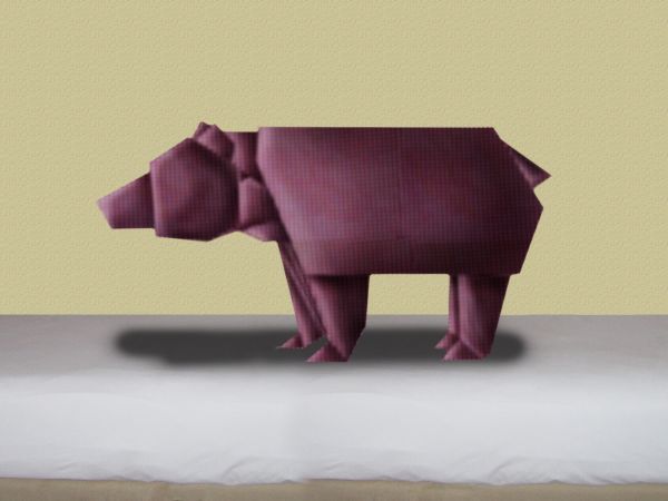
(5 years and 3719 days ago)
- 1: bed
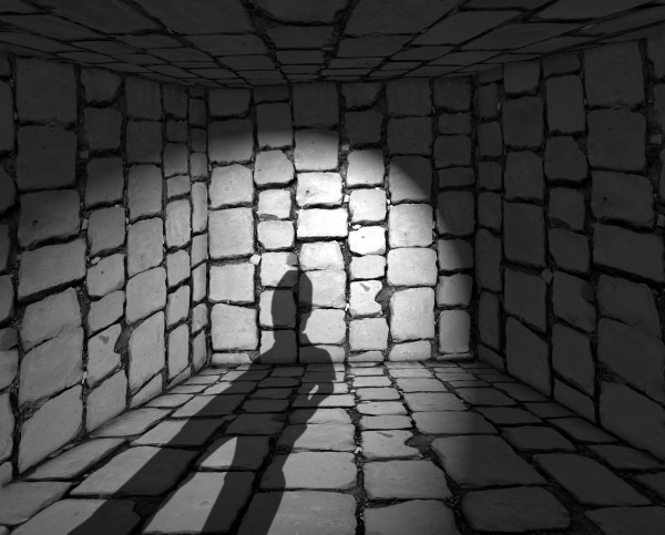
(5 years and 3753 days ago)
very good use of source and original. GL
Howdie stranger!
If you want to rate this picture or participate in this contest, just:
LOGIN HERE or REGISTER FOR FREE
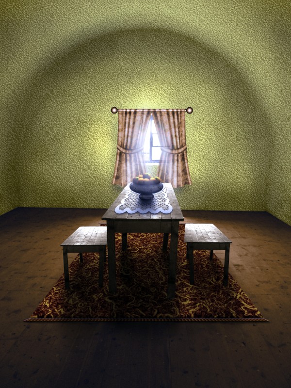
no outside sources (5 years and 3759 days ago)
That is a nice change to the empty room, and also a nice entry....gl author.
Good work, I was thinking of doing something like this my self.
Great idea, and a wonderful change!
Wonderful room,nice chop Author

Furniture looks good, curtains not so good, wall texture, color & lighting not good...
The vanishing point on the benches is much lower than the vanishing point on the table. nice job on the floors and the rug
well done author... just a small nitpicking... there should be a smooth merging of light b/w wall and floor... presently wall is bright even where it touches the dark floor....
Great sbs, love the making of the carpet, the best use of glowing edges I've ever seen 
Looks like Martha Stewart chopped it  I agree with pingenvy's comment. The perspective looks off because the benches don't match the table. I would try to line up one of them .
thank you all for your kind comments and suggestions! i agree with all of them but, unfortunately i can't make any changes right now.
thats cute but if the wall was further back the room would look bigger
Nice work author. Texture wall did'nt work for me. Also shadow of windows curtain and rod is missing. Overall nice image 
Howdie stranger!
If you want to rate this picture or participate in this contest, just:
LOGIN HERE or REGISTER FOR FREE
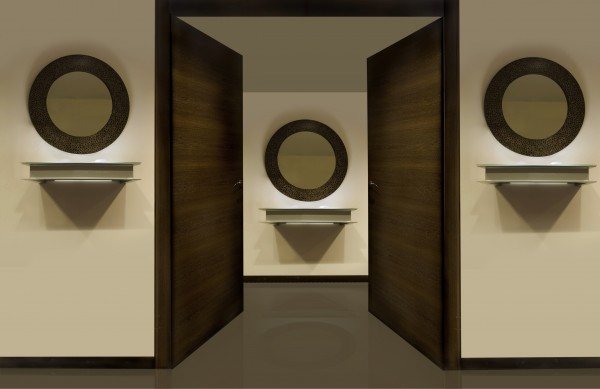
(5 years and 3765 days ago)
Good job, but fade the near part of the reflection on the floor...
Simple but well chopped.
Congrats! for 2nd
Congrats,
Howdie stranger!
If you want to rate this picture or participate in this contest, just:
LOGIN HERE or REGISTER FOR FREE
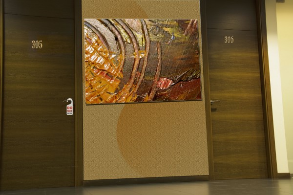
transformation from toilet doors to hotel room. would like to thanks fugue for the painting pic. (5 years and 3765 days ago)
Good change, just tweak the perspective on the painting a bit...
i dont think the paint is lined up right. i would work if you lined the door lines with the painting
Agrees with painting perspective comments
thanks all 4 comments but i can't understand what to change , i've manipulated the painting. the pic is a view from left to right so i've done according to that . but syill would love to get more feed backs .
Use the Transform Tool to change the bottom of the paiting. Its sides should be parallel to the doors frame 
Listen to Divair. 
thanks all n divair u too for comments i've changed as per your instruction and given steps for image perspective changes plz let me know now its ok or not
It still looks out of perspective. Try free transform/skew.
Almost there  But if you pay attention, the texture you applied to the wall is out of perspective too. It may affect the general look, causing the illusion that the perspective of the paiting is wrong...
Use skew for the image perspective and add some shadows on the wall texture to create more realistic look...beside that not bad at all...
Howdie stranger!
If you want to rate this picture or participate in this contest, just:
LOGIN HERE or REGISTER FOR FREE
Nice
Funny and Creative.....Good work...
Hee hee, too cute
Nice idea, lots of creativity. You should icnrease the shadows near his feet
good eye akassa, but how dark. i don't want people complaning its to dark, you know. thanks though
The image is great, but the shadow i think lets it down.. it seems very unrealistic...
Howdie stranger!
If you want to rate this picture or participate in this contest, just:
LOGIN HERE or REGISTER FOR FREE