(5 years and 3862 days ago)
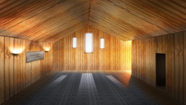
A fairly plain room, but i have tried to add some interest by using lights and shaddows. (5 years and 3871 days ago)
I like this one! A couple of goofy things though from what I'm seeing: the sunlight would stop seeping into the room at the top of where the ceiling meets the farthest wall. Presently it is above that line a little bit? Also, it may be correct, but the top of the dark door on the right looks tilted and doesn't seem to match the ceiling line above it. Still, great job on this!
Great job on this
very appealing!
This is good but silver surfer was right about the door. Other than that, it's very well done.
Thanks for your very keen eyes SilverSurfer and jawshoewhah. I have now corrected this if you haven't already voted.
Perfect work, the lighting effects look so realistic 
Much better!
this is a very skilled image. love the lighting from the windows and side lights.
Very nice use of source.. i love the light.
Congrats for your second place, Fezjez!
Congrats! You earned it 
Congrats!
thanks for all who commented and voted.
congrats!
Congrats!!
congrats 
Howdie stranger!
If you want to rate this picture or participate in this contest, just:
LOGIN HERE or REGISTER FOR FREE
(5 years and 3879 days ago)
Good work, but if you used the tutorial be sure to give it credit.
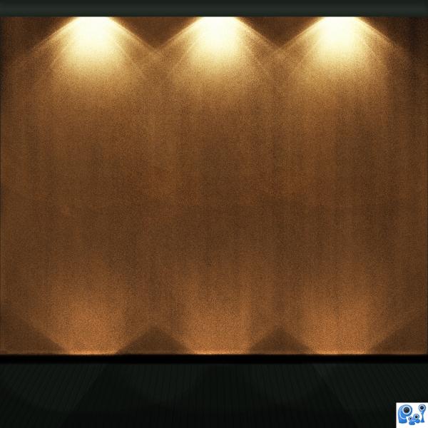
Now, this is a cool way of making lights, but really, you could've done it on something more complex, not just a wall....
Good work, but Ponti5 is right, you should link the tutorial. Good luck.
Nice job! Would have been a bit more exciting if you had something in front of the wall/curtain receiving the lighting. 
Howdie stranger!
If you want to rate this picture or participate in this contest, just:
LOGIN HERE or REGISTER FOR FREE

(5 years and 3917 days ago)
Why do i like this so much? I really don't know, it pops out at you! Good luck author.
Edit: After looking at the high res it seems that some of the selections on the right hand side are a bit jittery, whereas they seem nice and curved on the right, but it's not a huge problem. Good luck!
Re-Edit: Excellent 
Thanks Ponti, must have been too tired...edges cleaned up. 
nice job
i
Well done! The way this looks, it could have been the source pic. Nice job, author.
simple yet artistic. nice job author. 
Howdie stranger!
If you want to rate this picture or participate in this contest, just:
LOGIN HERE or REGISTER FOR FREE
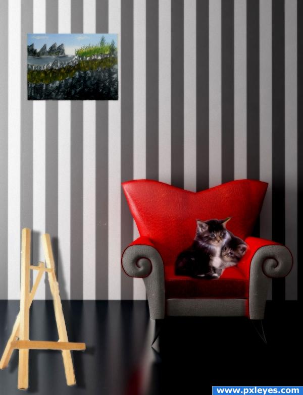
the painting on the wall was done by my husband (5 years and 3966 days ago)
this is very clever but you got to make it more yours.. a simple shadow around the picture .. added density to the easel and a nice refresh blur around the cats. you have the talent..go for it..and good luck
and will you please tell your husband to go for it.. I can't make out the work.. but He's got an obvious talent.. might as well use it
(high res would be a big help)
nice work! try to blend the cats with the background picture. good luck
I would either put a frame around the painting or use drop shadow/bevel/emboss. Right now it looks like a piece of painted paper taped up on the wall. Really nice otherwise.
Howdie stranger!
If you want to rate this picture or participate in this contest, just:
LOGIN HERE or REGISTER FOR FREE
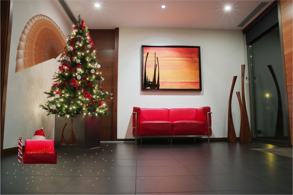
Hey...I think you've totally improved that print in the frame by adding that wood sculpture as a silhouette in black. Nice.
I agree with the Kid, but you made a balls of the tree pot. Also, not a lot of manipulation here, any donkey can flip an image and the parcell looks terrible and the little sparky things on the floor dont have reflections and the fan... nice job thoughh
Howdie stranger!
If you want to rate this picture or participate in this contest, just:
LOGIN HERE or REGISTER FOR FREE