Thank to
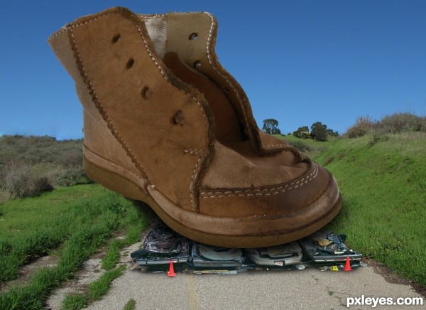
GiniMiniGi: boot
gdmanning: cars
dlockeretz: road (5 years and 3170 days ago)

(5 years and 3174 days ago)
Good blend & composition...GL author! 
Great image, it tells a story!
Thanks a lot!! 
fantastic work author
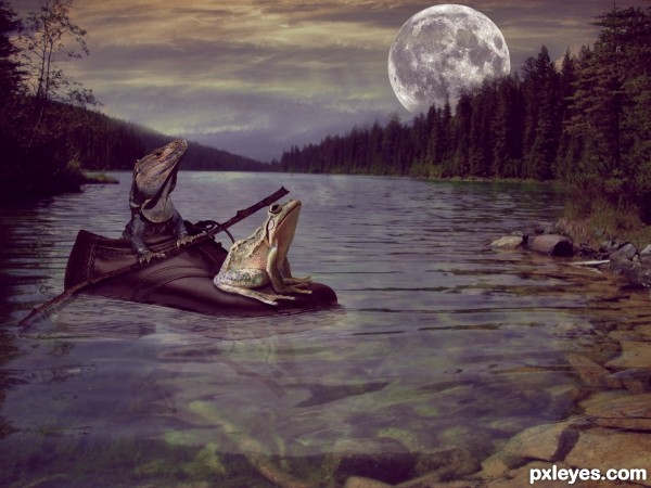
I like this a lot  Just a small nitpick ..there is too much luminosity rupture between the frog and the lizard..frog is just too bright imo...darkening the background, adding lantern at the back of the shoe (will match the lightning sources then) and little dodge and burn can make this image awesome..love how you blend the shoe in to the water though..anyway.. fav. from me
Thanks derdevil, I see what you mean. In fact I do have an adjustment layer for changing curves on the frog (I think I forgot to post it in the SBS). If I have time I will try to burn a little...
Thanks kush!! 
I really like this, too. It looks like it could be a scene from Frog and Toad stories, or Wind in the Willows. The frog looks like he has real weight on the shoe. Great job with that shadow there!
Just a couple of observations: wouldn't there be a reflection on the surface of the water of the shoe and the critters (maybe even some moonlight) like there is for the rocks in the center-right? Also, I don't think the "oar" would have that kind of drop shadow on the water surface. Wouldn't it be a reflection rather than a shadow, and somewhat rippled? One final observation: the moon should be solid. It can be dim if you like, but drifting clouds would pass in front it, not through or behind it.
fantastic scene author...best of luck
Great composition,good luck author ! 
Thanks for your tips, elemare. Changed the moon, put reflection of the twig and a very slight reflection too of the frog and shoe. I also darkened the frog a bit. Hope it's better!! 
Thank you erathion and dubhy63 for your nice comments!!
Very well done!!! Lovely image! 
Your improvements are subtle yet they make a significant difference.  Best of luck!
Thanks again elemare for your sugestions!!
Thanks Daniela for your nice comment! 
Howdie stranger!
If you want to rate this picture or participate in this contest, just:
LOGIN HERE or REGISTER FOR FREE
The boot doesn't look like it's on the ground behind the cars...brush & grass should overlap the edge. Sharp edge of the sole could use a bit of blur.
Love the concept author,
It's edited now, thank you for your comments.
Howdie stranger!
If you want to rate this picture or participate in this contest, just:
LOGIN HERE or REGISTER FOR FREE