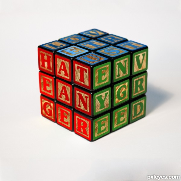
I tried to convey the simple separation of emotions before the mixup of 'growing up' inevitably destroyed what we knew as children, with the good starting out on top. (5 years and 3061 days ago)
- 1: source1

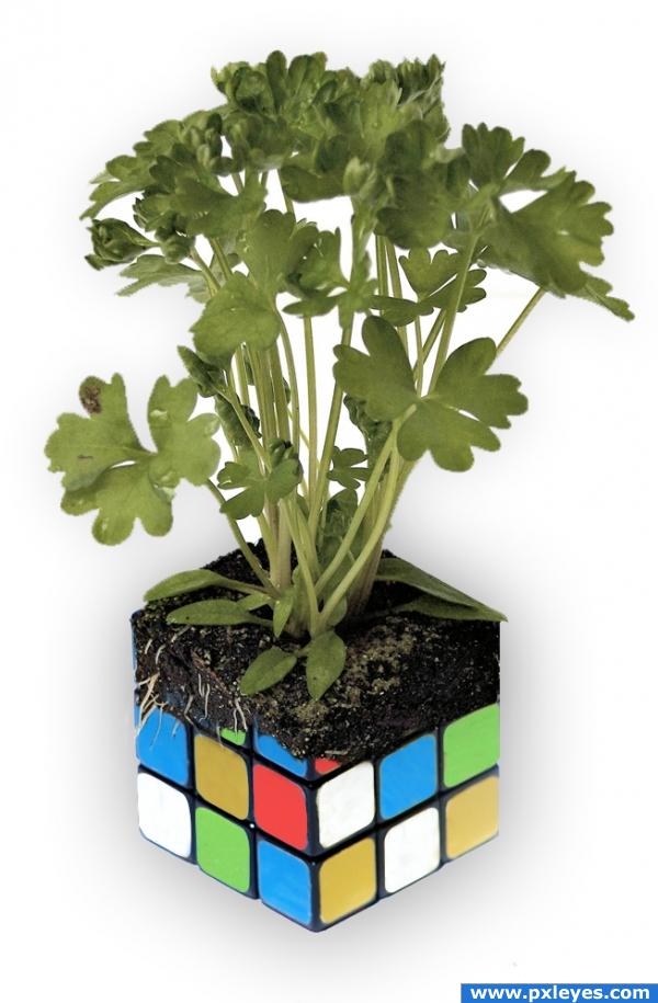
My first contest submission. I was going for a combination of the organic and the mechanical. Created using masks and the cloning stamp tool for color changes. (5 years and 3927 days ago)
Not bad for a first, good luck! 

very nice image (hehehe.. I remember pulling those a part and then reassembling them to solve them, until my brother showed me how to just remove the stickers... OY..hehehe) very nice image good luck
nice image
I like this, but maybe the change should be a little more gradual, to have a more natural bio-mechanic feel to it. Either way it's very nice, so no worries if you're happy with it the way it is. Good luck!
Good job
Like this one good job!!
Interesting...........needs shadow and seperation from background!
very nice 
Howdie stranger!
If you want to rate this picture or participate in this contest, just:
LOGIN HERE or REGISTER FOR FREE
Great entry, inteliget blur, good luck!
very nice use of source great expressing image
It would have read easier if you had made each word a different color, rather than each side like a Rubic's Cube.
agree with mossyB , but hey it's not words contest , it photoshop contest and it's my favorite ......... clean work keep up
Thank you guys. The color choice was deliberate as they are the color of the emotions. ie anger = red, jealousy = green, positivity/love = blue. The thought was when you are young these are easily distinguishable, but as you grow older and mix up the cube they become mixed up, the same as the puzzle does..... I may have spent too much time on this entry hahaha
What a great job!
well thought out and well executed
Very imaginative...I like the word colors the way they are. GL author!
Simple composition...which is a great thing! I too like how the letters are positioned and the color choice. Though it's simple...I'm not implying that it was easy or quick. This is time consuming with all the transformations of letters etc. Great job, author!
Cool work..like it a lot!
GL.
Very creative concept, author, and use of this source.
excellent work, i love the execution looks realistic... and the use of the source image is clever!!!
Good use of source and excellent work......Good Luck Author.
Congrats, very well done
Howdie stranger!
If you want to rate this picture or participate in this contest, just:
LOGIN HERE or REGISTER FOR FREE