Ruins by IreneIs: http://www.sxc.hu/profile/IreneIs (5 years and 3012 days ago)

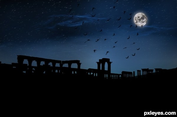
Night in ruins thanks to http://www.photos8.com for providing photo of ruin and moon, rest of all done in PS!
(5 years and 3509 days ago)
It's too dark...With that large of a full moon, the ground would be illuminated, not pitch black with backlighting. The moon illuminates the entire planet, not just sections. In the fall, the "Harvest Moon" is so named because it illuminates the Earth enough that crops can be harvested at night.
I like the mood. Yeah maybe the moon can cast more light, but I like it how it is.
It's like when the sun just set and your eyes don't instantly get used to the new light so everything is darker for a few minutes, before your pupils dilate.
I didn't know that, MossyB, I learned something new today about the harvest moon. And I agree with greymval, I really like it. It looks like a really good photograph 
Thank you all for your feedback. 
Very cool entry author...well done
Howdie stranger!
If you want to rate this picture or participate in this contest, just:
LOGIN HERE or REGISTER FOR FREE

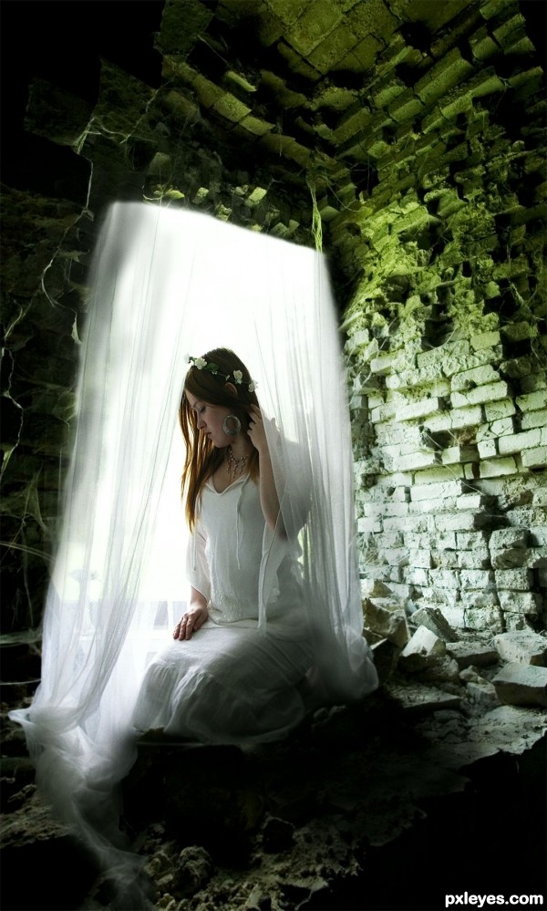
Thanks for the source image and thanks to Eirian-stock for the pic of the girl.
Suggestions are welcomed! (5 years and 3562 days ago)
Figure is distorted. Hold shift key when resizing.
Thanks CMYK...I thought it was distorted too but after staring at the source image for so long my eyes were beginning to play tricks on me!
I have gone back and made changes  Thanks
Sorry, but it's still distorted...try doing an overlay with the source pic. GL. 
Beautiful... but, as CMYK said, girl's image is still distorted (head is slightly stretched). And the curtain upper edges need to be sharp like lower ones. 
Thanks CMYK and Erikuri for you helpful suggestions...I have gone back and started from the beginning, but I think I have fixed the distortion. Thanks again for your suggestions...they are very helpful to me 
Thanks Nator for your nice comment!
Still a little bit distorted ( if you look too the head)
But I don't get the upside of the picture of the girl, you should fix it little bit more.
It also looks like the girl is floating or something..
well good tough !

Not sure how you are seeing it distorted still since the image was not changed in anyway...Go look at the source image for the girl and you be the judge 
Thanks for the comments 
Lol think I just had a bad day ?
Since there is no visible form of attachmentat the top of the fabric, I would suggest cropping it to run off the page. The bottom 3/4 is very effective, but the way the drapes end at the top leave me confused. good luck!
Pingenvy thanks for the suggestion...Unfortunately my computer crashed so I won't be able to try your suggestions...Keep your fingers crossed I can get up and running SOON 
I like it author,mood is perfect...good luck
Congrats Christy...well done
congrats
Congrats!!
congrats for your 3rd place
beautiful!!!!!
Howdie stranger!
If you want to rate this picture or participate in this contest, just:
LOGIN HERE or REGISTER FOR FREE

some info about Tikal ruins
http://en.wikipedia.org/wiki/Tikal
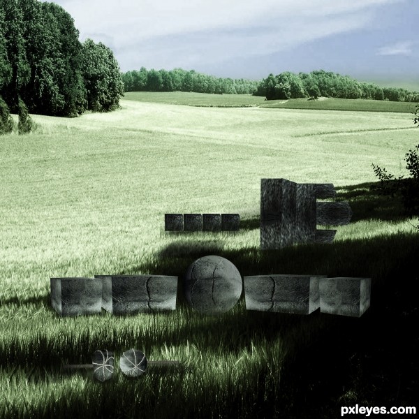
I decided to make the start of the construction... so they have almost nothing (5 years and 3666 days ago)
Interesting idea. Shouldn't the blocks that are in the shadows be a bit darker though?
Good suggestion. Darkening the shadows would be a better way to eliminate the look that they are floating, which they currently are. I'll hold my vote. GL!
GL
Good luck. Good to see you in higher level contests.
Howdie stranger!
If you want to rate this picture or participate in this contest, just:
LOGIN HERE or REGISTER FOR FREE
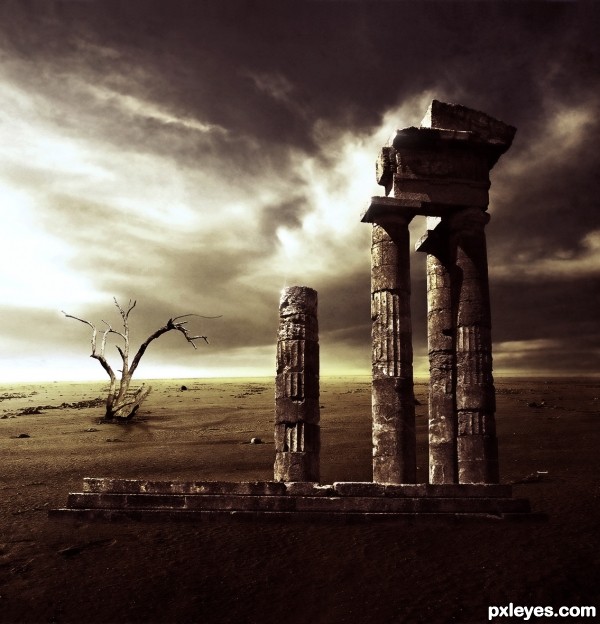
In your jobs the composition and your choice of colors are always fantastic! in this work, IMHO, the foundation of the building is calling attention to an error of perspective, I disguised the base with fog or something, GL!
Thank you so much for your comment, micoprego!
The "error" on perspective are totally proposital!
I think I understand it, what matters is that the quality of your work makes me have a folder on my pc with your name.
love the mood
Hahaha, thank you so much for your kind words, micoprego! I'm honored!
Thank you too Anoop, you know that I'm your fan!
Howdie stranger!
If you want to rate this picture or participate in this contest, just:
LOGIN HERE or REGISTER FOR FREE