here I used my photo and Photoshop (5 years and 2998 days ago)

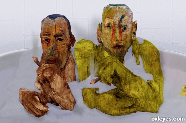
a.k.a. "Is that your wood?"
Please view in Hi-res before voting. (5 years and 3168 days ago)
lmao, took me a minute... but then everything does these days ;p
hehe, I don't know what's more disturbing - this pic or the fact that I thought of it :-P
I too was a little slow on the pick up.. LOL...
funny image.... This is one image where i dont want to know what was the driving thoughts behind your artistic creation  :p
:p
LMAO! Great humor 
Howdie stranger!
If you want to rate this picture or participate in this contest, just:
LOGIN HERE or REGISTER FOR FREE

source (5 years and 3258 days ago)
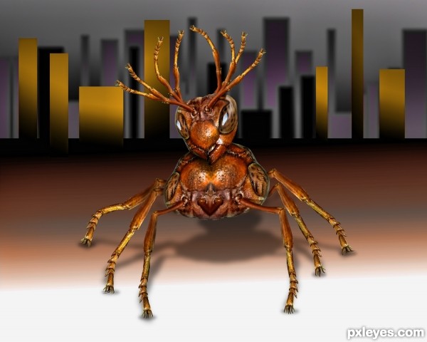
interesting construction I like the results
background to change to perhaps forest? 
...er, author, the background really is not very suitable... hope you can change it 
...er, aheman, it suits me and the goal I was aiming for (Look at the title)  and it's always good to hope

Cool critter, but I especially like your concept and title! 
Howdie stranger!
If you want to rate this picture or participate in this contest, just:
LOGIN HERE or REGISTER FOR FREE

only the source and PS (5 years and 3268 days ago)
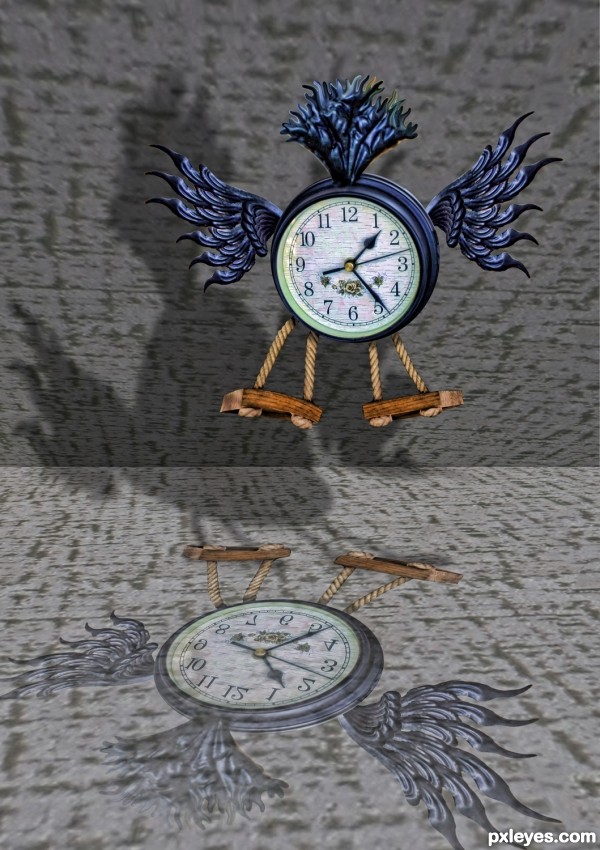
1) the shadow seems to be from the 'reflection of the clock', instead from the top flying clock.
2) the bottom surface doesn;t seems suitable for casting a reflection
but again... your title states"breaking the rules of time"..... ignore my above comments 

Howdie stranger!
If you want to rate this picture or participate in this contest, just:
LOGIN HERE or REGISTER FOR FREE

copy past burn and dodge :)
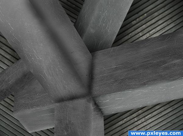
if anyone has an opinion on a better background please tell me as i couldnt find something that fits well. (5 years and 4007 days ago)
without a step by step it's a bit difficult to guide you.. I can see you burned and dodged.. and I'm pretty sure you texture placement as well.. the only thing I could suggest is to cut reflection strikes with white paint and try to place them where a mirror/metal flash would be and then play with the opacity (the white flash is that shiny thing on a sphere or an eyeball (Like the window shaped thingy on the eyes of the PXL Logo.. it give Objects a shine surface depth.. (You can gradient them as well.. experiment... (I'm okay at them but I AM not an authority by any means.. I'm sure others will have better Ideas.. I'm just voicing what I would do at your request.... good LUCK AUTHOR.. very good work)(sorry, I was so much better at this with oil/acrylic paints LOL, having a back light constantly always screws me up, It's like trying to play piano under water)
looks like hard work, and the roof is very convincing, but i just don;t believe that it's metal. Try adding a reflection, or making it shinier.. there are lots of tutorials on how to create chrome objects, try something like that, but a little toned down. Other than that, it looks like you put a lot of effort into this, so good luck!
OK................!
thanks for all the comments, ill try and add some shine if i can. and as for sparklen that was a very informative comment  was it negative or positive ?
nice
this should be metal?????? sorry but u far from that, u have to work with curves than hue saturation it will stay the metal that u want for shore good luck.
good luck author
metal or not this looks good to me. Nice work  good depth
Howdie stranger!
If you want to rate this picture or participate in this contest, just:
LOGIN HERE or REGISTER FOR FREE
Howdie stranger!
If you want to rate this picture or participate in this contest, just:
LOGIN HERE or REGISTER FOR FREE