(5 years and 2546 days ago)
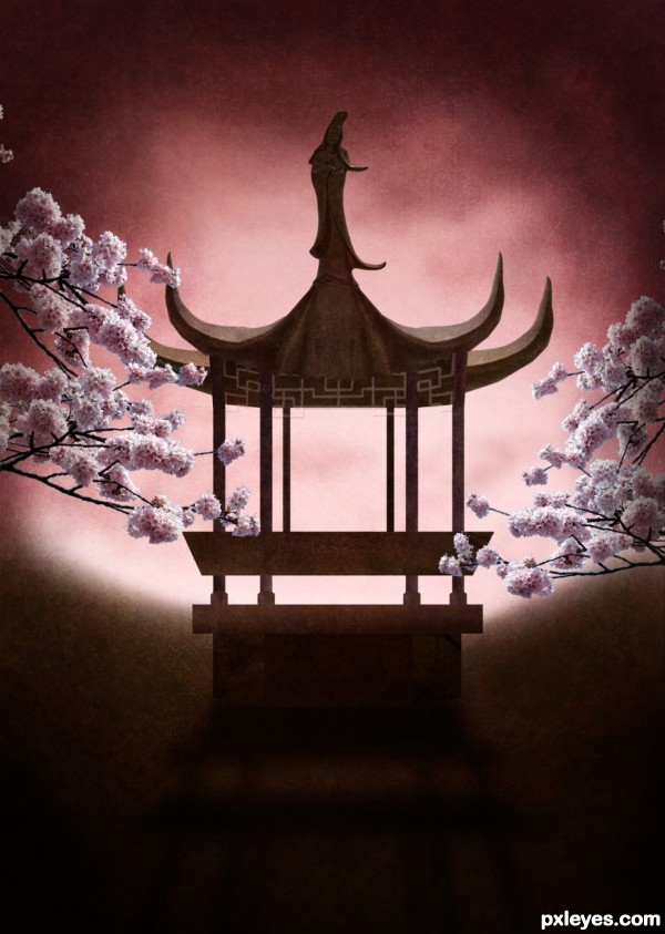
- 1: Blossom

This entry has been changed in light of St. Patrick's Day. St. Pauli Girl's beer belly due date is approximately every 30 minutes judging from the quantity. Please see high resolution before voting. Thanks. (5 years and 2959 days ago)
Super cOol!!!!...great chop!.
great idea .... i guess a beer tap on the belly button would be too much lol ... good luck 
lol gornats right on. Nice chop Author
fantastic entry... very very well done.... goes into my favs
I used to like a cold Pauli's girl....but I'm having some reservations now. Good work
Howdie stranger!
If you want to rate this picture or participate in this contest, just:
LOGIN HERE or REGISTER FOR FREE

---
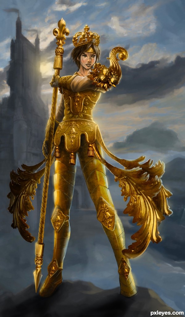
The Goddess of the Goldenspear tribe, long since exiled from their ancestral lands in Pixelian Vale, joined the Guardian Forces for monetary purposes.
However, weeks turned into months, and fighting alongside the many holy warriors with fearless souls inspired her with the responsibility of protecting the sanctity of the Pixelian castle.
This reputation is well earned by their Golden Warrior representative Joan of Archangel, with her devastating abilities revolve around shortening her own lifespan to spear her foes to burning pieces.
Considered a blessed martyr by her people, the Sacred Golden Warrior is not afraid of death, and will even run towards it willingly, sometimes desperately, in order to bring the Undead Rebels to an end.
---
Done entirely with You Know What Software & Hardware to do this in just several hours or so.
---
Good luck to everyone! (5 years and 3178 days ago)
I can say no words, Mr. cintiq,......just fav from me and full vote...
Umm... you just said the words, Mr. dekwid. 
Thanks for your compliments. Just posted this while I'm finishing this one today, not so detailed ofc... Tired of tight schedules. But, I can't hold anymore to post... maybe it's called post-gasm? 
JUST PERFECT!!! 
Very nice work, but there are some questions about the lighting.
Not perfect, theo... Nobody perfect, rite? And... Noentry perfect too. 
IMHO, I still need to tweak the legs, the upper phoenix-like armor, the non-blurred middle-part armor, err... there's so many things so little time. I just don't want to be late to post this girl here... she's ready for battle.
"Do you require aid, human?" she said to my ear while I creating her.
EDIT: yeah, the lighting too... I'm aware of that, I try to paint it over with clipping mask, but it will become dark, desaturated, I frustrated & well... I apologize for being lazy-ass... 
gold for this .
Golden thumbs for you, guys... Appreciated so much!
Thanks, Roon. Your works gold too. 
Wonky anatomy. Arms, legs and perspective. The cornucopia on the shoulder is visually out of place.
Really nice concept, but somewhat sloppy execution.
"...Not perfect, theo... Nobody perfect, rite? And... No entry perfect too."
That's a poor excuse.
This is not a competition site to make excuses. No entry is perfect, but generally we try our best with our entries...
Author, you also don't need to tell us the software and drawing tablet you use for your entries. This gives away your identity too easily.
It is very beautiful colors are great and the background is beautifuly done and the armor...... wish I could do that. The only 2 things that throw me off about this piece are the left arm (the arm with the hand grabbing the spear) and also the left foot it seems it looks like it's missing the shoe and foot. It's been a while since I been at this, and commenting n stuff
Other than that I think this is a wonderful piece
I apologize about the identity "software + hardware". Changed.
Yeah, ofc it's wonky coz I'm rushing to do this just for several hours. IMHO, I'm trying to put this idea first of all. Okay the execution was sloppy. Fine by me. I'll do the best for next time over a week absolutely just 1 piece of stunning design. Since I'm doing this by speed not accuracy & dexterity. If you want my perfect resume, it can't be done in two days of rushing things together.
So bare with me, would you? Please?
---
Thanks, DigitalDreamer for the input. It's not missing, it's just too narrow for my eyes too. I'll add depth if this contest got enough time to spare.
I think it won't be anonimity in your entries as most of them look the same techniques, and Mossy is right, you do not have to mention the time you spent and the programs you used to make your works, as you have done in all your entries. Well, it is you, the artist who decided what to say and what to post. I am just giving a point of view. Yes, it is beautiful again.
George, thanks for your words.
Time-spent & stuffs like that were NOT to bluff, boast or something.
Really, I'm not comparing pxleyes to any other forums like CGSociety & CGHub.
But.
People out there were add the time consumes + products to recall & honor their valuable times. I learned this way & by doing like that; I really know what I'm doing, not wasting a single time. Speed is the priority of my works. I almost see the clock every-time. Yeah, some people may say it's utterly useless, freak, idiocy or something.
For me, this is who I am.
NP author I checked out the SBS and seen it their just maybe the way the angle looks idk I'm no expert at this stuff hehe.
No entry is perfect lord knows mine are always in need of some tweaking here and their lol, and of course no one is always perfect 100% all the time unless you get paid to do this hehe. While speed is great to have on your side some times speed can ruin the quality of ones entry even if you know what your doing because some members here do vote for quality and execution rather than prettiness and good ideas. You are who you are, don't feel so responsible for it :P We all have our own ways and style of how we do things.
something wrong for the hand? Look like missing? Maybe too close for the body! Try to get more on depth of field! More better feel!
something wrong for the hand? Look like missing? Maybe too close for the body! Try to get more on depth of field! More better feel!
Stunning ! I say no more 

Very nice image. 

Superb!
beautiful work 
You are quite talented, author - chopping, digital drawing AND storytelling - you could produce entire books! I know how it is to get an idea, then try to crank it out in time to upload for a contest. Would love to see this tweaked and then hi-res. Overall, great job. 
great work!!
Very well created super hero 
Congrats!!
Congrats, fabulous work 
Congratulations!! another terrific entry!!
Well deserved! CONGRATULATION!
Thanks for all the supports. I kinda really down about something rite now... But, all the best to whoever support me & encourage me with the great words.
Especially Missy. 
congrats! 
Congratulations ,great work ! 
congrats! 
Congrats on your entry Author! Well-deserved win! I like missy comment on MossyB. I hope he internalize that. 
Thanks, everyone. I went a lot of terrible times within this creation & couldn't change the picture with the suggestions. Also right now, I'm a bit down with some matters. Maybe I'll had the time-off from Pxleyes.
Thanks for the great time, everyone. Cheers!
@bcabilan; thanks for your kind words, man. But it's not "he", but "she".
Howdie stranger!
If you want to rate this picture or participate in this contest, just:
LOGIN HERE or REGISTER FOR FREE

pls see sbs for details.
no external source used (5 years and 3187 days ago)
Imaginative use of the source. 
thanks CMYK! 
Way to use the tools at hand to make a really good image .
Howdie stranger!
If you want to rate this picture or participate in this contest, just:
LOGIN HERE or REGISTER FOR FREE

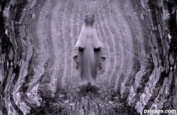
thanks to pix for the virgin pic (5 years and 3277 days ago)
The radiant effect behind the virgin looks nice. Good luck author.
very Catholic, I'll show you my scars (very well done 
Howdie stranger!
If you want to rate this picture or participate in this contest, just:
LOGIN HERE or REGISTER FOR FREE
Nice image. Good use of the source and the texture.
Howdie stranger!
If you want to rate this picture or participate in this contest, just:
LOGIN HERE or REGISTER FOR FREE