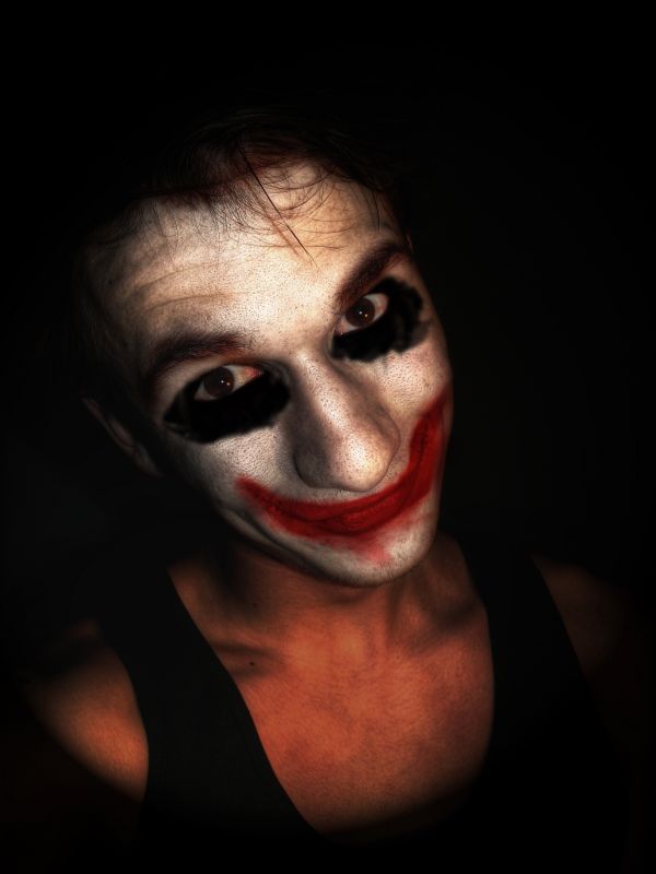
well.. i accidentally deleted the .psd file so there will be no sbs.. basically, there's a lot of coloring, adjustment levels and some burning and dodging.. hope you like it (5 years and 3796 days ago)
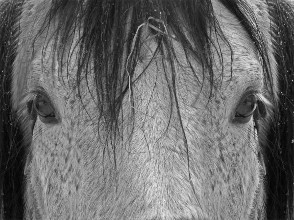
Only clone-brigthness-restoring modify (5 years and 3810 days ago)
Good job varying the 2 halves so it doesn't just look like a copy & flip job.
This isn't bad! Good job 
Wow, not bad GL 
Oh my God, this is FANTASTIC! Nice skills!
great,gl
Quiet simple but a beautiful work done....
Cool, try adding more highlights to the middle of his nose...to make it stand out more...GL
Howdie stranger!
If you want to rate this picture or participate in this contest, just:
LOGIN HERE or REGISTER FOR FREE
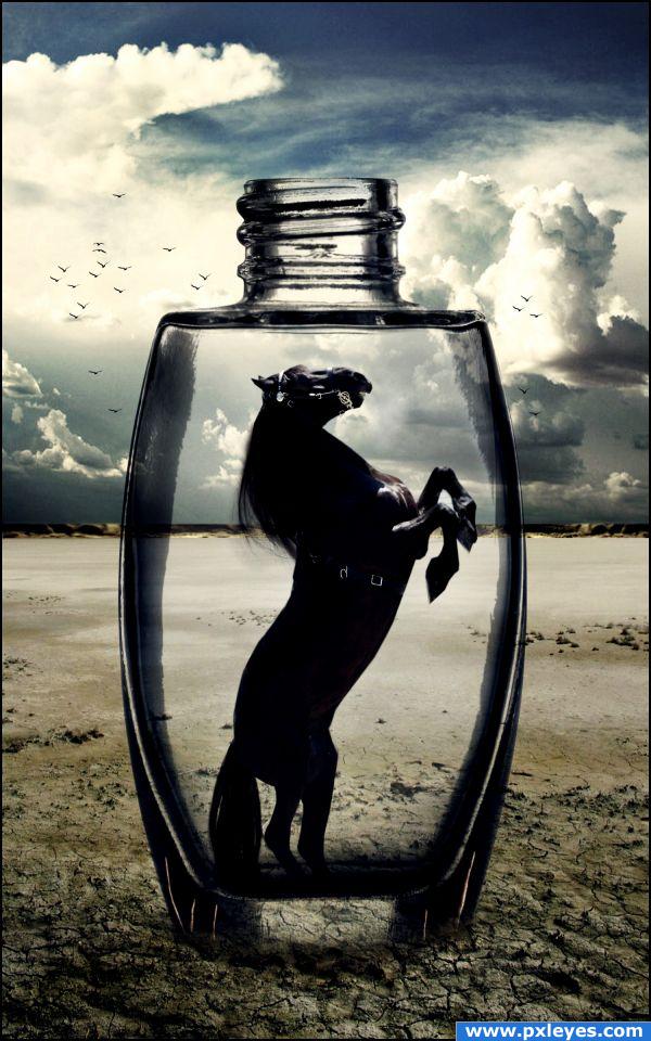
Who doesn't like a story with a happy end? Most of the time we get disappointed or sad if a story ends in a bad way...
Thanks to:
- http://littlenake.deviantart.com
- http://night-fate-stock.deviantart.com
- http://darkresources.deviantart.com (5 years and 3909 days ago)
Love it, everithink looks good, gl
Nice one, but what's the story, why is it an end and not a beginning. Maybe the landscape that we can see through the bottle should be distorted somehow, maybe a spherize.
Err we normally don't like sad endings... it makes us sad as well so giving a sad end to a story fits on this contest.
Nice blend...and cool final result!
I don't get it, but the bottom of the bottle needs an edge...
The bottom of the bottle is a little underground... it's covered with sand.
Great but to look more sucessed word you need to fix the blur in the end of bottle.
I like the image, and i like your choice of sources, but i don;t see how it fits with the theme, but then again i don;t really understand it :p Good luck, and high marks from me.
I added a more solid edge to the bottle's bottom... Anyway i already explained my idea -.- in this contest we have to take the joy of something we like to create a feeling of disappintment in relation to something, so my work represents a sad ending of a story.. what story? well it doesn't matter, what matters here is that the horse is trapped in a bottle in a desert, there's no escape from death.
Actually I prefer a story with an effed up ending (i.e. "Seven, Knowing, etc.) but mainly because those ending are NOT expected. Personally I think if you have to explain it, then it makes it hard to fit the theme. A good entry is an obvious entry.
Beautiful image  Poor horsie, don't want to be on its place...
beautiful image.. surreal in a way.  SO sad to have something so beautiful captured.
WOOOW!!
Congrats for your second place, Akassa
congrats
Congrat Akassa... 
Congrats!!!!
Congrats, Akassa 
Congrats on your win
congrats !! What a lovely entry!!
Howdie stranger!
If you want to rate this picture or participate in this contest, just:
LOGIN HERE or REGISTER FOR FREE
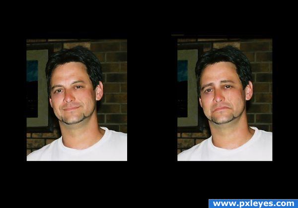
This is my photo of my son. I used the liquify tool to give the sad expression and painted a teardrop on his cheek. (5 years and 3925 days ago)
Good change! He looks definitely sad. Maybe you could try to make the tear a little less white and a bit more transparent. I think, that could look even better. Good luck!
i would say 1st is he single? 2nd it would be better without the tear GL
Howdie stranger!
If you want to rate this picture or participate in this contest, just:
LOGIN HERE or REGISTER FOR FREE
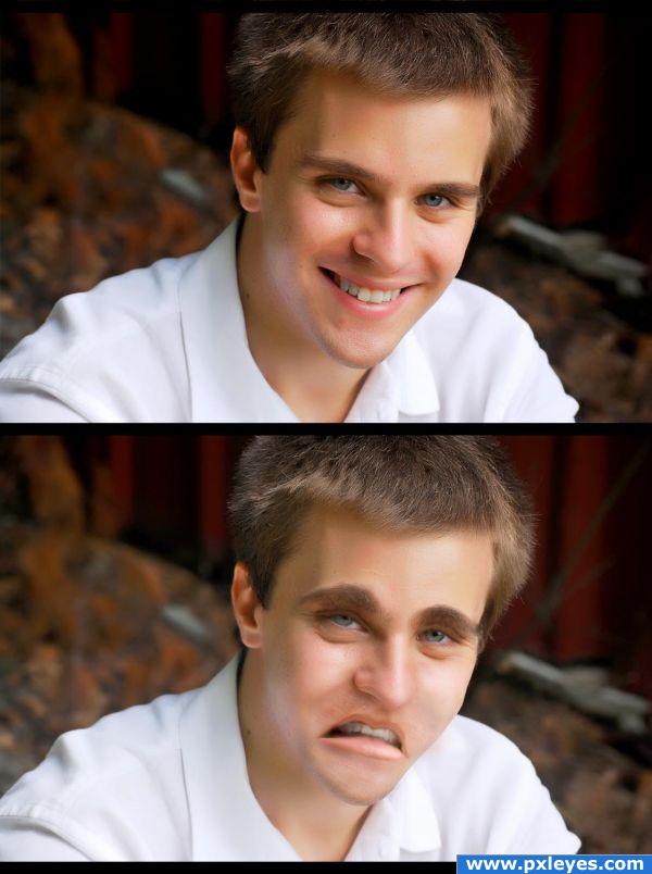
This guy is terribly sad as u could see...
No external sources as per the guidelines , SBS shown (5 years and 3926 days ago)
the cheeks stand out too much. they're in this position only when a person is smiling
The pointed part in the middle of his lips is distracting.
Howdie stranger!
If you want to rate this picture or participate in this contest, just:
LOGIN HERE or REGISTER FOR FREE
The transformation is quite impressive.. the high res is AWESOME.. great capture of your friend good luck
Well done, GL
this is really good work .. personally I find the joker/ insane clown theme getting old... but I still think you have done a wonderful job.. GL!
Jellopudding, i'll agree with you on this one, but i've had this photo for some time now trying to figure out what to do with it.. this contest and the Joker idea seemed to fit perfectly.. thanks ya'll
i have Coulophobia so my clown opinion is bias... lol I have shaky hands while commenting lol.. but I thought it was very well done gl
gl
Good work!
Good idea......why so serious? should be your title according to the joker....Nice try....
haha thanks! i have no idea why i wrote 'why so sad'...
Congrats!!
I love it but I'm really just worried about the hair on the back of that chicks hand
Howdie stranger!
If you want to rate this picture or participate in this contest, just:
LOGIN HERE or REGISTER FOR FREE