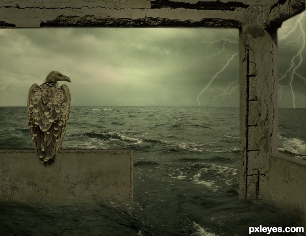
(5 years and 2570 days ago)
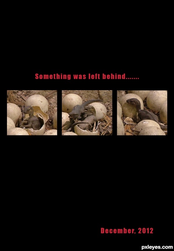
Thanks to Mskadu from flickr for the pic of the dino nest. (5 years and 2708 days ago)
Good image find, I like your concept. 
Thanks Pearlie.....
Howdie stranger!
If you want to rate this picture or participate in this contest, just:
LOGIN HERE or REGISTER FOR FREE
(5 years and 2892 days ago)
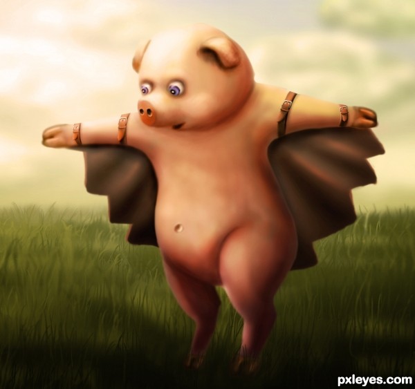
Beautiful drawing. Especially love the grass and the leather straps. Piggy's right trotter (hand) has a few sharp edges.
I softened the edges a bit. thanks a lot for the tip! 
Aww, he/she is so adorable. Don't worry, little buddy I am here to catch you if you fall  .
.
i think it's a "he" though i'm not sure. thanks for the comment! 
This is a cute one....Nicely done..... good luck author!
thanks! 
cute entry.... 
thank you! 
Oh, lovely little piggy! So nice!
thank you! 
Very cute. The leather straps are fabulous! 
thanks a lot! 
this is my fav of yours yet!
this is my favourite too! 
thank you! 
Congrats 
Congrats to you too 
Congrats making it to the final round! 
Congrats!!
Thank you! 
congrats oana
Thank you! 
Howdie stranger!
If you want to rate this picture or participate in this contest, just:
LOGIN HERE or REGISTER FOR FREE
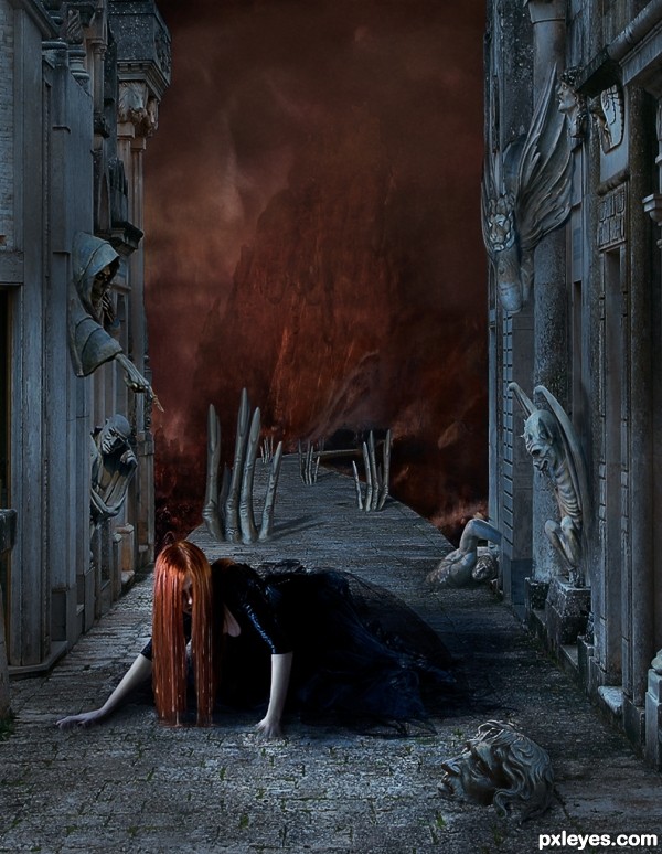
A little dark. Thought something haunting would be appropriate for coming up to Halloween.
It is a visual depiction of horrors and sense of entrapment Mental Illness can cause.
Thanks to Rebecca-parker stock for the model. Other images used are my own.
SBS is a described Animated GIF and the images used. (5 years and 3458 days ago)
Fantastic ! love the contrst between the grey and the orange/red
Very nice scene! I also like that you've used mostly your own images. One think you could work a little on; the transition between de fore and background. They don't look connected. You could at least blur the far end of the bridge/edge since the back is blurred too. And maybe make the front part of the mountain where the bridge is touching it grey too like the foreground. Good luck!
awsommmme... love the hands through the path and even teh girls hair is cool... well put together author great peice of art work here 
A.W.E.S.O.M.E
Sorry it took me so long to get to this. I have been out of town and did not have access to a sort of took Ressiv's advice but instead of softening the end of the bridge ... which I had don a little already I sharpened the mountain just a bit so it would me the same sharpness as the bridge where it connects. And I added a little gray to the portion of the mountain.
I did not want to soften the back ground too much as I wanted to have a more surrealistic look than "natural" I hope I have achieved that???
Agree with the others' opinions. About the background I don't think you have to work more on it, now it's fine. The purpose of using the shallow DOF is making the main subject standing out. In your case, the path behind her has the pattern which is uniform enough to lead the focus to the girl, so it's okie, not mention that you also achieved the surrealistic look  . But I still have some questions for you, author. Why the hair is longer than her left hand when they have equal position horizontally (I mean both of them are limited by the ground, so the end of the hair should be higher or equal to the left hand, which is a bit in front of the hair). Why the statue hands behind her have the long, straight, and sharp shadows but she has just blurry and not clear shadow (the hair needs shadow on the ground also)? The last thing is the nails of the statue hands look distorted too much.
All in all, the first impression on this work is very good, especially the wise use of color and smart composition. You really have not only the good skill but also the artistic eyes, congrats!
Love it! Spooky feeling of horror without the blood and gore! Beautiful rendering!
Langstrum ... thank you so much for all your advice.
I have redone the hair (shorter and now melting into the ground like the hands), softened the shadows on the hand statues and added missing hair shadow! For the distorted hand statues I touched them up a bit but I am trying for a sinister, surrealistic look and want them to be odd... so left them quite warped.
Regarding her body shadows ...the shadow is not as sharp as the hand statues because she is between the buildings and the light is not getting to her (this was intentional, to depict the darkness and claustrophobic feeling of being trapped inside a mental illness). I also avoided strong shadows on the statues in the corridor around her for the same reason.
The lighting is off on the whole image to some degree. I wanted it to be nightmarish so I tried to make things not quite "right". So, just like in a dream where everything is off but still feels real I thought that the lighting and shadows was a good area to mess with, if you know what I mean???
Thanks again for your well thought out critiques ... great help! 
beautiful
good luck!
great ........ 
WELL DONe !!
Very good,dark scene.
Excellent, love it, very timely for Halloween. 
Very cool work author...this look like one very scary place...best of luck
Congratulations
Congrats...fantastic entry,well deserved in hard competition...well done
Congrats! wonderful work!!!
Congrats!! A wonderful, creative entry!! A real winner!
Congrats Arca, ENCORE!
Congrats!!! Really love this work!
Congrats & very well done Arca.... hope to see more!
Congrats, another great creation =)
Howdie stranger!
If you want to rate this picture or participate in this contest, just:
LOGIN HERE or REGISTER FOR FREE
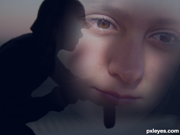
(5 years and 3555 days ago)
cool
Beautiful! 
thanks Tuckinator and erikuri!
Great idea author...best of luck

Howdie stranger!
If you want to rate this picture or participate in this contest, just:
LOGIN HERE or REGISTER FOR FREE
good mood
Howdie stranger!
If you want to rate this picture or participate in this contest, just:
LOGIN HERE or REGISTER FOR FREE