(5 years and 3596 days ago)

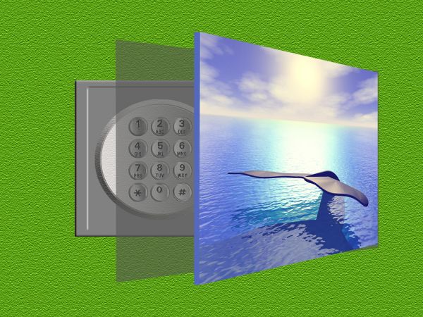
A Safe in the wall (5 years and 3678 days ago)
Great idea,but picture looks like levitating...Work a bit more on the right edge of the picture...good luck author
good Luck
Howdie stranger!
If you want to rate this picture or participate in this contest, just:
LOGIN HERE or REGISTER FOR FREE

(5 years and 3739 days ago)
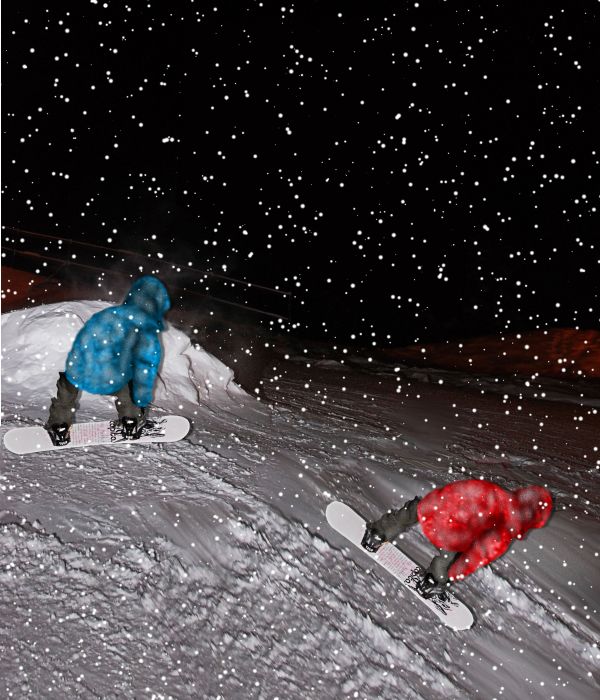
It's simple but a clean chop and very convincing but just a small nitpick, in high res, the snowboarders edges just need a little bit more attention, maybe feather 1 pixel when cutting with polugonal lasso tool Still well done 
I think the shadoe is very unnatural, and the repetition in snow patches is obvious, even in low resolution, i suggest working on those.I would also suggest adding a bit of motion blur to the snow
agreed, put some motion blur on the snowflakes. also, experiment with different flake sizes, to help create depth 
Thank guys hope this is better
Try to find a tutorial on the internet for how to create snow in photoshop, it will definitely help you to improve this. I also suggest you sharpen the background, because the snowboarder has now been blurred completely. As for the shadow, it still looks unnatural, i suggest you remove it and try again, just a bit of low opacity black paint around the edges of the snowboard and not the whole person. Good luck.
Ok here is a remake. Thanks all
It's totally different now...
Howdie stranger!
If you want to rate this picture or participate in this contest, just:
LOGIN HERE or REGISTER FOR FREE

(5 years and 3938 days ago)
nice done! good luck 
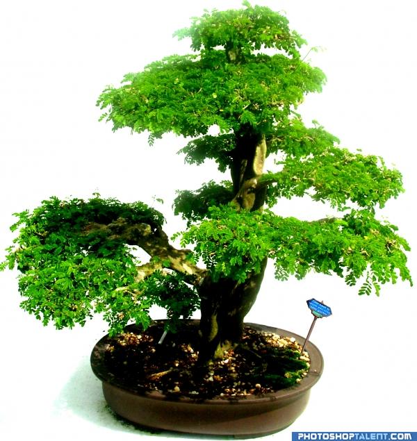
nice.. just remove those 2 little dots right of the sign 
I got them elficho, thanks
Match the blur of the image to your sign??
source usage is very less
very nice 
lol I loaded the high res, read the sign and I was like, meh waste of time lol. In a good way 
coolness
nice 
good
I would have more appreciation for this had you used some of the source leaves to replace your own.
Howdie stranger!
If you want to rate this picture or participate in this contest, just:
LOGIN HERE or REGISTER FOR FREE
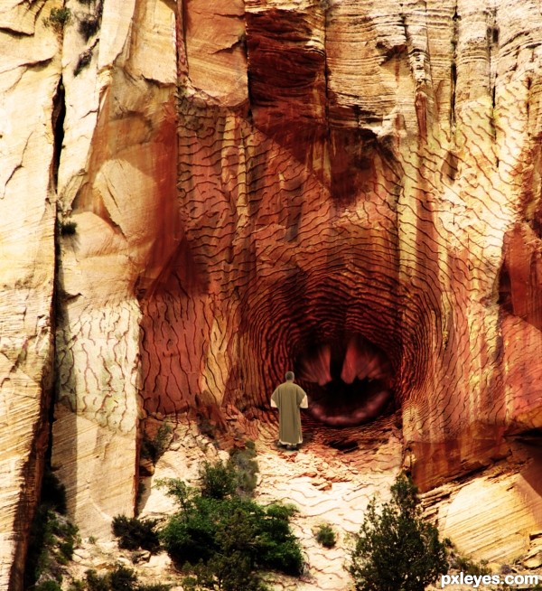
Very nice apply-ing of the texture at the some parts,left part needs a bit more color adjustment because sun is brightest there.But the guy looks too copy paste-ed.U could use some color adjustment layers or blur the edges and brown photo filter maybe.My advice with the original color is to create one dark brown color layer,with maybe 40-50% opacity,and one dark gold color or soft color layer...Good luck author
Thanks erathion, I had applied some blur to the man, but I've now blurred his edges a little more and applied a brown photo filter to him, I think he looks better. I'll fiddle a bit more with the texture too.
Nice , I like it ... Good job =)
omg, that triggerfish makes a great center for this!
nice work ................. ..............he looks like a warlock to me, and he is saying some mantra to open the door ................. how is that ......... ha ha ....... all the best to u ...........
  :
:
Howdie stranger!
If you want to rate this picture or participate in this contest, just:
LOGIN HERE or REGISTER FOR FREE