Photoshop Pictures: Sailor


results 1 - 5 of 7

Mmm, I smell a sailor... - created by pearlie


Mmm, I smell a sailor...
Favs: 0SBS: 4Hi-resRank: 10/15Score: 57% (0)10109 views

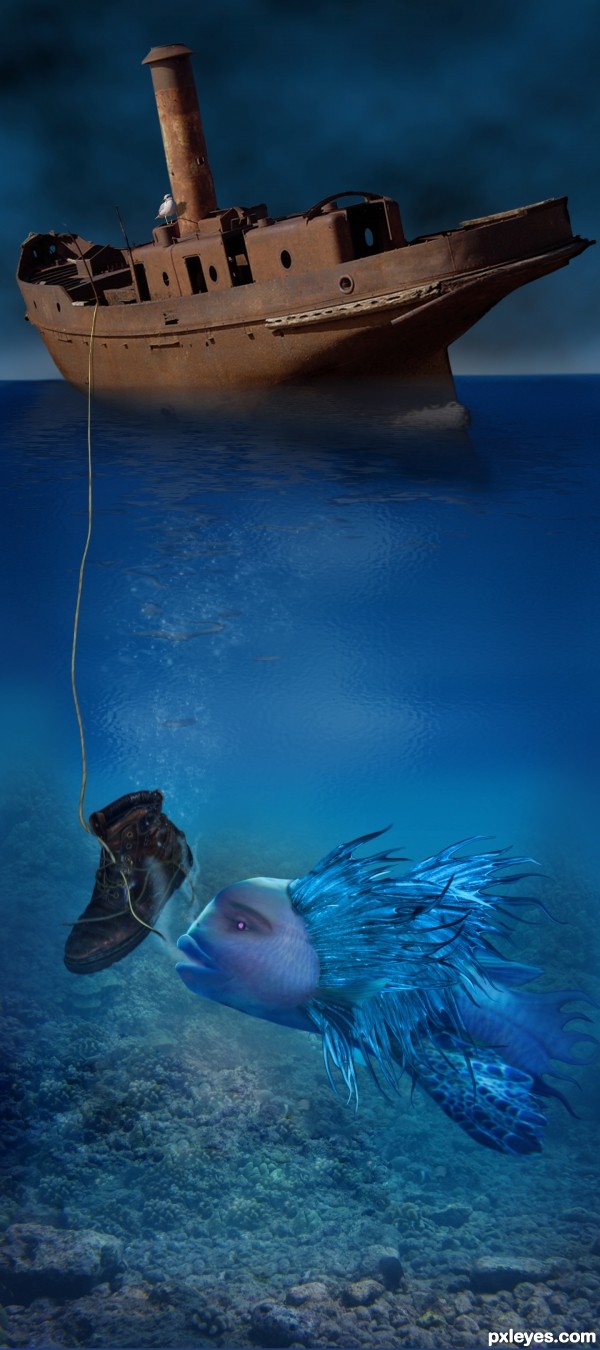
This mer-fish creature is one of the predecessors of the Mermaid, and a relative of the Siren.

Background on these sly creatures who lured sailors to the deep...... The word is a compound of mere, the Old English word for "sea", and maid, a woman. Much like sirens, mermaids sometimes sing to sailors and enchant them, distracting them from their work and causing them to walk off the deck or run their ships aground. Other stories depict them squeezing the life out of drowning men while attempting to rescue them. They are also said to carry humans down to their underwater kingdoms. In Hans Christian Andersen's The Little Mermaid, it is said that they forget that humans cannot breathe underwater, while others say they drown men out of spite.
(5 years and 3292 days ago)

8 Sources:

avatar lchappell
lchappell says:

I agree with Nator, the sky and ship look great. I like the way you got the ships reflection and the waterline. Cool "mercreature"

avatar lolu
lolu says:

Rasta fish !! Cool man......

avatar CMYK46
CMYK46 says:

This is a great image! One thing confuses me: where's the transition between the surface, where the ship is reflected, and under the surface?

author says:

Thanks Bob, and I realize this is an awkward transition, so by extending the canvas vertically - and having to use a drydocked boat (best shot I could find of a hull and I liked the rust), the transition is simply in the center (above the boot), shortened for the site. And yes, I realize the proportion of the rope's thickness is also off due to this. I used artistic license. Edit - now tweaked, see next comment.

avatar DanLundberg

Distorted reality is part of the charm of this image. Nevertheless, I think having the boat end of the rope realistically thin would be a good thing along with showing some signs of life on the boat. I would also eliminate the 'oil slick' thingies in the center of the image as that should just be the unencumbered transition area between the surface and the under-sea portion. The water line of the boat could be a tad more curved following the shape of the hull and the reflection of the prow should extend as far out as the actual prow does. The turtle really distracts IMO.

author says:

Made some tweaks per your suggestions, Dan. I flew in my re-con gull, and he's reported that indeed that boot was the last link to any life aboard. The crew must be in Davey Jones' locker, he said. I 'skinnied' the rope, eased back on the 'oil slick', and worked on the waterline. However, if you are referring to the right side of the image as the prow, that's the stern (see original image). The prow, or bow, is on the left. I did add some darkening of the water off the stern, tho. And the turtle has scooted off to other waters - no sense fighting over one old boot.

avatar Geexman
Geexman says:

Well done ... great image

avatar erathion
erathion says:

nice creative work author...good luck

avatar jadedink
jadedink says:

This is a fabulously fun entry! I've watched it since its debut, and I love your changes! Most of all your creation is so full of imagination, as are your replies with the re-con gull.
And I do think removing the turtle was a good thing. Plays more into that aquatic diva. Good luck!

avatar George55
George55 says:

good work..... nice and interesting image.... gl

Howdie stranger!
If you want to rate this picture or participate in this contest, just:

LOGIN HERE or REGISTER FOR FREE


Sailor - created by Poss


Sailor
Favs: 3SBS: 12Hi-resRank: 4/15Score: 57.8% (20)9909 views

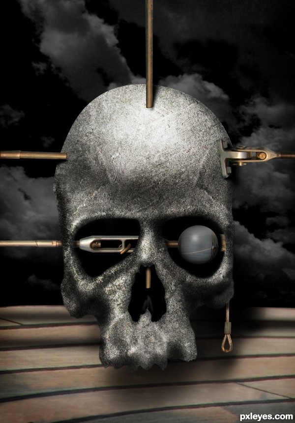
I finished this last Sunday and wasn't going to submit it, but then I thought , Oh well why not? I hope you like it.

I used 2 of my own photos for texture on the skull and clouds in the background included in the SBS.

(5 years and 3403 days ago)

avatar Tuckinator

wow i really love this idea! i dont want to see it go to waste! so, maybe add some shadows where the "skewers" enter and exit the skull and also a little shadow in the eye on the "skewers"

author says:

Thanks Tuck, you're right I keep editing as we speak.

avatar erathion
erathion says:

very cool concept author...i don't like to repeat comments but u have to work a bit more on shading...use burn tool at places where skewers enter to the skull and maybe add come color layers for better blending effect...and how i like this image and i will hold my vote if u do some changes...good luck

avatar erikuri
erikuri says:

Fantastic surrealism... Very nice!

avatar pearlie
pearlie says:

Cool work on the skull, and creative texture. If only the couple of rods had burn/shadow on the skull, and the bracket on the right as well. Great surrealism, tho.

avatar CorneliaMladenova

Amazing entry, Author and I wonder why you have hesitated to submit it, I like it very much :0

Howdie stranger!
If you want to rate this picture or participate in this contest, just:

LOGIN HERE or REGISTER FOR FREE


Ahoy Sailor! - created by jadedink


Ahoy Sailor!
Favs: 4SBS: 2Hi-resRank: 2/15Score: 62.7% (30)12125 views

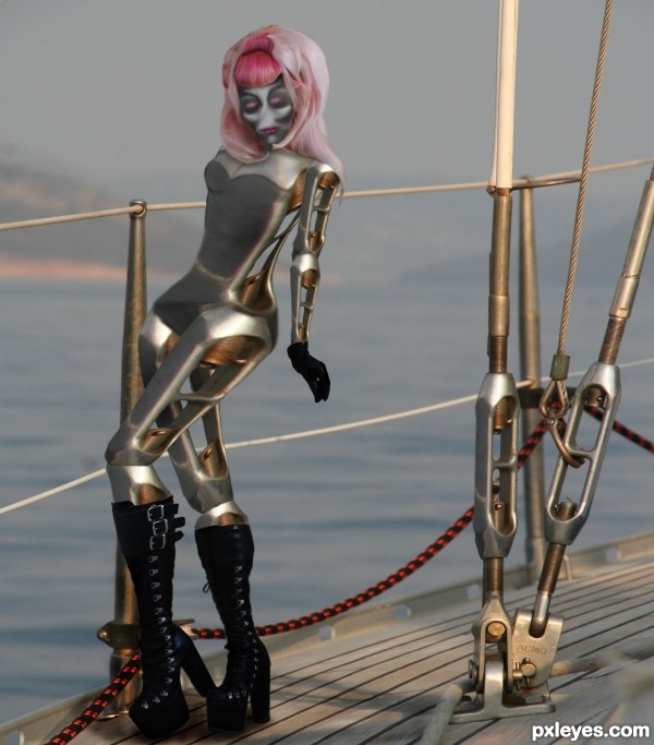
Thanks to the lovely Razor Candi @ deviant art for the permission to use her now deleted stock. See SBS for original stock shot with Permission Email from her allowing the use of her image.

Unfortunately, because of one very inconsiderate person in the world making profit off of someones image and not even crediting her, she has chosen to delete all of her previous stock. Luckily she took the time to allow me the use of them.

all body parts made from pieces of the metal works on the boat. (5 years and 3404 days ago)

avatar ponti55
ponti55 says:

Really good shapes, the legs look great! Be sure to add in a shadow for the robot though

no avatar
Widiar says:

Yeah.. the body is very good. Head and hair.. dunno.. needs shadow, as the rest of the picture has it. The boots are a bit excessive, but well.. her arms are a bit on the small side, but overall, very nice work.

author says:

oops. uploaded the corrected version with the shadows. i had picked the wrong file in upload.

Widiar, i used her body as reference, so i'm sure you can check the sbs for the pose and see her arm isn't too much different from the models proportions.

avatar dekwid
dekwid says:

clever creation of the source.....! awesome.....

avatar erikuri
erikuri says:

Very creative and sexy, author.Boots are not proportional between themselves, one is smaller that the other.

author says:

erikuri...check the sbs and see that the boots are the same proportion as the model's. i copied them exactly with equal transformation for sizing. only the tops were warped to stretch around the calves which ended up larger than the model's legs. But thank you for the comment always appreciated!

Dekwid thank you she was fun to make

avatar lchappell
lchappell says:

nice boots! yet another proud member of the IBTC...robot style

avatar Tuckinator

wow incredible work

avatar DanLundberg

Very nice, but her torso and head don't seem to have as much contrast as the rest of the image and thus get kind of lost.

avatar erathion
erathion says:

very nice work author...best of luck

avatar Warlock
Warlock [banned] says:

Killer boots!! And a nice pose......my only suggestion would be size, she’s a little bit small compared to the rest of the image, maybe a bit late for this. I would increase the size of the original source buy cutting and pasting the top section given you enough room to scale her up so the waist is parallel with the top guide rope

avatar jawshoewhah
jawshoewhah [banned] says:

Somehow I just knew this was yours.

avatar CorneliaMladenova

Ahoy, girlie! Nice boots and hair!

avatar Drivenslush

CONGRATS on SECOND!!!

avatar CorneliaMladenova

Congratulations!

avatar Warlock
Warlock [banned] says:

Congrats cool image!

avatar RichieMB
RichieMB says:

Congrats for 2nd

avatar oana
oana says:

congrats Jade!

avatar nasirkhan
nasirkhan says:

Congrats! for 2nd place. Nice Construction

avatar Ressiv
Ressiv says:

Congrats for the 2nd place! well done.

avatar Lelaina
Lelaina says:

Congrats for your second place, Jade!

Howdie stranger!
If you want to rate this picture or participate in this contest, just:

LOGIN HERE or REGISTER FOR FREE


Lover - Sailor - Gourmet - created by pearlie


Lover - Sailor - Gourmet
Favs: 2SBS: 1Hi-resRank: 15/15Score: 50.9% (0)7293 views

This is a real card. The original idea with a line illustration was 'floating around' (pun intended) back in the 80s and was printed in just black ink.

The photo used in this card is a personal photo (just a poor quality one), and this full color version was created by me a couple of years ago. And how appropriate, as this particular sailor has recently retired and is in the process of buying a sailboat. Bon voyage! (5 years and 3476 days ago)

avatar lchappell
lchappell says:

avatar Drivenslush

bhahahhahahahahahahahhahahahah!!! super funny.. and I know it's true..there are tons of retirees down here in Florida with the same exact card... LOLOLOOL

avatar erikuri
erikuri says:

Manure??? Coffins??? Argh...

avatar k5683
k5683 says:

there's no contact info. what is the sense in a business card if they can't get ahold of you?
I guess I'm blind because I really have no idea what business this person is in?
It DOES though get my attention.

author says:

In this case, k5683, it's more of what we label as a "calling card" - just something to give to friends or aquaintences (who may already have our actual business card). Good observation, tho.

avatar FairyGardens


oh, I have this business card, contact details are on the other side
'Repossessed coffins, elephants bred, orgies organized'... this guy can multitask!
k5683 - no business too small for this man, he can do whatever you require

avatar cabldawg71

this is great. Saloons emptied lol I love it. My kind of guy

avatar erathion
erathion says:

So cool...Man of the world...good luck

avatar swordfish
swordfish says:

nice card....... all the best to u author ...............

avatar itsdesign
itsdesign says:

nice

avatar RAZ0R
RAZ0R [banned] says:

Howdie stranger!
If you want to rate this picture or participate in this contest, just:

LOGIN HERE or REGISTER FOR FREE


Sailor's girl - created by erathion


Sailors girl
Favs: 0SBS: n/aHi-resRank: 5/15Score: 57.1% (15)24620 views

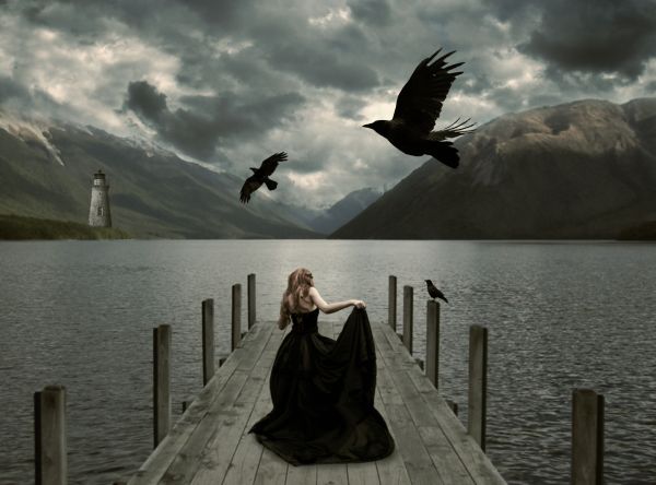
I used this quote as a guide line
"A woman knows the face of the man she loves as a sailor knows the open sea".

Honore de Balzac

Jessica-http://faestock.deviantart.com/

Alana Smith-http://www.sxc.hu/profile/Alana12

Julia Starr-http://www.sxc.hu/profile/night_fate

Andrew Conn-http://www.sxc.hu/profile/andrewconn

Lavica-http://lavica-photoshop.deviantart.com/

Thanks guys for the great images that i used for this project...


(5 years and 3573 days ago)

5 Sources:

avatar langstrum
langstrum says:

This girl looked quite small, I think. But it's a good job. GL, author

avatar ponti55
ponti55 says:

The girl is very small, and the smallest crow should be a bit smaller. The lighthouse doesn;t seem to fit in too well to the background, perhaps a colour overlay above your image for blending? Good luck!

avatar loopyluv
loopyluv says:

I think you should make the girl bigger..she looks tiny weeeny

author says:

Thanks guys,i made some corrections...girl is bigger not...or better to say taller....

avatar CMYK46
CMYK46 says:

Girl is too small, light is from the right, solighthouse should be flipped to match...

author says:

Thank u for the comment CMYK but i don't agree...girl is now regular size and light coming from both side and at right side of the lighthouse is big dark cloud who blocking the light....So i think that the lighting is ok...

avatar Jellopudding

this is pretty, in a creepy morbid way .. wives tale says 2 crows mean death....

avatar Govindrathod

This is pretty but dimensions are bit difficult to digest...

avatar jawshoewhah
jawshoewhah [banned] says:

I think CMYK was right about the lighthouse.

Howdie stranger!
If you want to rate this picture or participate in this contest, just:

LOGIN HERE or REGISTER FOR FREE