(5 years and 3659 days ago)
- 1: source1

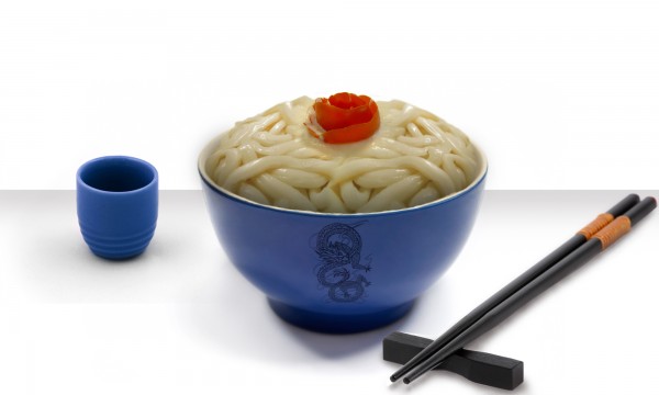
Tomato rose by pokpok313 in http://www.flickr.com/photos/pokpok/107028014/sizes/l/ (5 years and 3775 days ago)
Very nice indeed...chopstick block needs a shadow too, and blur chopstick shadow to match the blur on the other shadows. The only way I'd like your idea better would be something weird poking out of the noodles, but that's just me... Good luck! 
Thanks CMYK! There's nothing weird poking out of the noodles, but I put something edible 
This looks great! Very nice job indeed.
Definitely NOT sushi.  well done. GL!
Howdie stranger!
If you want to rate this picture or participate in this contest, just:
LOGIN HERE or REGISTER FOR FREE
Nice idea, but I wish you would put in a more interesting background.
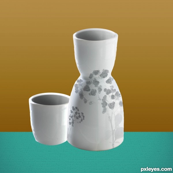
Put down shadows that lean to the right, opposite of the light source. Currently the vase and cup look like they are floating.
nice idea but.. as jawshoewhah said.. it looks a little floating...
Good !
shadows needed
Howdie stranger!
If you want to rate this picture or participate in this contest, just:
LOGIN HERE or REGISTER FOR FREE