Comments are welcome (5 years and 3586 days ago)

I've cut some of the heads out of the original image, then duplicated them. the duplicate -desaturate. over the original heads i've placed the flags then the desaturated heads over them all with blend mode set at linear light. then i've toyed with contrast/lighting. and last drop shadow. (5 years and 3788 days ago)
Nice idea. It would have looked better if the flags followed the shapes of the heads.
It's a very clever idea and I comment you on your using the source. I imagine this was a lot of work.
creative and artistic thinking author. nice work
i really like that harsh feel to it. Good luck!
Howdie stranger!
If you want to rate this picture or participate in this contest, just:
LOGIN HERE or REGISTER FOR FREE

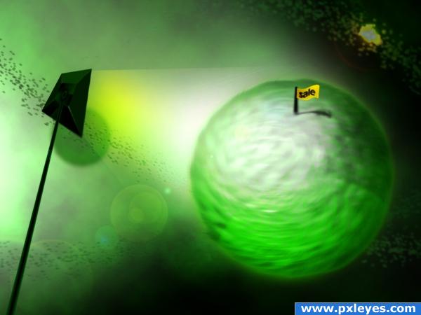
for the days ahead, its beter to buy a green planet for ourselves. So.. how much do u bid!!!? (5 years and 3882 days ago)
Scottish paradise!
Very nice, i love it!
Howdie stranger!
If you want to rate this picture or participate in this contest, just:
LOGIN HERE or REGISTER FOR FREE
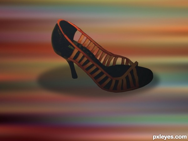
beautiful shoe!
Try to fix the shadow...look at the source pic.
I agree with CMYK.
Howdie stranger!
If you want to rate this picture or participate in this contest, just:
LOGIN HERE or REGISTER FOR FREE