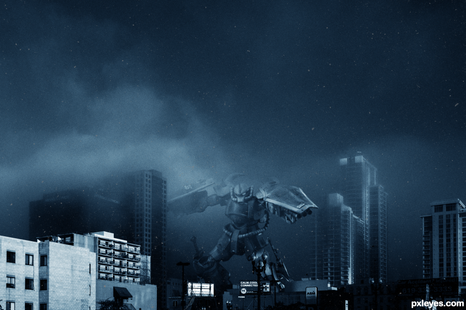
First submission. I had fun putting this together. (5 years and 1606 days ago)
- 1: Robot
- 2: City
- 3: Scratch Texture

First submission. I had fun putting this together. (5 years and 1606 days ago)
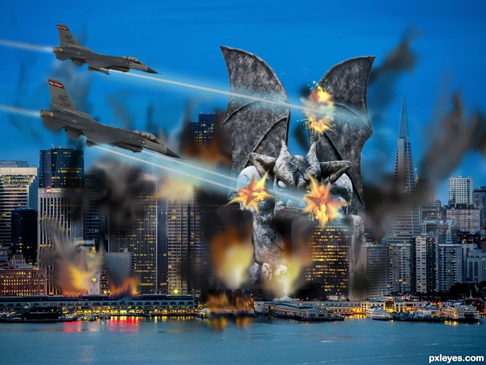
This time San Francisco was attacked by a Giant gargoyle. (5 years and 1653 days ago)
Attack again... Might need an assistance of a superhero to defend your frequent attacks author 
Kerpow! Bang! nananananananananana... BATMAN!!!!!
Cool effects 
I knew the military were using lasers on their planes  Definitely an interesting image. I understand that you made the planes a little bigger to appear in the foreground, however, the perspective isn't quite right. Making them smaller would make the attacker seem even bigger as well as the damage the lasers are doing to it. Just my opinion. Great job!
Howdie stranger!
If you want to rate this picture or participate in this contest, just:
LOGIN HERE or REGISTER FOR FREE
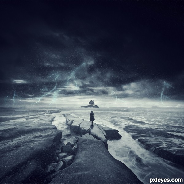
A friend of mine asked me to create the cover art for his new album. Of course, this is the version without text.
The image contains 6 different photos of mine taken over the last few years, combined to create a surrealistic & exaggerated "storm of the century" - like image. Nothing was from an outside source other than the brushes used to create the lightening.
Techniques to create the image were all performed in Photoshop CS5 and Lightroom 3.
(5 years and 2950 days ago)
Oh, I'd like to see a hi-res version...
This is very nice image but i don't see it as surrealism...Every single element is blended very well and all together presents very nice image but without surreal mood...Try to add some pieces that will enhance theme of this contest....
Congrats with a spot in the next round 
Good luck on the next round!
Howdie stranger!
If you want to rate this picture or participate in this contest, just:
LOGIN HERE or REGISTER FOR FREE
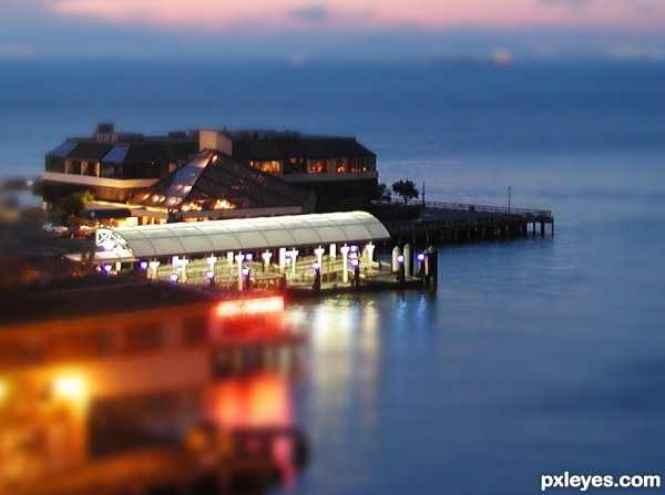
Pier Buildings off of Wharf 39, San Francisco. I viewed the tutorial video in the contest description, but I had previously found a Photo Shop tutorial and used it. i had to modify it somewhat, as I use Paint Shop Pro, but it is a good read. (5 years and 3386 days ago)
Cool! I ate a big calamari tube stuffed with shrimp in a white sauce with sourdough toast at a restaurant there while on business in the early 90's(for breakfast). It was awesome!
I digress. I've never tried this technique before, although I want to, but yours looks pretty good!
Howdie stranger!
If you want to rate this picture or participate in this contest, just:
LOGIN HERE or REGISTER FOR FREE
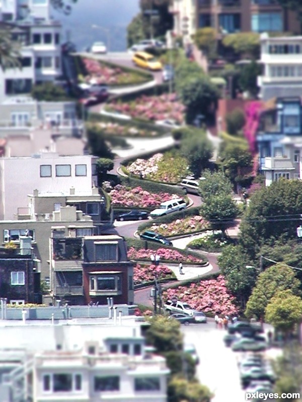
Worlds most "crooked street" (5 years and 3386 days ago)
give your shots really different titles or they will be pulled because you are giving away who the author is by keeping them so close in names!
awesome shots though.
play with contrast and HDR toning... this has some major potential (in the tute you can add saturation.. I really like where this is going.. it's a very neat image... good luck
Very nice, but the lack of resolution in the source pic diminishes the impact of your work by diminishing the contrast between the in-focus and out-of-focus portions.
Dan, pretty well stuck with this image,, as it was taken a few years back from a very long distance away, and with a lower resolution (mega-pixel) camera.. But I do appreciate the comments
Howdie stranger!
If you want to rate this picture or participate in this contest, just:
LOGIN HERE or REGISTER FOR FREE
Welcome to Pxleyes! Nice first entry, glad you had fun that's what it's all about! Looks good. I think the dust works but maybe it would be better without the hairs, just my opinion still a nice image.
I went back and forth a half dozen times on that. And still think maybe the dust/hair layer needs to be toned down a bit.
I thought the dust made sense as it looks like debris but the hair didn't look right for me unless you wanted it to look like an old photo but I'm not sure that works. That's just how I see it.
As a first entry, this is SPECTACULAR. While I can see what you were going for with the texture, it confuses the focus because when viewing the image, I tend to flash to the hairs and debris and not the image. I think that's what Spaceranger is talking about. Good luck and toning back the debris would be a great fix on an already great chop
WOO HOO.. much improved author! GREAT!
Thanks! The input us greatly appreciated.
Congrats..........
Fantastic job... CONGRATS!!!
Thanks everyone! 2nd on my first submission! Im honored.
Congrats for your first shot!
congrats
Congrats!!
Howdie stranger!
If you want to rate this picture or participate in this contest, just:
LOGIN HERE or REGISTER FOR FREE