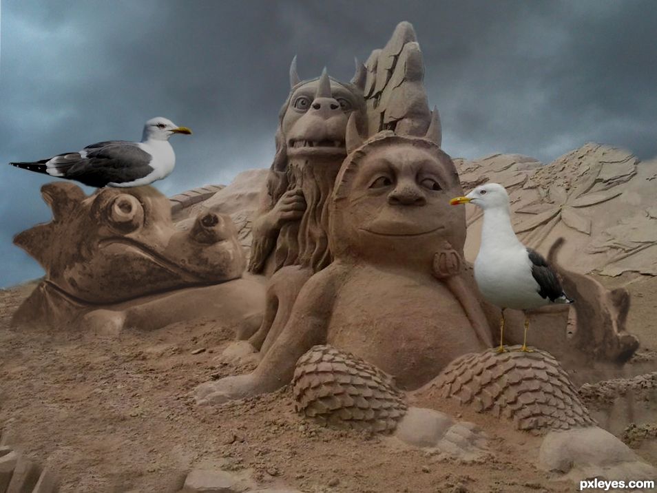
Picture of cloudy sky is mine. (5 years and 1451 days ago)
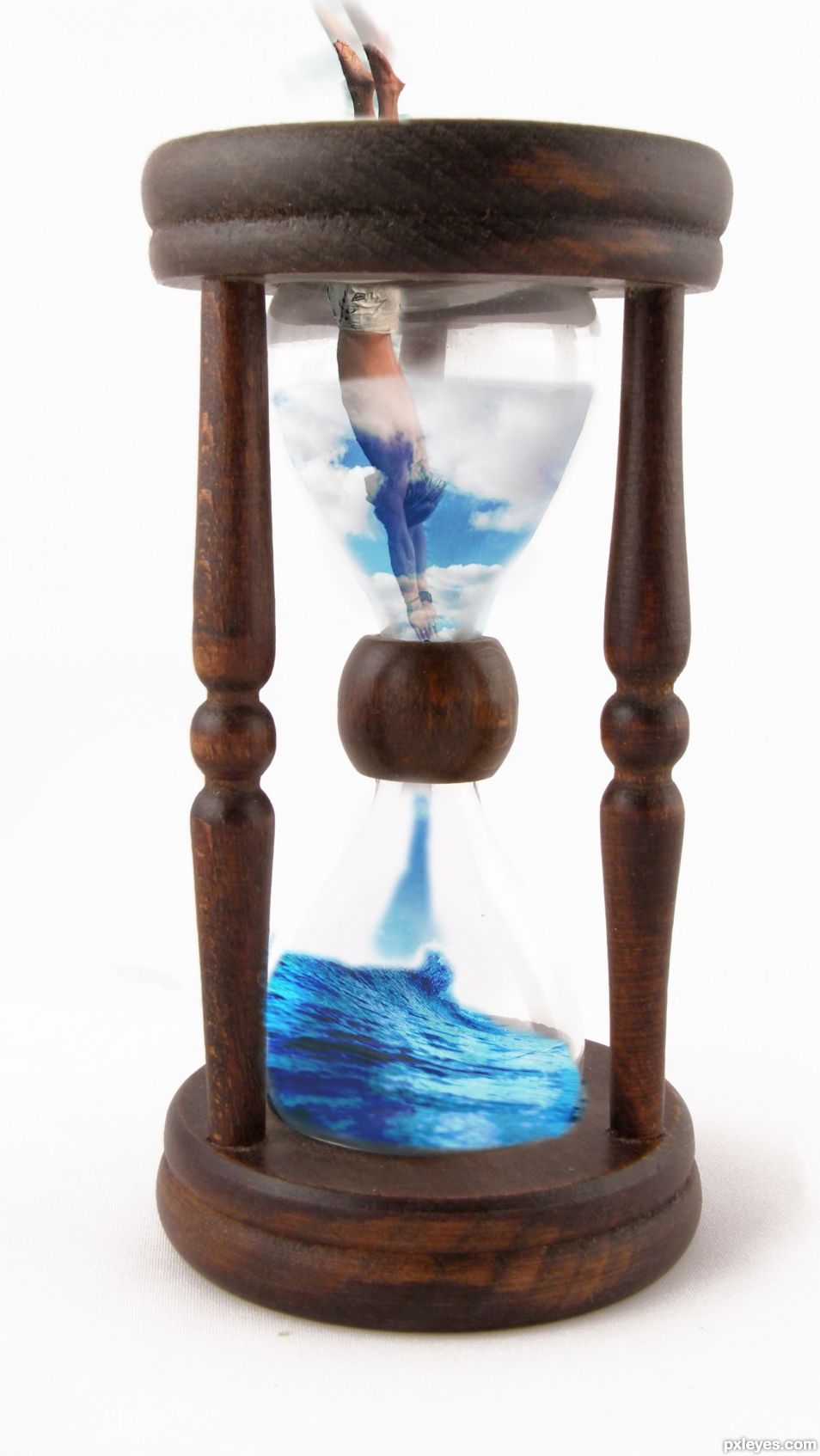
(5 years and 1473 days ago)
Howdie stranger!
If you want to rate this picture or participate in this contest, just:
LOGIN HERE or REGISTER FOR FREE
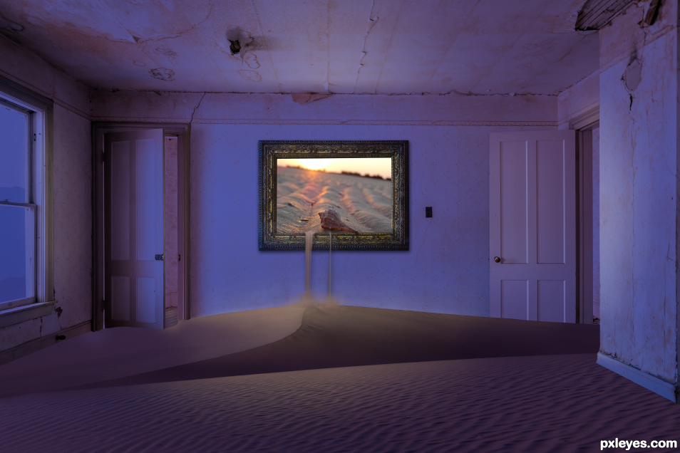
I had a lot of fun doing this one, and tried real hard to keep it to the objective. (5 years and 1574 days ago)
Looks good...nice mood & lighting.
Break out the DYSON... oh what a mess  Great JOB! Just love the lavender!
I wonder who is going to clean the room.... nice job of course.
Congratulations.. nice work.
Congrats!
Congrats!!
Howdie stranger!
If you want to rate this picture or participate in this contest, just:
LOGIN HERE or REGISTER FOR FREE
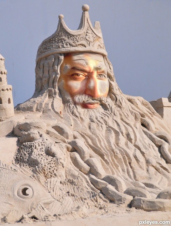
This King has been turned to Sand!
Used only the source and an image from Sxc.hu Thanks to royv. (5 years and 2539 days ago)
Interesting spin Author. You might want to consider using less of a smooth blend for the transition between skin and sand since sand is rougher. The yellow glare above and next to the nose is distracting as well. Would be cool to see human hands sticking out of the sand or perhaps real hair and beard partly transitioned.
Thanks rturnbow, I agree on the smoothness and the yellow glare and I aim to fix this and love the idea of adding more realistic elements. Will get to work and hopefully have time to resubmit.
Howdie stranger!
If you want to rate this picture or participate in this contest, just:
LOGIN HERE or REGISTER FOR FREE
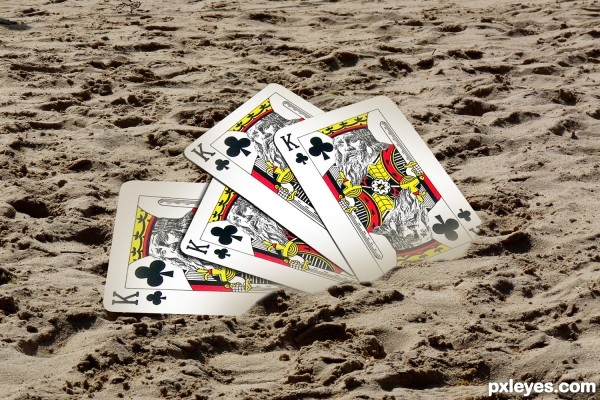
(5 years and 2543 days ago)
wow!!! amazing thinking... good luck!
thank you sivan 
Such an imaginative idea - bravo!
thank a lot..!
Author not playing with full deck...
ha. ha.. sure
I love your creativity , for me it's great... GL ... Well done!
thank you!
Awesome! Great idea. Great thinking to put the cards in the sand.
thank you!
thank you everybody..
love this!
thanx
Nice idea, very original! 
thank you 
So... YOU REALLY deserves a better place with this composition...
Howdie stranger!
If you want to rate this picture or participate in this contest, just:
LOGIN HERE or REGISTER FOR FREE
Very nicely done and original thinking! Little dragon fits in well with the other sculptures. My only critique is that the edge where the sand meets the little dragon might be a little soft. If you look at the sculpture in the foreground the edges there are more distinct. Just a minor point, personally this is the entry I like most.
Thanks for your comment, I used a softer brush and softened the edge there where you pointed out. Hope it looks better...
I think you mean you made the edges less soft which is what I suggested. Looks perfect now!
Thanks again Rein.
One, two, ready, go
Grow some big feet, holes in history
Is where you'll find me, is where you'll find
All is love, is love, is love, is love
~Karen O
Thanks my friend.
Good job! Love it!
Thanks...
Congrats
Thanks my friend....
Congrats once again George, I really like this one!!
Thanks Rein.. I like learning... thanks for your advise...
Howdie stranger!
If you want to rate this picture or participate in this contest, just:
LOGIN HERE or REGISTER FOR FREE