(5 years and 3689 days ago)
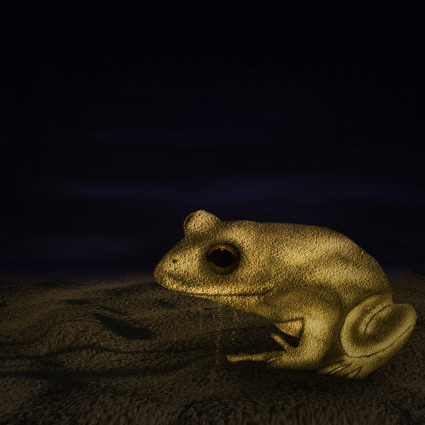
My first attempt at something like this... Thanks to Hatestock. (5 years and 3766 days ago)
Pretty dark, but well done...
Looks great!Very creative idea! (Maybe you can blur some of the edges)
nice work
Very original idea. Sand out of mouth is a nice touch.
Oh, love this froggy with golden highlights 
nice image
Howdie stranger!
If you want to rate this picture or participate in this contest, just:
LOGIN HERE or REGISTER FOR FREE
(5 years and 3773 days ago)
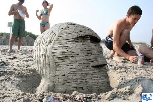
Very nice colour matching and blending with the sand. Good luck.
Ha, good idea. Like it. =)
LOL
Very nice blend. Looks very realistic.
very well done, the different perspectives twitches my eyes a little though
and also Congrats! for third 

congrats! 
Congrats!!
Howdie stranger!
If you want to rate this picture or participate in this contest, just:
LOGIN HERE or REGISTER FOR FREE
(5 years and 3778 days ago)
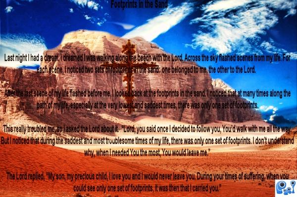
a nice image, but this writing is usually assoaciated with a picture of 'footprints in the sand' hence it's title........
There's no use putting type on an image if you can't read it...and where's the sand?
imo, you would have been better leaving the other picture up, even if it were ot!...this one is not anywhere near as good.....sorry.
Text distracts from your image author. i can see your thoughts for this works, you have creativity just need to build skills to develop you ideas .. gl with your next entry.
Howdie stranger!
If you want to rate this picture or participate in this contest, just:
LOGIN HERE or REGISTER FOR FREE
(5 years and 3830 days ago)
very nice done
Oh, I like this! Clever and creative. Good luck.
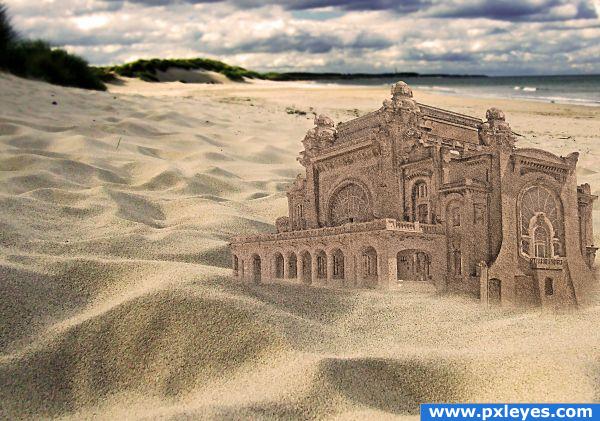
Sand effect looks pretty good, but you wouldnt like to adjust the color of the castle a bit more to the beach color? Good luck!
Hope it looks better. Thank you all for voting
I suppose it was made with wet sand, so the colour looks ok to me, i would suggest some falling sand from the edges, if possible.
I really like the idea but isnt the perspective of the building off?
Hope it looks beter this way.
Thank you all for the comments and votes.
Howdie stranger!
If you want to rate this picture or participate in this contest, just:
LOGIN HERE or REGISTER FOR FREE
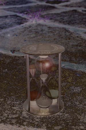
:dev Xerostock: thanks to him for the hour glass
to simple...needs a high resoulution.And why is lends flare there...?
the lens flair is to show a light that fall upon the glass..adn falired
Nice!
Howdie stranger!
If you want to rate this picture or participate in this contest, just:
LOGIN HERE or REGISTER FOR FREE