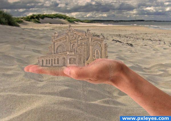
The sand falling from the hand was generated using Ps. (5 years and 3938 days ago)
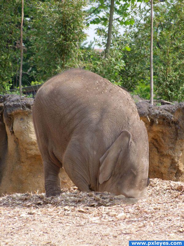
(5 years and 3945 days ago)
funny idea, i like the elephant in the sand, but the proportions with the mouse are all wrong...I would fix that or remove the mouse for good 
Not bad, but you lost the elephant's eye and you need to shrink the mouse...
Edit: Might have been good to keep the mouse...fix the shadows.
Hilarious and clever idea. Good luck to you...
Great idea... where's the mouse, that would add so much to the concept here! g/l
Howdie stranger!
If you want to rate this picture or participate in this contest, just:
LOGIN HERE or REGISTER FOR FREE
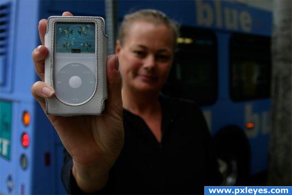
The all new Fish Pod now you can listen to your music and watch your fish and feed them and even clean the tank with the auto feeder and cleaner build in :)
Thanks to cgtextures for the fish,water,sand, and thanks to hawksmont Brushes for the bubbles for my fish and to stock.xchng for the ipod photo background (5 years and 3958 days ago)
Nice job. I did a similar thing with a cell phone.
good idea and implementation 
cute
"You want fish? There's an App for that."
Nice, a higher resolution would;ve been nice, but good image otherwise!
Howdie stranger!
If you want to rate this picture or participate in this contest, just:
LOGIN HERE or REGISTER FOR FREE
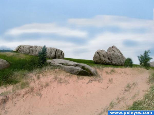
Source image and my own photo. The photo was taken just this weekend in the U.P. of Michigan.
I blended the two photos by placing them one on top of the other. I brought the opacity down and I could see where I needed to erase. I switched from one opacity of the eraser tool to another. It is simple but it was tedious. (5 years and 3984 days ago)
Now all you need is Tiger Woods poking his head out... Great blending, author!!
wow this image really does look awesome! and like ponti said tiger woild be cool...lol awesome image author!
Excellent sea scape,very simple yet elegant.
FORE................can I play through? Very nice.
good blending!
Howdie stranger!
If you want to rate this picture or participate in this contest, just:
LOGIN HERE or REGISTER FOR FREE
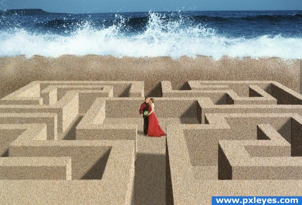
Had the idea to make a sand maze like a hedge maze. Hope you like.
Pictures of couple and sand are my own. Hedge maze used as reference. Ocean pic from jupiterimages.com downloaded under subscription. Proof of subscription in SBS. (5 years and 4019 days ago)
Nice job! Maybe you could adjust the level of noise on some of the walls or blur the furthest point more to give it a depth of field. Right now, the noise looks a bit too uniform. Is that a wall of sand beyond the maze? It isn't clear what that is...I like how you arrived at the perspective in your SBS. I really like the look of this image...very intriguing. 
it's so sandy it makes my eyes water.. but i think that's what makes it so excellent... it sorta forces your eyes to focus on the couple.. I like that.. good luck author
the lighting on the shore doesnt look right but good work i agree w/ pixelkid
very nice
thanks all. It isn't the shoreline, it is a breaker/retaining wall of sand, not rigidly formed like the maze just pushed up like when you build a moat for a sand castle. 
gl
Congratulations!!!! 
Howdie stranger!
If you want to rate this picture or participate in this contest, just:
LOGIN HERE or REGISTER FOR FREE
Nice, but needs shading...
Very nice!
very nice
Thank you, added some shading, thanks for voting
Good job! And especially a good idea with the falling sand. Good luck!
Thank you all for the comments and votes.
Howdie stranger!
If you want to rate this picture or participate in this contest, just:
LOGIN HERE or REGISTER FOR FREE