Thanks to *mjranum-stock, ~shaedsofgrey , ~hawksmont , Andrzej Estko , ~redheadstock and =Falln-Stock for Stock. (5 years and 3388 days ago)
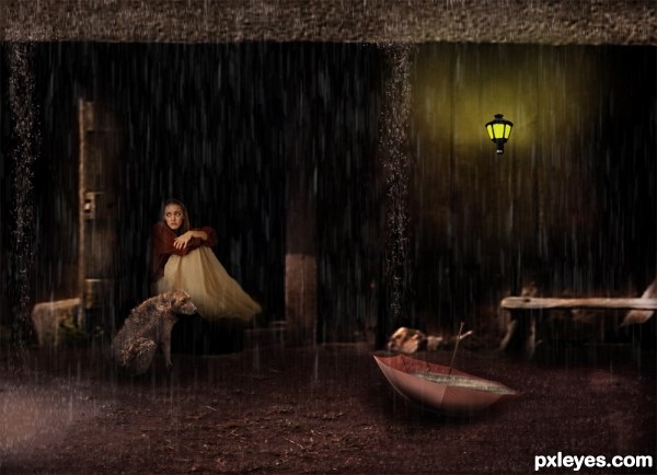
Hope you like it friends !!! (5 years and 3394 days ago)
nice conceps and execution, good luck!
I really like the composition of this....my only nitpick is the lighting....See how the glow off the lamp is yellow it would put out a softer yellow tone which should reflect in the water in the umbrella IMO...Best of Luck 
Wow....very nice image and composition...
I like your artwork.....good luck,my friend..... 
WOW! Very nice work here. :?)
Great work on this piece author...best of luck
Impressive mood piece ... there is some technical problems but as a piece of artwork without considering the technical I think it is a wonderful image. If you have any questions on the technical PM me ... but IMO the image has quite a lot of depth and expression just the way it is!
A bit too much "negative space." This would have looked better with some judicious cropping of the sides. Good composition and concept, though!
Howdie stranger!
If you want to rate this picture or participate in this contest, just:
LOGIN HERE or REGISTER FOR FREE
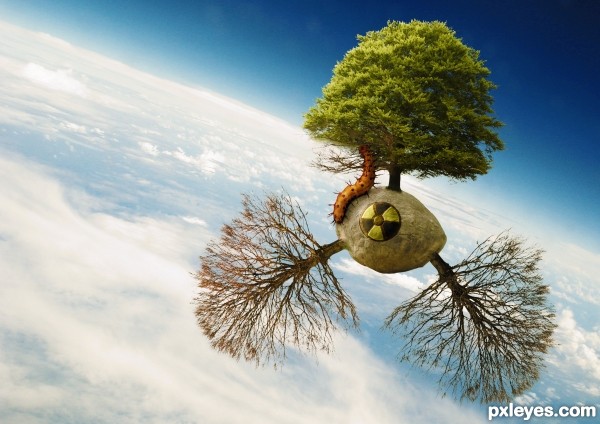
for this image i used masking and adjustment layers while considering the light source, color and atmosphere in order to emphasize shadowing and mood and bring all the parts together
the nuclear symbol was remade with pen tool, bevel and emboss and curve adjustments to create depth
(steps are described) (5 years and 3410 days ago)
Good concept!
Excellent entry! 

Well done, very nice. GL
Good image. When you upload, there are spaces to enter the URL & description of sources. It would be nice if you used them.
thanks for the support
i fixed the URL and self made the nuclear waste symbol which was a 3d render
Nice entry, reminds me of an orbiting satellite.
"i fixed the URL and self made the nuclear waste symbol which was a 3d render" - ??? I'm having trouble deciphering your comment... is the existing nuclear sign made with the pen tool or is it a 3D render... if it's a 3D render then you need to update your sbs. If it's been made with the pen tool then it's not a 3D render.
it was temporarily removed from the contest because it was a 3d render
then, i made it again with the pen tool, you can see it in the "how to steps"
very cool  !
!
just amazing :O
great work author...very well done
Congrats yoguy108!
Really cool image 
Congrats, really nice work 
Howdie stranger!
If you want to rate this picture or participate in this contest, just:
LOGIN HERE or REGISTER FOR FREE

Iam posting after a very long time, This is just an 'Campaign poster' idea.
Thanks for the sources.
1. andreyutzu
2. OeilDeNuit
3. abcdz2000
from http://www.sxc.hu. (5 years and 3440 days ago)
The RH side of the frame looks a bit "chewed up," And the white under the elephant's head looks a bit odd, but a nice conservation poster!
The white edge on the lower RH side of the background makes it visually confusing, as it then is hard to discern from the framing. It needs a bit of trimming, whether you leave the "chewed" effect or not.
Interesting take on the source. The edge at right is part of the background paper texture.
Howdie stranger!
If you want to rate this picture or participate in this contest, just:
LOGIN HERE or REGISTER FOR FREE
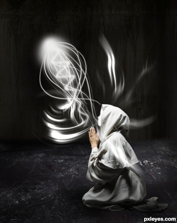
Credits to :
Light Brushes - ~hawksmont , ~anodyne-stock and *ShadyMedusa-stock
Witch - *mjranum-stock
Floor and Wall - CGTextures (5 years and 3454 days ago)
Are you channeling Ponti?... Great job author.. very pretty image
lovely work
HOW DO U guys do this..i really want help couse i want 2 do my picture like that..
can anyone help me
please
n Tanxz
HOW DO U guys do this..i really want help couse i want 2 do my picture like that..
can anyone help me
please
n Tanxz
cool work author...gl
Fascinating .... the limited colour palette gives this piece quite an emotional depth. Good work!
nice work .......... 
A bit inconsistent. Looks like she's "channeling" an egg whisk...
And what about your entry ? 
Has nothing to do with YOUR egg whisk...
Unlike you, I don't compare other people's work. I merely point out what I observe about the piece, without the need for smileys.
Beautifull, but may be more work on the hands could be great ! Good luck author
Great work Author..., very neat.., Good luck 
Beautiful!
nice job on this
grt job...gud luck author
Howdie stranger!
If you want to rate this picture or participate in this contest, just:
LOGIN HERE or REGISTER FOR FREE
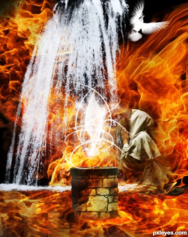
like the thing above the stone in the middle but i do't get the bird
IMO get rid of the bird and the person on the background
would make it less chaotic
GL
I will get rid of the bird asap, but I can't remove the woman, because the theme is "fire people"
I feel like the water (it is water right) is too blurry. Maybe finding another source for it may help
Nice creation...best of luck author
Howdie stranger!
If you want to rate this picture or participate in this contest, just:
LOGIN HERE or REGISTER FOR FREE