(5 years and 3324 days ago)
- 1: source1

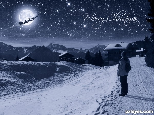
I turned an image taken on a sunny afternoon into a Christmas Greeting Card. I hope, you like it!
Only outsource images are the Santa Claus and the night sky. Daylight image and the picture of the moon are my own photos. The girl standing there is a friend of mine. :-)
please also have a look at the high res.
Edit: since Santa was an illustration I was forced to take it off, as the use of illus does not comply with the rules. Replaced Santa with doves that come in Photoshop. Appologies for that. :(
Thanks to spaceranger who found a photo with Santa Claus I changed the image back to the original idea. Thank you very much!
Thanks to mammadepants for use of the image of Santa Claus (5 years and 3340 days ago)
Beautiful results!
Perfect for this contest, RIGHT ON TARGET
Beautiful !!  Having in mind that is night time, shadow that girl is casting is too strong IMO
Thank you all for your nice comments. The remark on the shadow could be right, although knowing how bright a night is with a full moon shining on snow covered land I'm not sure. 
PS: sorry, wanted to give you the gold thumps up and clicked the wrong color. So please accept two more points from my heart. 
I definitely agree about the strength of the shadow, but then again with surreal lighting, surreal shadows are to be expected :P
Really nice fantasy scene 
You should remove the shadow with clone or simply soften it. Very nicely done.
thank you all. Had to replace Santa as he was an illustration which is not allowed to use. So now there are doves that come with Photoshop. Also changed the title as "I saw Santa Claus" now does not fit anymore. Also worked on the shadows as you recommended. Hope the mods now approve and you still like it. 
Appologies to the mods for using an illustration, I was not aware of that rule. Surely enough I could not find a PHOTO of Santa. 
You Mods do a great job here and I truly thank you for that. 
oh wow! This is sooo beautiful! Nice work 
I like this idea very much. I liked the sleigh w/Santa so I searched on flickr and found this: http://www.flickr.com/photos/borrowed/2071281749/sizes/l/ Should be easy to mask the shape, a little clean up and it should work and you'll keep your original idea! Couldn't hurt to try. 
The rule regarding use of illustration has been changed slightly. See http://www.pxleyes.com/forum/viewtopic.php?f=5&t=2956&p=39727#p39727 for details.
Like the creation. A bit of shadow angle and blur. Like the idea and choice of source. 
The doves just don't work as a substitute, since doves don't fly at night...Maybe some bats or owls or a jet in the sky...
right, thank you spaceranger! I used the image of mammadepants and now the image is back to the original idea and title. Sorry for all this back and forth, but my idea at first I liked best and so I'm very happy to be able to show it to you again the way I did at first.
The shadow is about 10 degrees off from the light source...just draw a line and see. Not bad otherwise.
i love this picture. however acording to the rules ""Basic rules: -You cannot use complete night skies -"" this is the perfect image for a Christmas card. i love this
thank you, CMYK46. You are right, I am aware that the shadows are a bit off, since the sun was not in the same place as the moon. Tried to move it but didn't like the outcome. I wanted to express a dreamy Christmas feeling and I hope the 10 degrees off shadow do not hurt that. 
@ Dragonside: Thank you! But I did not use "complete night sky", did I? I integrated the clouds as part of the night sky and placed a shining full moon there, see it? 
yeah im agree with Dragoncide , You cannot use complete night sky , cuz u placed the night sky on the original sky ,IMO , but this good entry , Good luck 
text is unnecessary!!! you have a box called TITLE!!!
Thanks everyone! I updated the entry using screen mode on the sky and I also put another step in the sbs with a print screen on it. I hope this helps now. The sky is now slightly brighter, which actually I like better.  The entry follows completely the rules as far as I can judge that.
@ ShiZa: why are you yelling at me? The title of the image is: I saw Santa Claus, I do not want to change that. Read the description: "I turned an image taken on a sunny afternoon into a Christmas Greeting Card." So the text is just fine where it is. O.k.? 
Author nice job imo and you should send this to friends and family next Christmas 
They will love it and the fact you made it for them.
The theme states "-You cannot use complete night skies -You can use moons, stars and clouds cut from night shots - some of what you use can be shot at night but only minimally -" This entry fits this description, only parts allowed are used.
@ShiZa, normally I don't like text on entries either however this is a greeting card and I agree with cabldawg71, it's a very nice one!
Very very good job author...I love how u created dark here...and the great thing about your entry is your bright night feel...Its hard thing to achieve great result like u did...best of luck
Nice job Would be nice Christmas card
Great work and wonderful Christmas card ... IMO spaceranger is right ... image complies with the guidelines. I like the shadows as well ... the whole image has a great night mood!
Howdie stranger!
If you want to rate this picture or participate in this contest, just:
LOGIN HERE or REGISTER FOR FREE

(5 years and 3714 days ago)
Nice distortion.. realistic outcome. Good job.
It's convincing but a little too simple I think. Perhaps you could not crop it so close and maybe put a look of fear on the horse. Just a suggestion.
The idea is nice....and a good job....
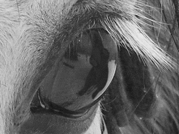
Thank you for the advices! I don't know if only I noticed that, but I really think it's a bear reflected on horse's eye, when zoomed in... Imagination???
Great result!  GL
GL
Nice change of pace and interesting use of source. Simple, but nice.
Howdie stranger!
If you want to rate this picture or participate in this contest, just:
LOGIN HERE or REGISTER FOR FREE
Creative!
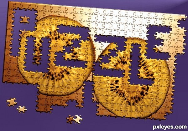
Objects have formed letters here, not vice-versa. IMO not on theme.
Congrats on an amazing interpretation of the theme. The unfinished parts of the puzzle is very much part of the actual object in this case, therefore I think it's brilliantly on theme. Though I do do wish that you'd used something more interesting than a kiwi but that's just me. Well-done!
.. perhaps you like better to use the word door, or house, or teacups and have a bunch of teacups in letter shapes... plenty of things to come up with..- like it is sad in the rules.
so it's on theme .
i think cmyk meant that the pieces should form the word puzzle itself instead of having the empty space as the word, it would be even more on theme, creaive concept though!
great
CMYK is correct. Look at the link in the intro section. That being said, it is a very nice image.
Howdie stranger!
If you want to rate this picture or participate in this contest, just:
LOGIN HERE or REGISTER FOR FREE